Hey there! This is the Uniform version 3 documentation site. If you’re looking for version 4, go here instead.
/
Space
Control visual distance between and within objects.
Space may be invisible, but the concept is critical to good interface design by establishing relationships and influencing visual style.
Scale
Our scale is based on a 16px (1rem) unit. We chose this because it is our base typography size and a factor of common screen resolutions.
Rather than name the scale with t-shirt sizing (small, medium, large), we opted for a mathematical approach, using fractions and multiples of our base size (16px). The result is easy to learn and extend, with a simple vocabulary to convey specific meaning.
Our space sizes are ⅛ space (2px), ¼ space (4px), ½ space (8px), 1 space (16px), 1 ½ spaces (24px), 2 spaces (32px), 3 spaces (48px) and 4 spaces (64px).
Style
Relative
The amount of space needed to convey the appropriate relationship or separation depends on how space is used throughout the rest of the interface.
In a dense interface, a half space might be perfect for associated elements. But in a sparse interface with a lot of negative space, that same half space may not be sufficient.
Relationships
A small amount of space between elements implies association or a close connection. Vice versa, a large amount of space implies separation.
Usage
Measuring Typography
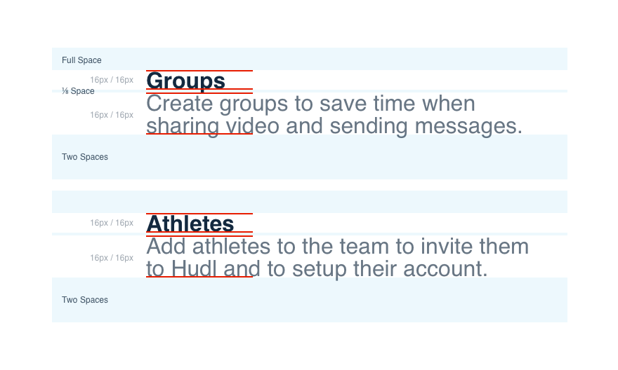
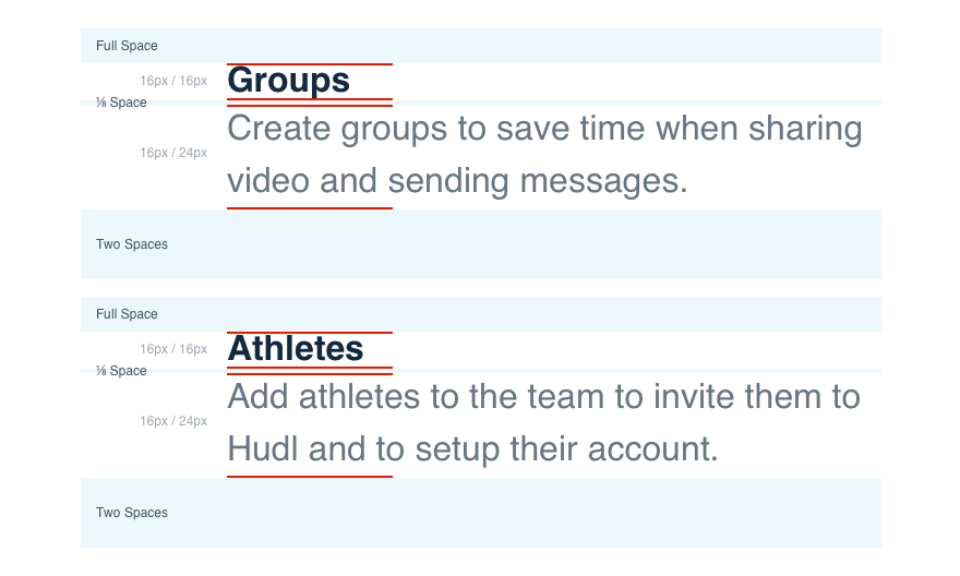
When measuring space for typographical elements, calculate size based on the line-height of the type in question.

Don'tmeasure descender to ascender, baseline or x-height.

Doaccount for line-height when measuring.
Measuring Boxes
When calculating space for a box, measure from edge to edge. Boxes have two types of space: inside (padding) and outside (margin). Inside space does affect the size of the box, whereas outside space does not.
Outside space is the distance between the box in question and other elements within the interface. Outside space needs to be accounted for in determining overall layout considerations, but is not a part of a given box’s size.
Platform
| platform | notes |
|---|---|
| Web |
|
| Apple |
|
| Android |
|
| No guidelines exist for Windows (yet). |