Hey there! This is the Uniform version 3 documentation site. If you’re looking for version 4, go here instead.
/
Content Selection
Call out the object or group to be affected by an action.
These visuals tie a selection to the primary action (most likely a button).
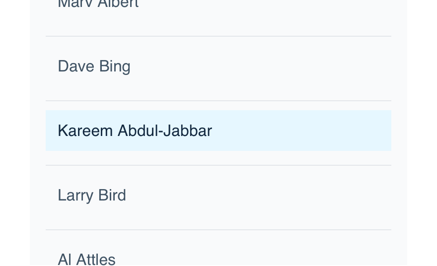
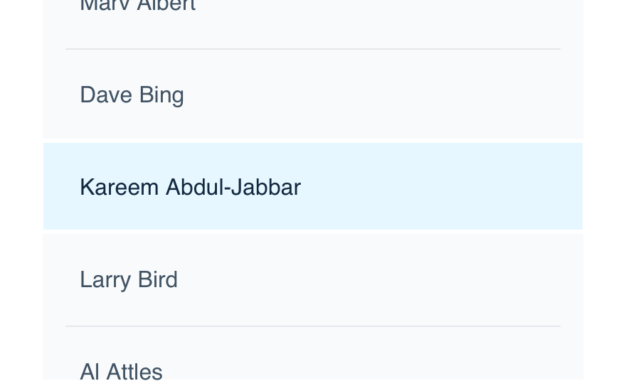
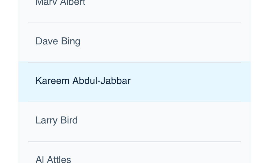
State
Selectable content items have three states: default (unselected), hovered and selected. States are important in showing whether the content is selected or not (unselected and selected) and to signal to the user that content is selectable (hovered). All forms of our content selection patterns below have all three states.
Type
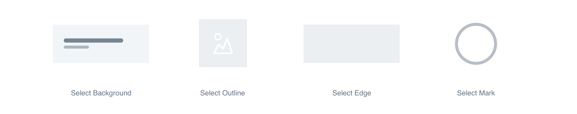
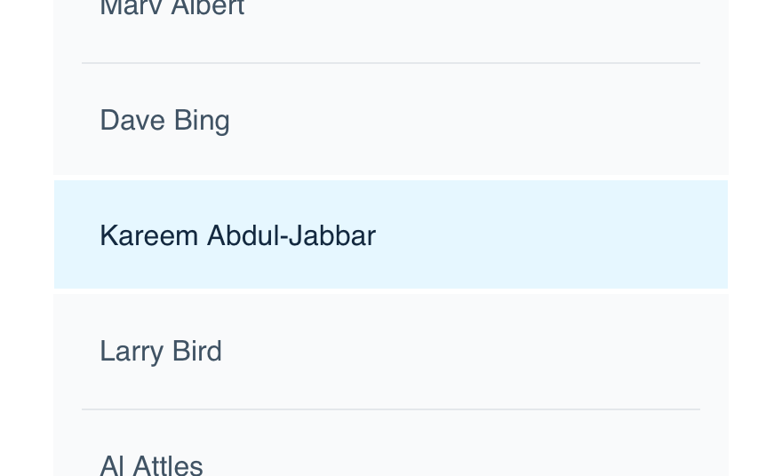
Background
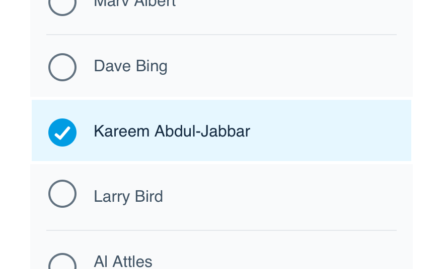
This type is best suited for text-based selectable regions with visible backgrounds, like a table-cell. If a user selects a piece of associated content, this can be coupled with the edge type. In a multi-selection mode, be sure to use the mark type as well.
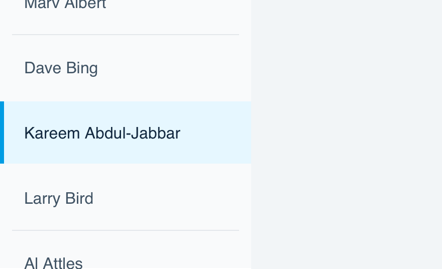
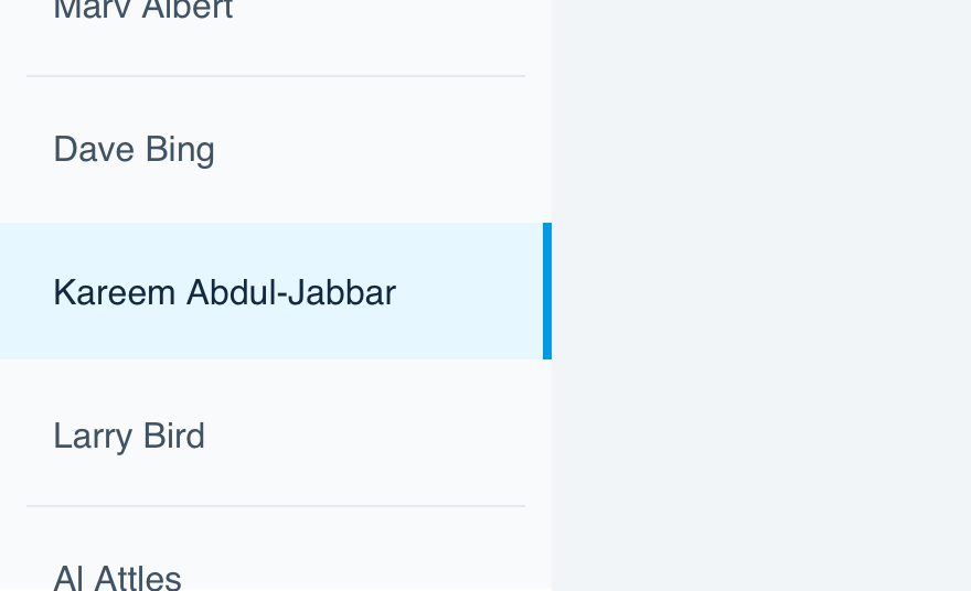
Edge
If a user selects a piece of associated content, place a 4px stripe adjacent to the content. This type doesn’t have a multi-selection mode.
Outline
Best suited for visual content, such as video thumbnails on a grid, that don’t have a defined background. Inset a thick 4px outline on the content when it’s selected. In a multi-selection mode, be sure to use the mark type as well.
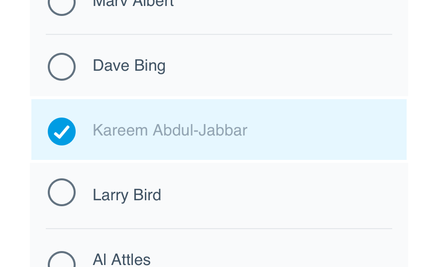
Mark
Only use this for multi-selection mode. The mark denotes that multiple items can be selected. An example of this would be selecting a group of videos to share. The mark should typically be used in conjunction with one of the types above. More details are available on the select mark component page.
Mobile
There should be no changes to how content is selected on mobile, but special attention should be given to tapping and gestures. To match how content selection operates on the web, make use of hover styles for tapping content when the tap opens an item or new view.
Mobile navigation should always adopt the selection background and edge to display the associated content.
Usage
Background Region
The background color should stretch to the edges of the selected region.
Don'tpartially fill a background region.
Dofill the entire background with the appropriate selection color.
Background Dividers
Dividers adjacent to a selected (or hovered) region should be replaced with Level 0 lines.
Don'tuse level accents to divide a selected region.
Doreplace dividers with edge-to-edge Level 0 lines to emphasize the user's selection.
Edge Placement
When a selection reveals additional content, the Select Edge should always be on the side adjacent to the revealed content. This helps associate the item with the content and is consistent with tab navigations.
Don'tplace the edge on the opposite edge of the related content.
Doplace the edge adjacent to the related content.
Text Contrast
Use increased text contrast for selected and hover states of text-based selectable items. On the flip side, unselected items may have reduced contrast to support the selected item.
Don'tuse low contrast text color for selected content.
Doincrease text contrast to emphasize selectable and selected content.
Values
Light Environment
| Color | Name | RGBA |
|---|---|---|
| LE Selection Outline | 0, 156, 227, 1.0 | |
| LE Selection Outline Hover | 0, 156, 227, 0.5 | |
| LE Selection Bg | 230, 247, 255, 1.0 | |
| LE Selection Bg Hover | 240, 250, 255, 1.0 | |
| LE Selection Edge | 0, 156, 227, 1.0 | |
| LE Selection Edge Hover | 127, 215, 255, 1.0 | |
| LE Selectmark Unselected | 19, 41, 63, 0.65 | |
| LE Selectmark Unselected Hover | 0, 156, 227, 1.0 | |
| LE Selectmark Selected | 0, 156, 227, 1.0 | |
| LE Selectmark Selected Hover | 19, 41, 63, 0.65 |
Dark Environment
| Color | Name | RGBA |
|---|---|---|
| DE Selection Outline | 0, 156, 227, 1.0 | |
| DE Selection Outline Hover | 0, 156, 227, 0.5 | |
| DE Selection Bg | 0, 56, 82, 1.0 | |
| DE Selection Bg Hover | 0, 44, 64, 1.0 | |
| DE Selection Edge | 0, 156, 227, 1.0 | |
| DE Selection Edge Hover | 0, 103, 150, 1.0 | |
| DE Selectmark Unselected | 230, 242, 255, 0.65 | |
| DE Selectmark Unselected Hover | 0, 156, 227, 1.0 | |
| DE Selectmark Selected | 0, 156, 227, 1.0 | |
| DE Selectmark Selected Hover | 230, 242, 255, 0.65 |
Platform
| platform | notes |
|---|---|
| Web |
|
| Apple |
|
| Android |
|
| No guidelines exist for Windows (yet). |