Hey there! This is the Uniform version 3 documentation site. If you’re looking for version 4, go here instead.
/
Mobile Navigation
Our mobile screens have less room to perform just as many actions (sometimes more). The options to progress forward and backward should remain clear, but concise.
Style
Icon-Only: You have two options here—a back arrow and a forward arrow. No other icons should be used to navigate.
Type
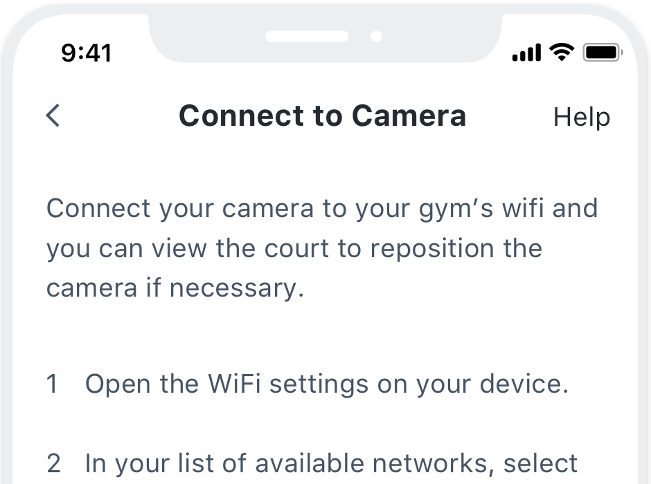
Back: Anytime they can revisit the previous item or screen in a series. Should only be represented by the icon, never labeled.
Usage
Navigating Back
The option to go back in a series of screens should only ever be represented by the arrow icon. We choose not to use the back label in case it runs into the current title’s screen.
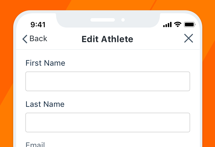
Don'tspell out “back” and clutter the nav bar.
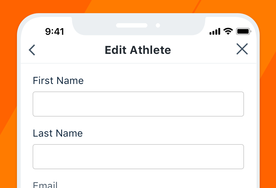
Douse the back icon for the option to revisit the last screen.
We also don’t label the previous screen because they were just there! No need to remind them already.
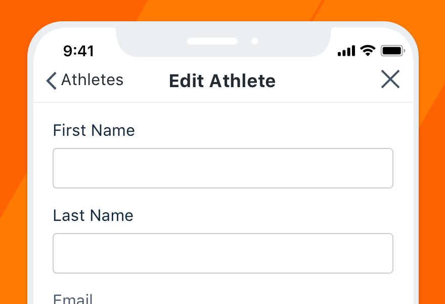
Don'tdistract from the current screen’s title and purpose.
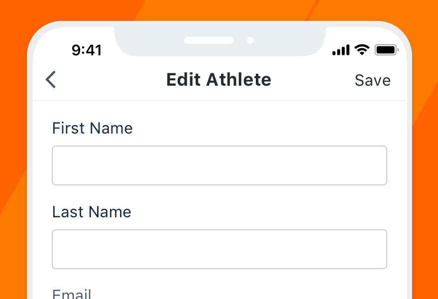
Douse only the icon for clarity and consistency across screens.
Reversing Course
Whether the user is going back, closing a one-off task or canceling changes, the option to reverse course should always live in the top left. Save the top right for moving forward, whatever the context.
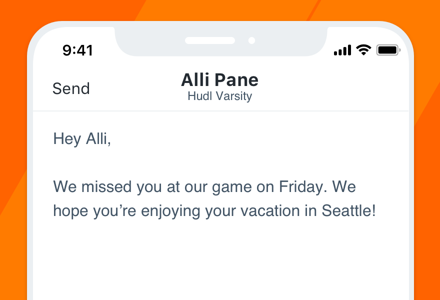
Don'tconfirm or move forward anywhere but the top right.
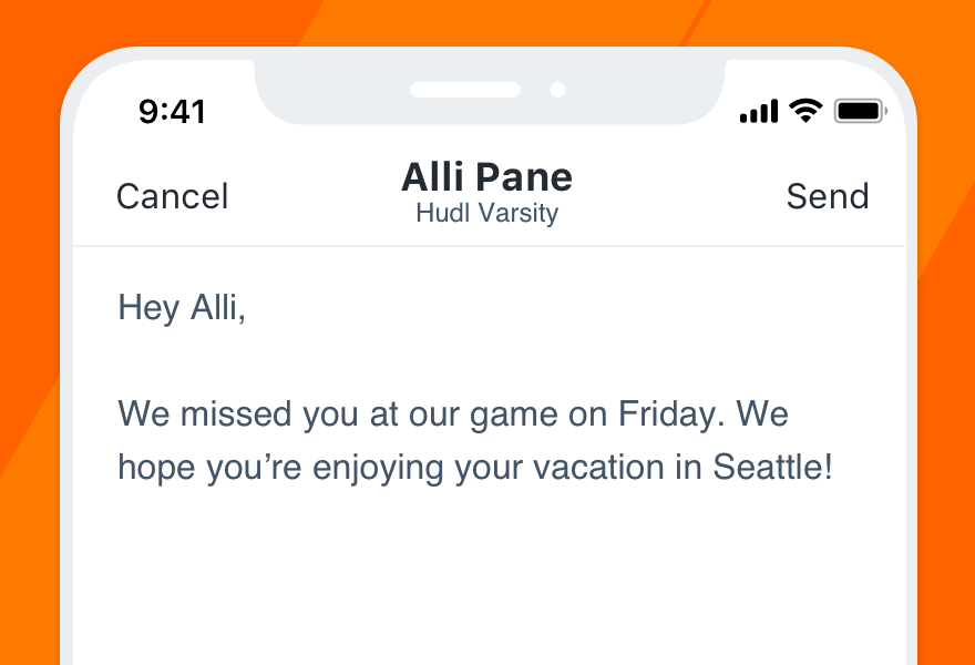
Doput Close or Cancel in place of the back arrow when appropriate.
Note that all guidelines pertaining to “going back” apply only to Hudl’s iOS app. Android has a built-in back button that removes the need to include the option in-app.