Hey there! This is the Uniform version 3 documentation site. If you’re looking for version 4, go here instead.
/
Forms
Whether it’s part of a larger task or a one-off entry, completing the form accurately should be quick and easy. Layout and content are key to building that experience.
Elements
The following guidelines reference many different parts of the form. Take a quick look at what each one is and where it sits.
Title: Not required, but helps the user understand exactly what that form will accomplish. Limit one per form.
Type
Of all the forms in Hudl, we found four common cases. Each has its own musts and maybes.
Admin
Coach
Athlete
2019
2020
2021
Add: This form starts from scratch, asking for all new info. The more fields we can give them to thoroughly complete the task, the better. Just make sure each one is necessary.
State
Default: The field is active and ready for the user to enter info.
Usage
Multiple Fields
A true form is always two or more fields. If all you need is one field’s worth of information, add it to an existing (related) container.
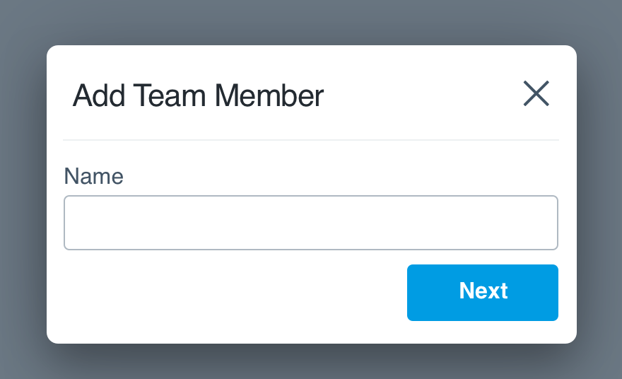
Don'tchop up the workflow with isolated fields.
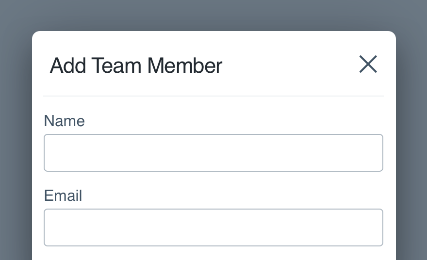
Dodisplay all fields together for one cohesive form.
In the rare case separate panes are preferred, tie the fields together by communicating progress. Just be sure the user can go 'back' if necessary. If they can’t, don't split the form at all.
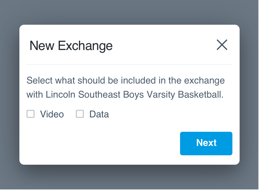
Don'tforce a user through a series of steps.
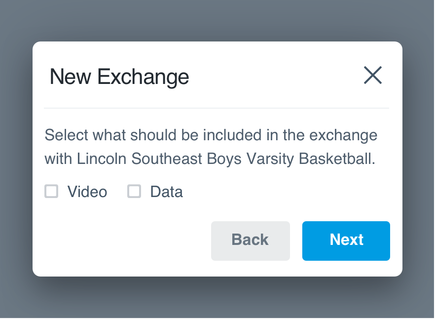
Doallow them to backtrack and progress however they'd like.
Stick with 'next' for forward progress. Avoid ‘save’ unless they can abandon the form and finish later.
Required
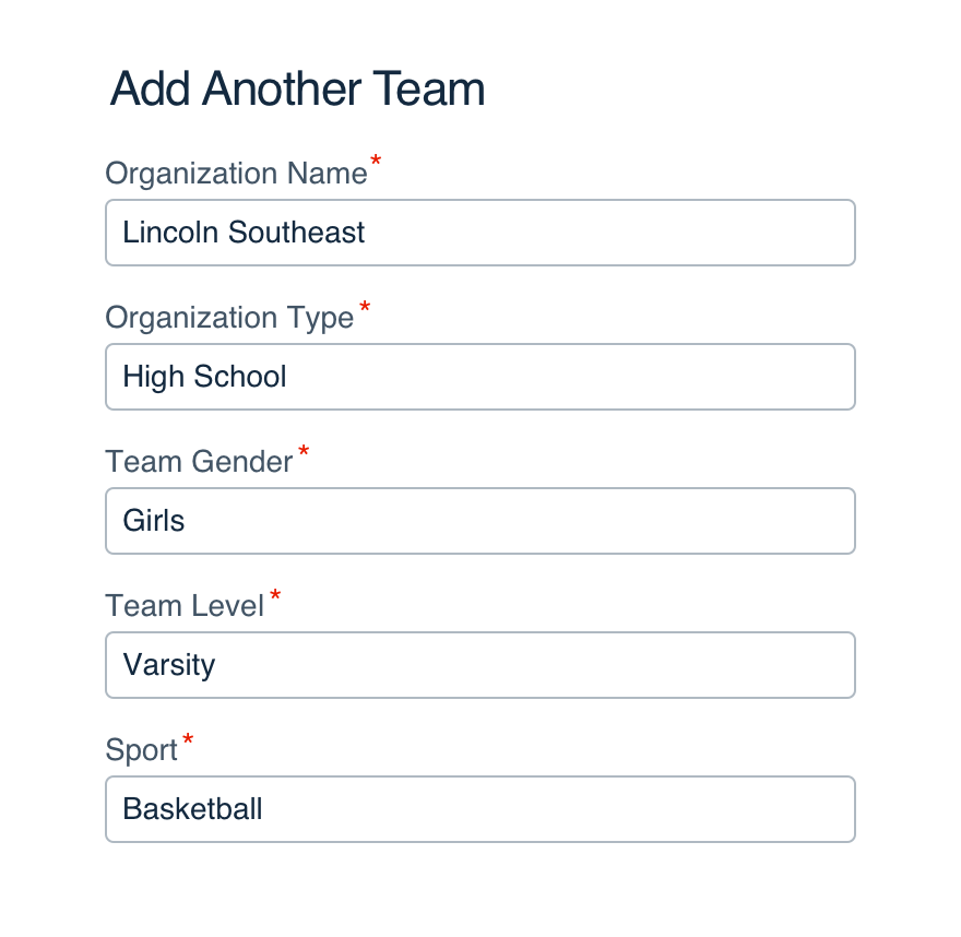
For a longer form (5+ fields), use an asterisk to denote required information.
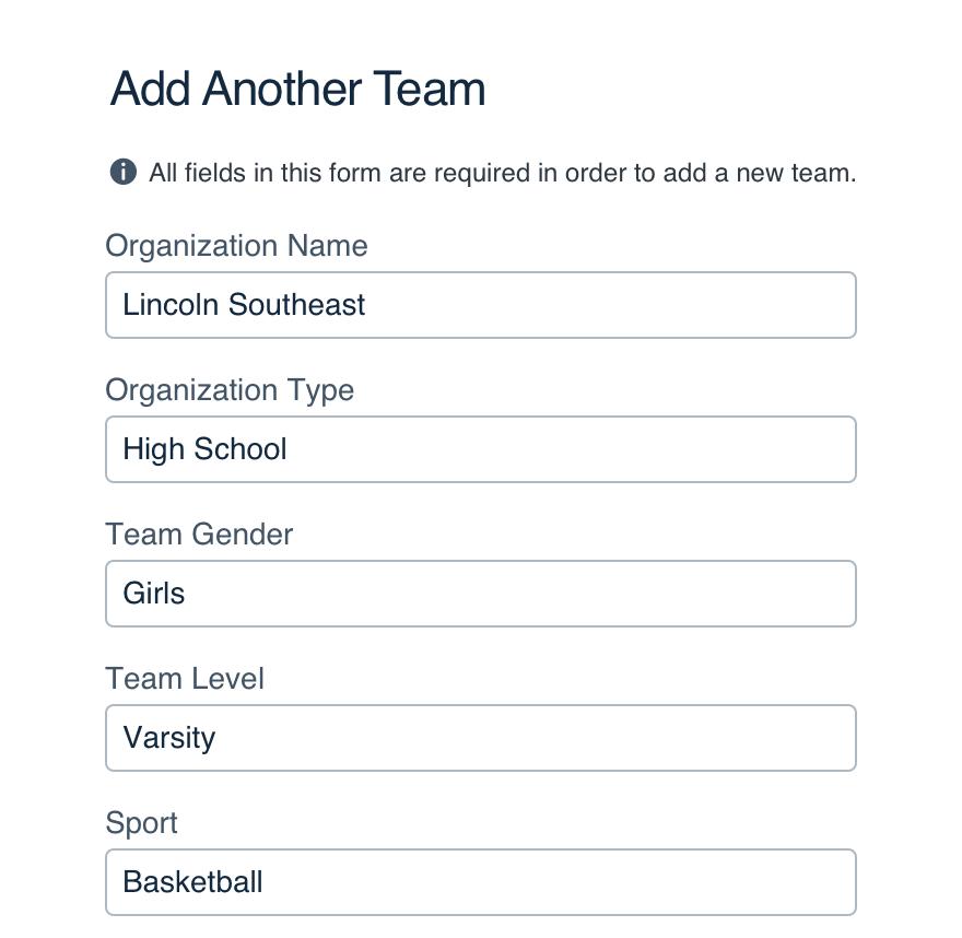
If the entire form is required, use a note to save everyone from the chaos of a million asterisks.
Don'toverwhelm or distract by marking every field.
Doclearly state upfront that all information is required.
Layout
Prioritize fields the way you'd prioritize the info itself. If you get stuck, think about how you'd ask the questions out loud. What would kick off the interview?
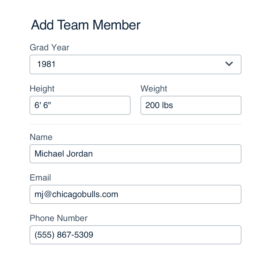
Don'trandomly add fields with no clear order.
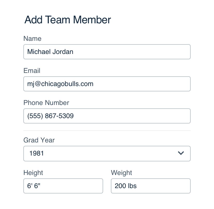
Doorganize the form as its own conversation.
For forms with a mix of required and optional, put required fields at the top (ideally all together, but if that doesn’t work logically, don’t force it).
“Obvious” order applies to actual steps, as well as info with a common display, like addresses. (In the rare case we ask for country, put it last—after city, state and zip code. It saves us from disrupting the order by adding or removing when necessary.)
For larger forms, take full advantage of the form section component. Think personal info, contact info, shipping, billing, etc.
Recipients
When using a form to share, don't use 'To:' anywhere.
Sending a message could be to someone, but when sharing video and data, with is more natural. A recipients field fits both.
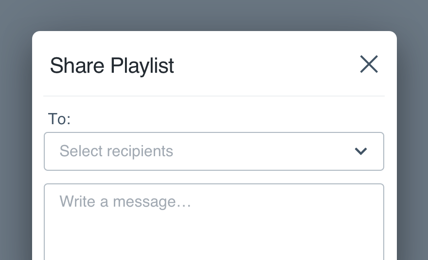
Don'tuse 'To:' as a field label or placeholder.
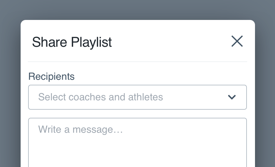
Doprovide a spot for the user to list recipients.
Share recipients are usually chosen from a multi-select, so be sure to check those placeholder guidelines.
For messages, the placeholder should help the user enter recipients (e.g.,Separate multiple emails with a comma).
Microcopy
Titles
Titles aren’t required, but they help the user understand what completing a form will do.
Keep it brief, 4-5 words max. It shouldn’t be a complete thought, just the purpose of the form itself.
Labels
Check UI label guidelines for more detail on case and punctuation.
Placeholder
Placeholders are suggested but not always necessary. They shouldn’t repeat the label outright or insert the label into a CTA (e.g., Enter your email address).
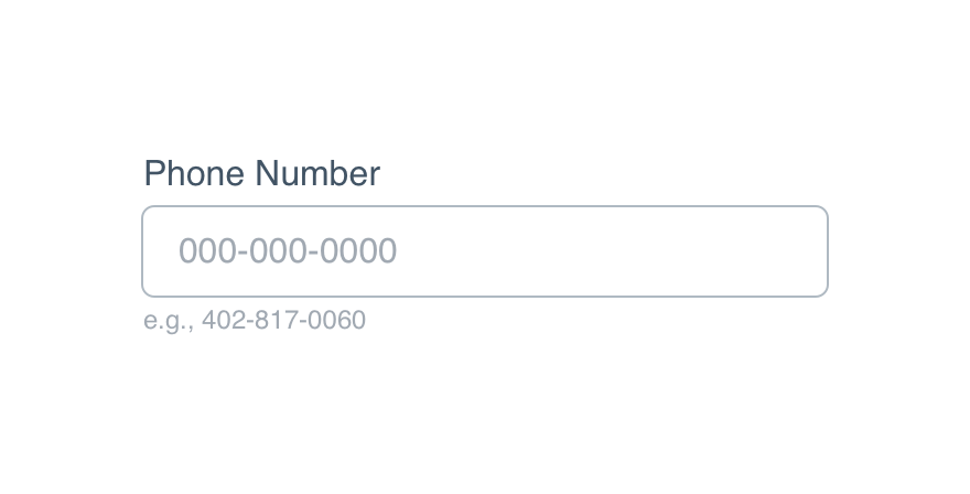
Use one to provide an example or preferred format, like a date or phone number.
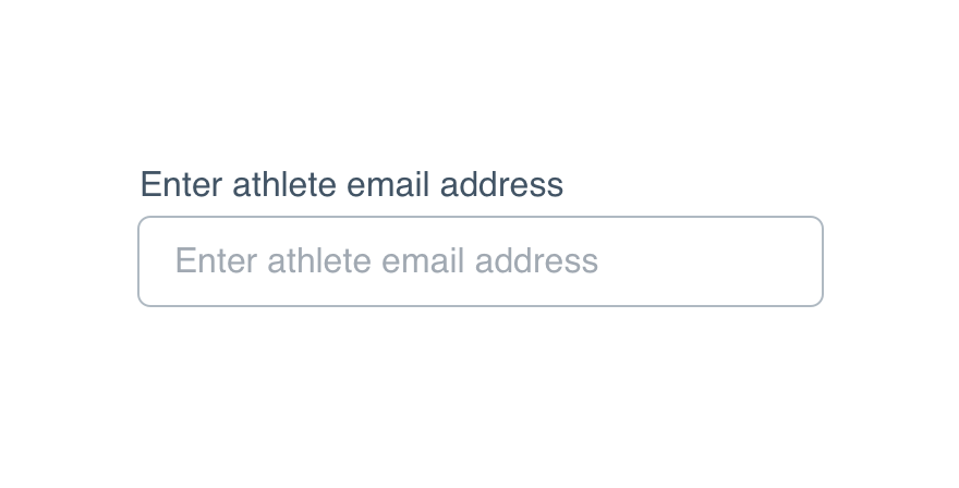
Don'trepeat the label for the sake of having a placeholder.
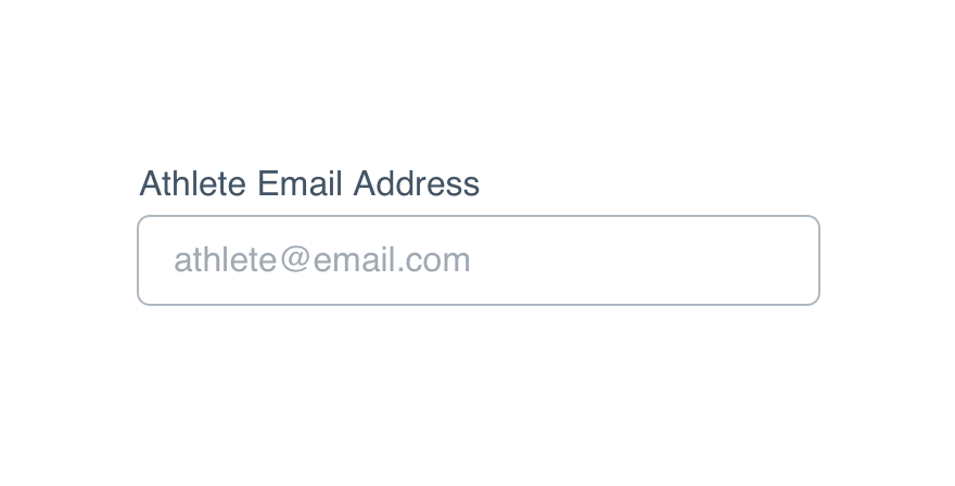
Doprovide more instruction with a sample entry.
Placeholders should follow non-label text guidelines without punctuation.
Help Text
Help text can provide details not included in the label or placeholder, like certain criteria to meet for a valid submission.
Don'tuse the help text to provide a sample entry.
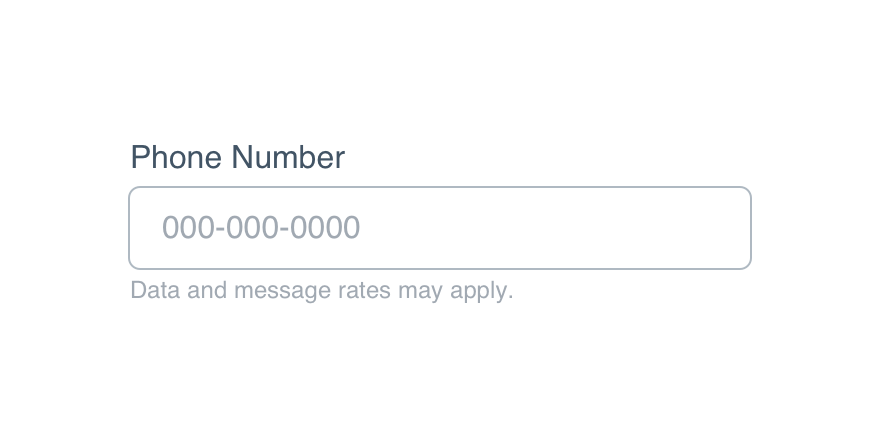
Doprovide any additional context for that field.
In the case of an error, update the help text to explain why an error occurred and how it’s fixed.
CTAs
For any add, edit or create workflow, use save to indicate the new information will be stored. Include the object for congruence.
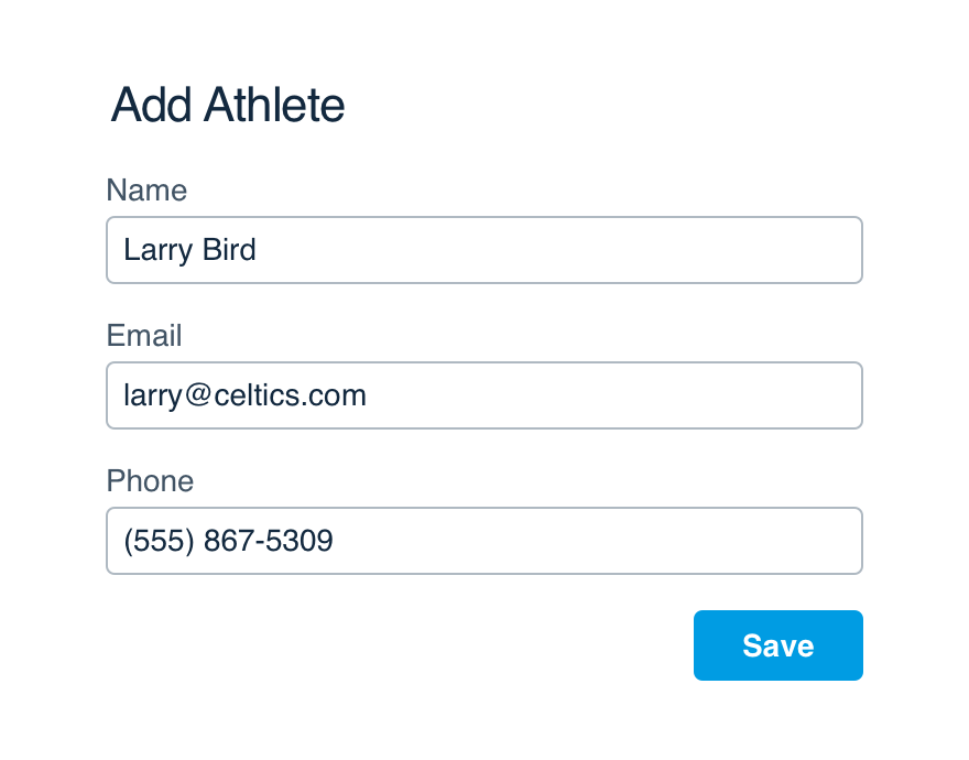
Don'tbe vague with a form's CTA.
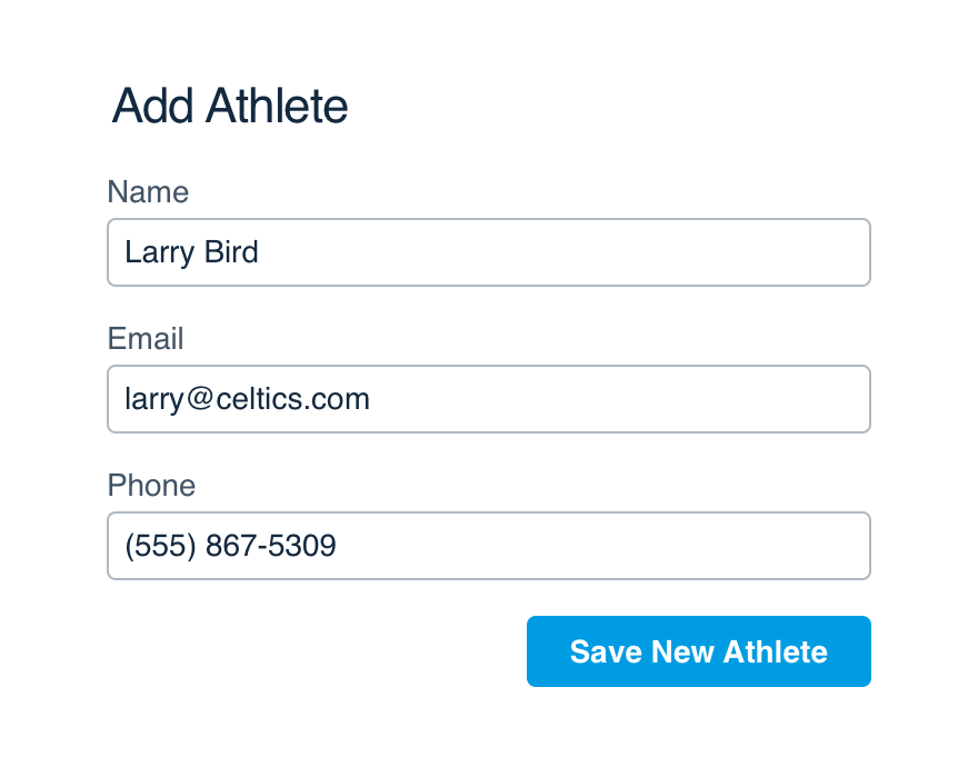
Doclearly communicate what the button will accomplish.
For share and send, clearly call out which thing they’re doing. The same goes for submit—they shouldn’t expect anything in return.