Hey there! This is the Uniform version 3 documentation site. If you’re looking for version 4, go here instead.
/
Tabs
Tabs serve to break up similar content by highlighting what’s necessary–when it’s necessary–without confusing the user.
Position
Tabs exist both horizontally and vertically. Sometimes, if the interface requires, use them in combination.
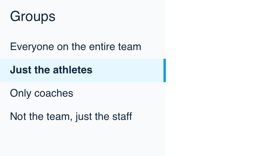
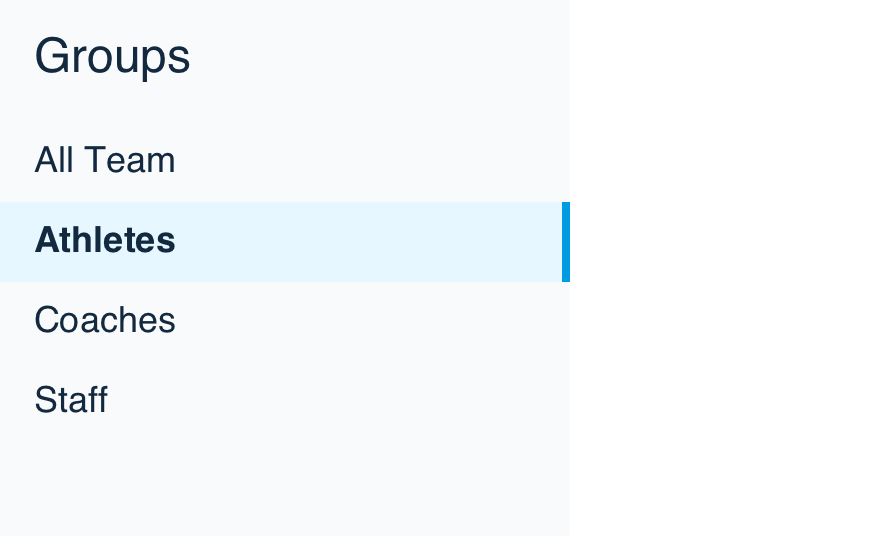
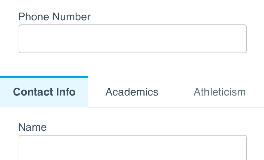
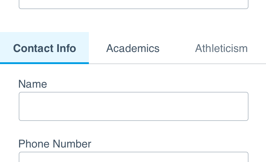
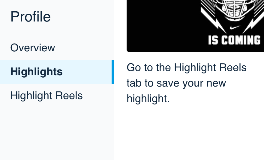
Horizontal: Place tabs next to one another and display content beneath them.
Style
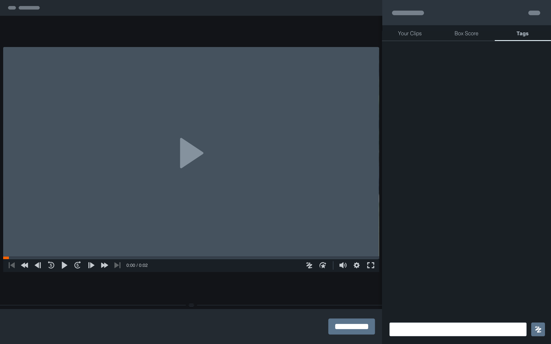
Depending on the content they’re showing, tabs may need to call more attention to themselves. In some cases, like the video player, tabs should take a backseat to the primary focus of the page.
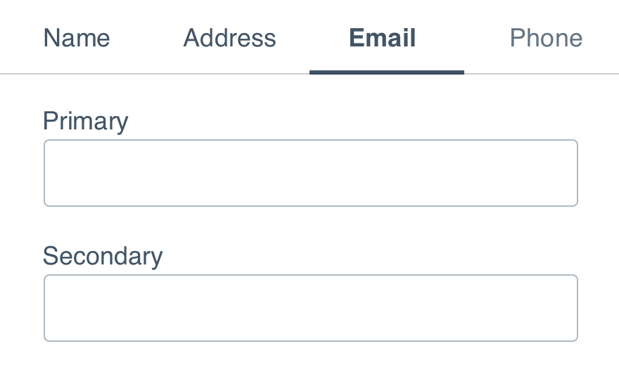
Content Selection: If content is visually similar between tabs, bump up the contrast of the active tab.
Mobile
Tabs come in many different forms in mobile interface design. Between segmented controls, tab bars and switches, there are a lot of ways to divide content in a way that makes sense. But don’t worry, we’ve sorted when to use what below.
- Segmented Control: If filtering between only two similar types of content, use a segmented control. This makes it simple to switch back and forth without things getting too complicated.
- Switch: Switches shouldn’t be confused with or used in place of tabs. Reserve these for enabling (or disabling) features and user preferences, like notifications.
- Tab Bar: Use tab bars when sectioning between areas of the product, like navigation. These are always fixed to the bottom of an app screen and shouldn’t be used in place of tabs.
Use Apple's segmented control, switch, and tab bar components.
Use Material's switch component.
Usage
Number of Tabs
Too many tabs can make separated content difficult to find and having too few can hide content from view for no reason. With vertical space in abundance on both web and mobile, use as many tabs as makes sense. But space is at a premium horizontally, so limit the number of tabs to five.
Don'tbreak up content into more tabs than necessary.
Dogroup similar content into a few tabs that make sense.
Labels
Labels should describe the content within the tab it’s describing. We recommend labels be no more than two words. Internationalization may expand the label beyond that, but we’d rather be limited than unreadable.
Don'twrite sentences to describe the content within the tab.
Dokeep it clear and easy to understand.
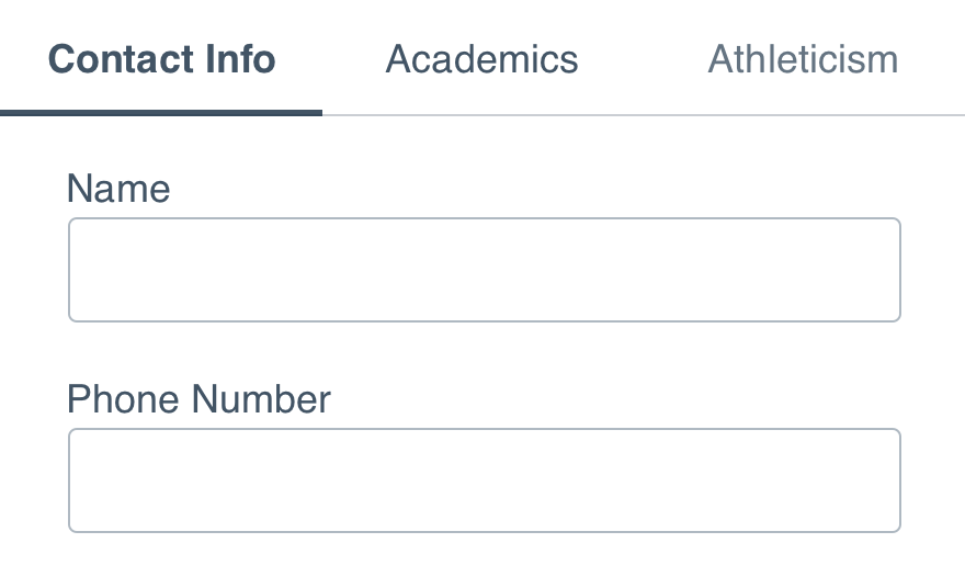
In some cases, icons add an affordance to breaking up content. When using them in tabs, it’s all or nothing–either use them or don’t, don’t pick and choose. If you decide to use them, keep them to the left.
Style
When using tabs that follow our content selection, use the edge in the direction that flows into the content.
Don'tadd visual flourish to an active tab in a way that is confusing.
Douse selection to guide the eye to the enabled content.
Content
Only one tab should ever be active so the focus can be on the content shown within.
Don'tmake a user switch between tabs to complete a task.
Doseparate content into smaller, relatable sections.
Only use tabs to navigate between similar types of content, not another area of the app or to complete a workflow.
Don'tuse tabs in place of buttons or links.
Douse them within the context of the tabbed content.
When navigating to other portions of the app on mobile, use the tab bar component over Uniform's tab pattern.