Hey there! This is the Uniform version 3 documentation site. If you’re looking for version 4, go here instead.
/
Button
Let users perform a single, clearly expressed action.
We have a wide variety of button sizes, styles and types, all designed for specific contexts.
Type
The button type is determined by its purpose and the action being taken.
Primary: Save the primary button for the strongest available action. Try not to use multiple in a single view.
Icons
A button can be all text, a single icon or both. For icon-only, make sure the action is clearly implied.
Text
Icon & Text
Icon Only
Style
Your button style depends on how much attention you want to draw to the action.
Standard: Background colors and rounded corners make the standard button look clickable, making it clear the user can and should take action.
Size
Consider view density and the button’s position when choosing between the four available sizes.
X-Small: Only use this when you really need to squeeze, like in a card or sidebar. Stick to text or icon-only.
Associated Actions
Multiple sizes should never be placed adjacent to one another.
Don'tuse multiple sizes in the same context.
Douse button types to emphasize a preferred option.
Mobile
Touchpoint sizes on mobile devices differ than the button target area on the web. To make Uniform accessible on both platforms, the x-small button is unavailable for mobile.
Use medium as the default for most interfaces, but small works just fine, too. Reserve large for iPads.
Medium is ideal for most interfaces, but large also works. Use small sparingly.
Usage
Primary Actions
Because our Action color demands attention, limit the number of primary actions per page. (We strongly recommend just one.)
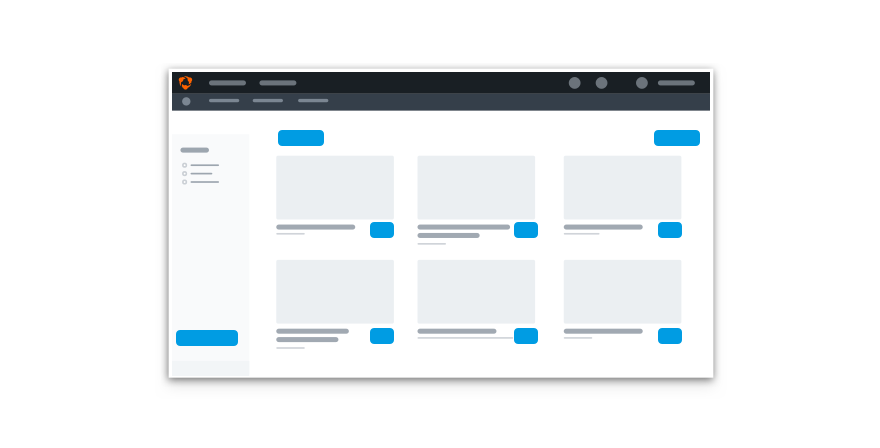
Don'tuse many primary actions on a single view.
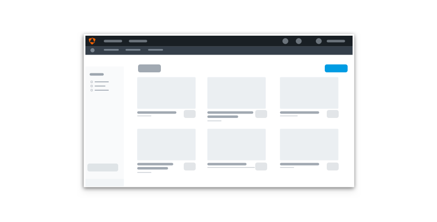
Douse secondary and subtle buttons to create hierarchy without overwhelming the screen.
Statuses
Not every button needs the following statuses. Save them for actions that could take some time to complete.
Statuses come as a package deal. Never use one on its own.
Mobile
When using buttons for mobile, consider placement while keeping in mind what HIG and Material have to say. We want Uniform to fit in nicely with other system components and patterns, like mobile navigation.
Don'tuse standard buttons in navigation.
Dochoose buttons to fit seamlessly within the OS.
Don'trandomly change the button elevation.
Dofollow elevation guidelines if they exist.
State
The button’s state changes with mouse and keyboard interactions. We can also disable a button entirely.
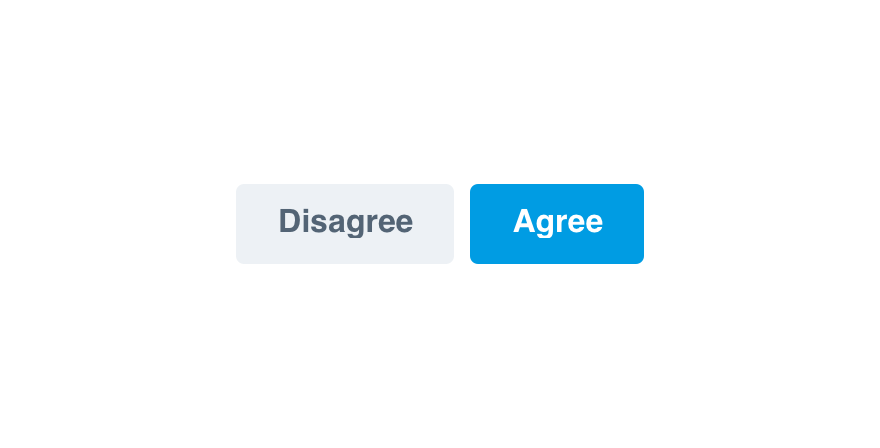
Default
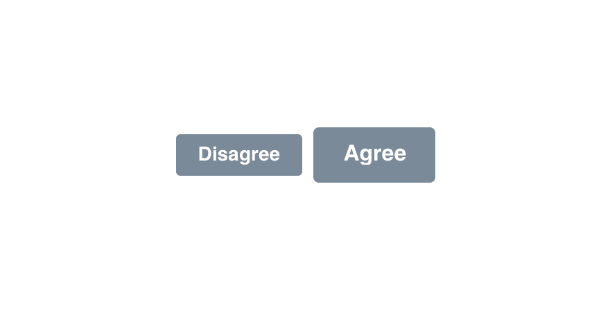
Disabled
Microcopy
Case & Punctuation
Buttons follow the UI label guidelines. Use title case without punctuation unless noted otherwise.
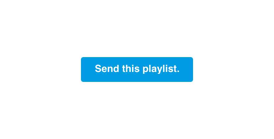
Don'tlabel buttons with full sentences.
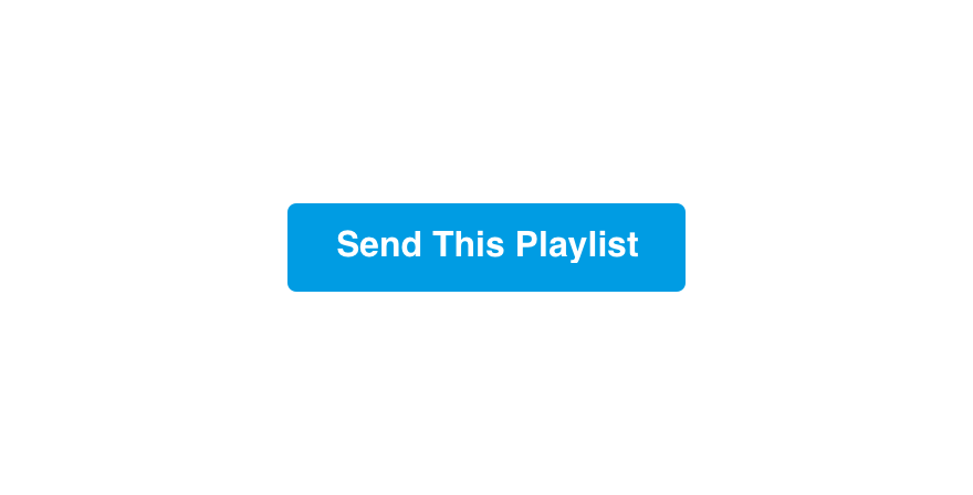
Domake buttons title case without punctuation.
Action
Labels should clearly indicate the action being taken.
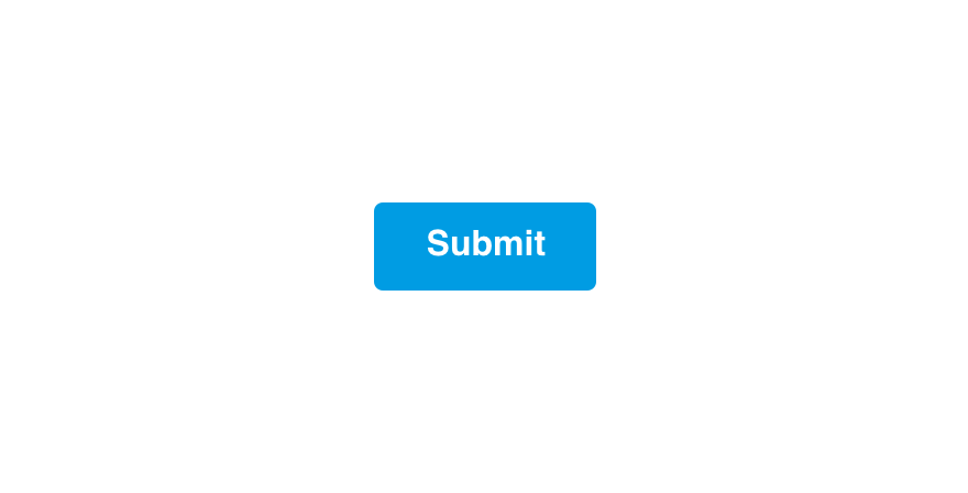
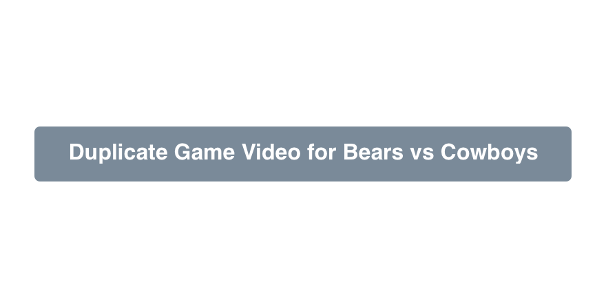
Don'tmake button labels so generic there's no clear outcome.

Dolabel with specific, action-oriented verbs.
Hudl Voice
Button labels are a great opportunity to inject personality with the Hudl voice.
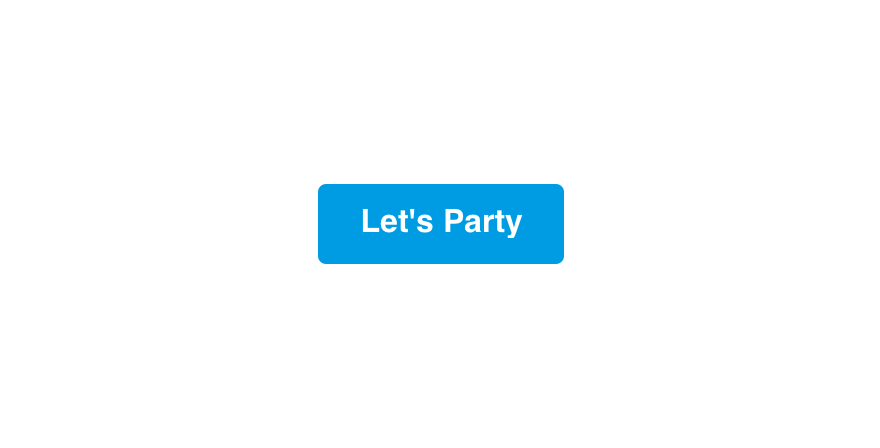
Don'tmake labels distracting with excessively playful language.

Dowrite labels that sound human.
Length
Button labels should be between 5 and 25 characters.
Don'tmake button labels long and difficult to read.
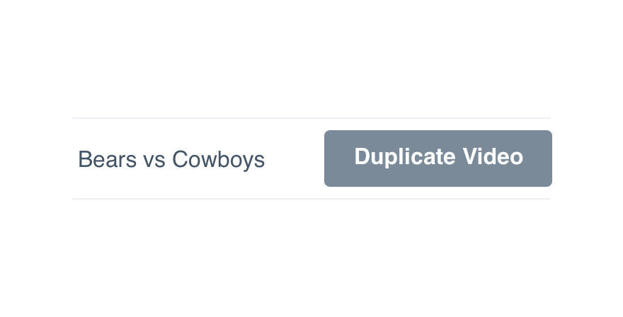
Domake button labels concise. Use supporting text for additional context if needed.
Platform
| platform | notes |
|---|---|
| Web |
|
| Apple |
|
| Android |
|
| No guidelines exist for other platforms (yet). |