Hey there! This is the Uniform version 3 documentation site. If you’re looking for version 4, go here instead.
/
Select Mark
Indicate an object or region is selectable.
Select marks help draw attention to a selected object or region, though not every selected object requires the mark. Use it in conjunction with our broader selection guidelines.
Size
Select mark is available in small, medium and large. Consider view density and the mark’s position when choosing between the three.
Small: Ideal for dense interfaces.
State
The select mark’s state changes with mouse and touch interactions.
Usage
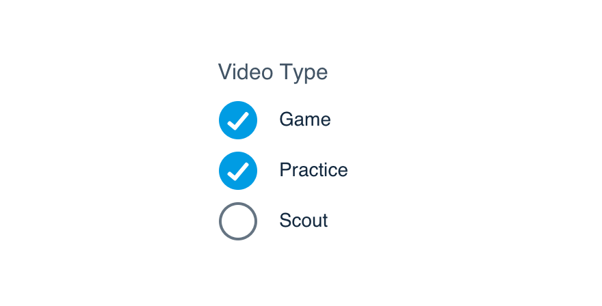
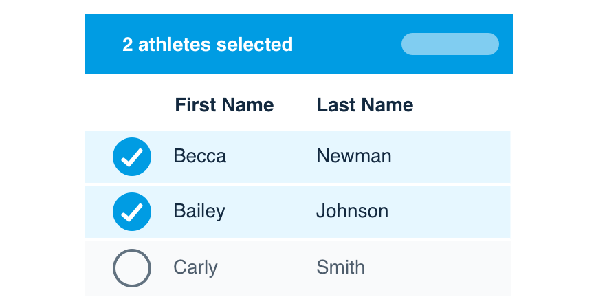
Multi-Selection Mode
Select mark should only be used with multi-selection mode. It’s a prominent indication that multiple items in a group can be selected at the same time.
The primary action should appear when the first item is selected. The state change and use of the Action color reinforce the relationship between the items and the action.
Don'tuse it in place of a checkbox group.
Douse it when multi-select is enabled.
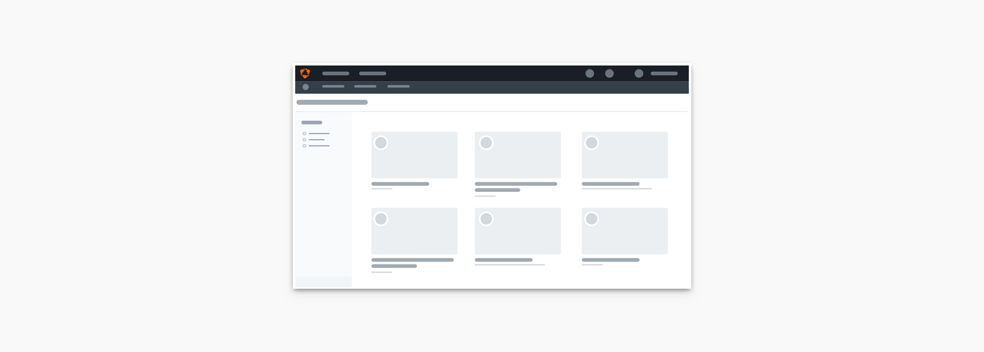
Complex Selectable Regions
Selectable regions sometimes require sub-actions (buttons, links) and different states (expansion, activation), making use and design more difficult.
Check our content selection patterns to see how select mark can be incorporated.
Platform
| platform | notes |
|---|---|
| Web |
|
| Apple |
|
| Android |
|
| No guidelines exist for other platforms (yet). |