Hey there! This is the Uniform version 3 documentation site. If you’re looking for version 4, go here instead.
/
Elevation
Assign treatments according to a layer's place in the stack order.
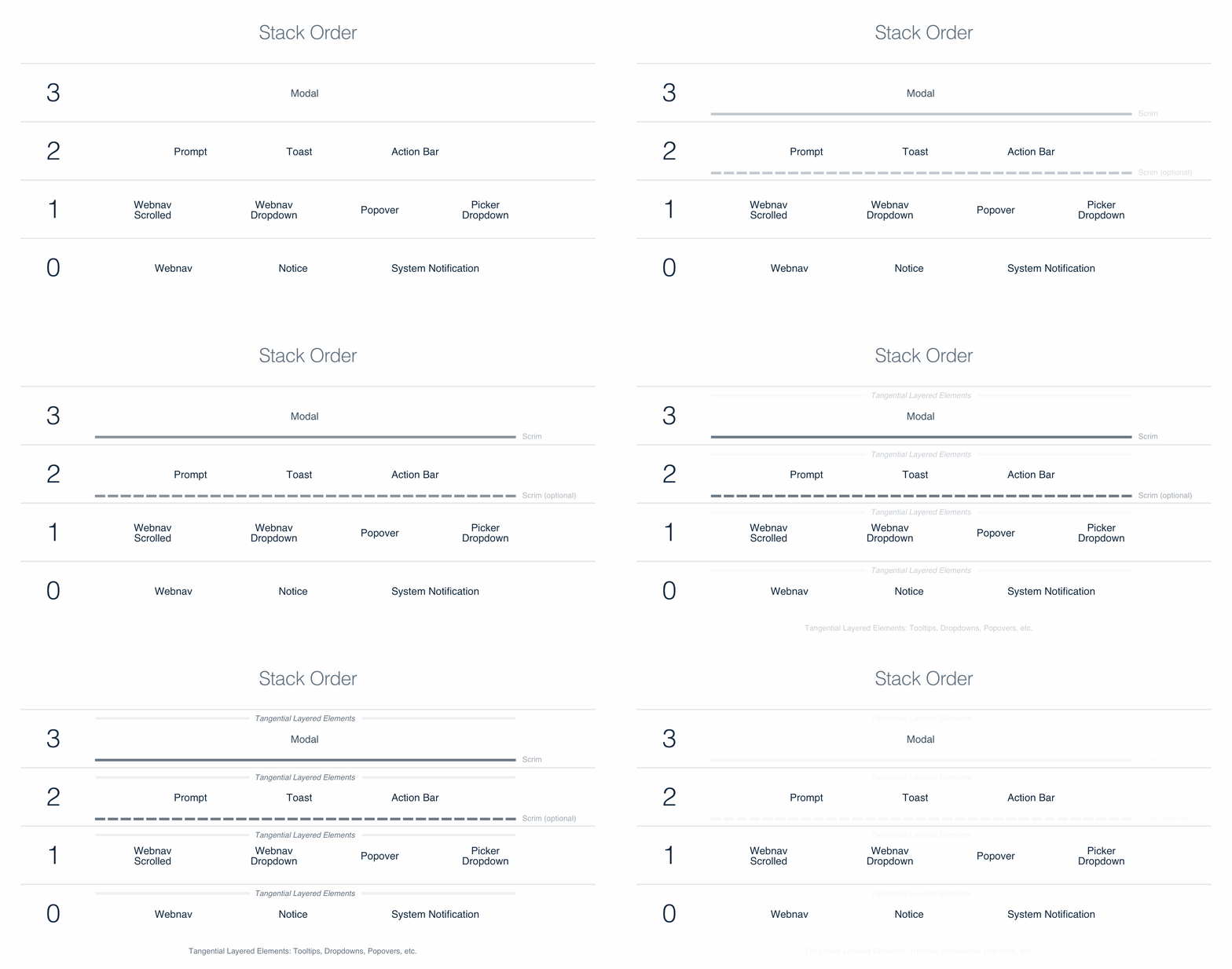
Every layer has a predetermined elevation on a scale of 0-3, with assigned style treatments like shadows.
Stack Order
Common interface elements are layered on a predetermined elevation scale ranging 0-3, with each level indicating importance and priority to the user. This stack order is consistent across Hudl interfaces.

Tangents
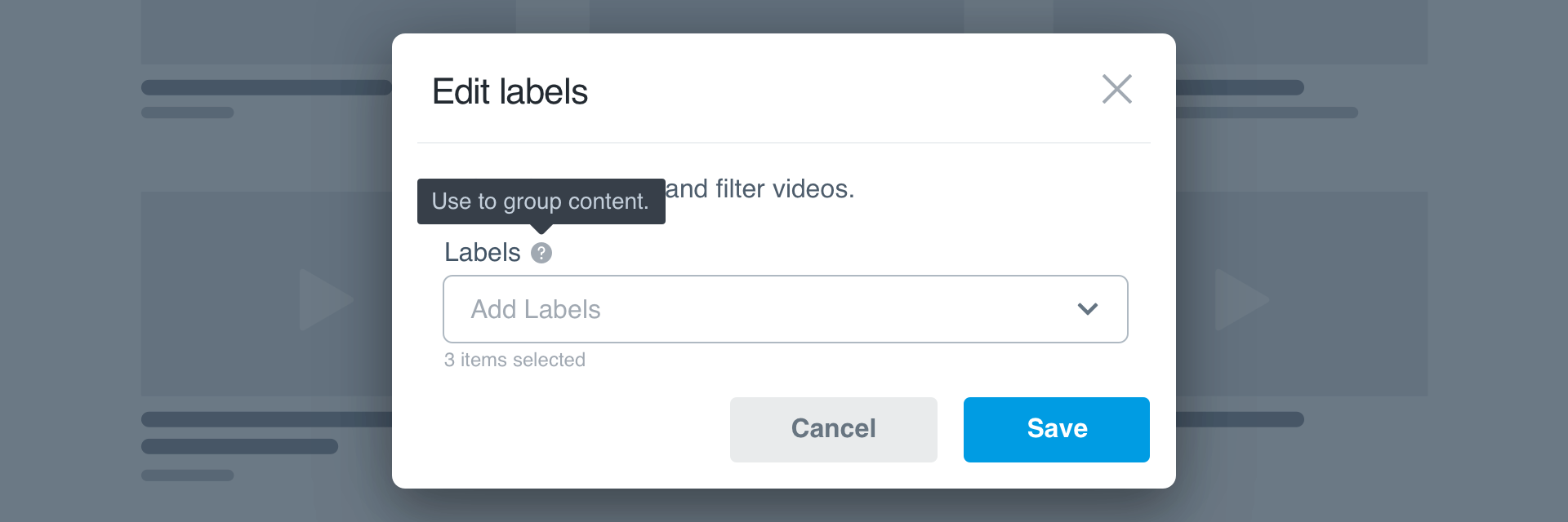
A tangent is a piece of content (tooltip, dropdown, popover) that does not have a set elevation, but needs to sit above other content in its current elevation. A tooltip within a modal (layer 3) is a perfect example.

Scrim
A scrim is a transparent overlay placed just beneath a layered element. Its purpose is to dim and obfuscate content underneath the layered element. This focuses the user’s attention on the layered element in question. Scrims are required for layer 3 (modals), but optional for layer 2 elements like prompts, toasts and action bars.
Levels vs. Layering
It’s important to distinguish theming environment levels from the concept of layering. Levels affect the background and/or border color of a given element, whereas layering physically places one element on top of another.
Levels create separation between regions on the same plane, while layering creates a new dimension altogether. For instance, you might paint your living room and upstairs bedroom the same color, but color is where the connection ends. Otherwise they’re totally separate, physically and in purpose.
The dimension of layers is visually accentuated with the shadows applied to each.
Mobile
Layering elevation still applies to design on mobile but is approached differently depending on the portion of the interface affected. For example, modals used in iOS make use of modal view, which applies elevation and shadow to the entire view. Whereas Android depicts the layer with a scrim. Be cognizant of each platform when designing elevation.
Usage
Stack Order
The stack order ensures similar interface elements like toasts, modals and action bars have a consistent elevation across all Hudl products.

Don'tput elements on the wrong layer.

Dofollow the correct stacking order.

Don'tuse shadows to “elevate” levels.

Doapply shadows to layered elements.
Platform
| platform | notes |
|---|---|
| Web |
|
| Apple |
|
| Android |
|
| Follow platform guidelines. |