Hey there! This is the Uniform version 3 documentation site. If you’re looking for version 4, go here instead.
/
Shadows
Imply the relative height of a layer.
Shadows simulate three-dimensional height above the surface of an interface. Use them to enhance the layering effect for a given elevation.
Layers
Layers place interface content “over” other content. While this can obstruct content, it increases the available area for additional content without leaving the current context. If we apply shadows at different levels, we can simulate a three-dimensional stack of layers.
Mobile
Shadows differ between platforms. Keep a close eye on how layering and elevation affect shadows on both.
Shadows should be used subtly and minimally throughout an iOS interface. Depth can display layers in order without using shadows with touch gestures and motion instead.
Layering is closely tied to shadow and elevation for Android design, and should maintain that relationship using Uniform shadow values.
Usage
Application
- The first elevation shadow is meant for elements that are still somehow “connected” to a parent element, such as dropdowns or popovers.
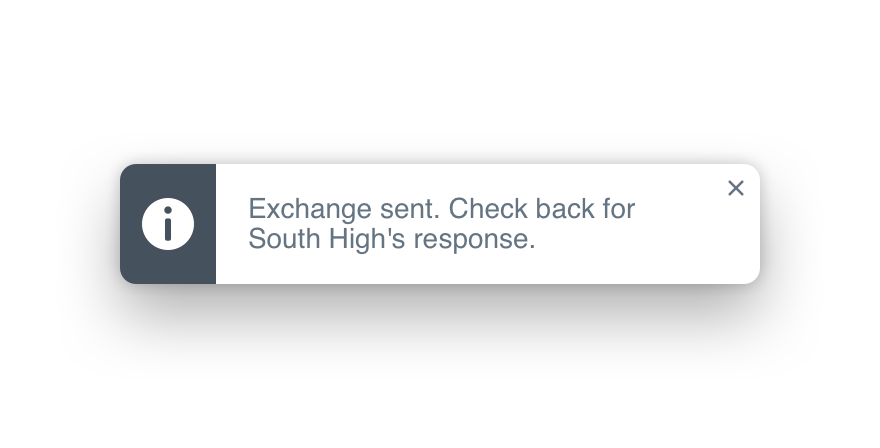
- Alerts, like toasts, receive the second elevation shadow–they typically don’t block an interface, but are still disconnected from any main interface element.
- When blocking an interface entirely with something like a modal, the third elevation shadow should be used.

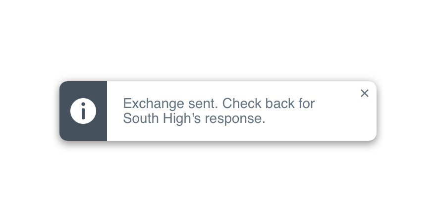
Don'tmismatch shadows and layers.

Doapply the correct shadow to its matching layer.
Layout
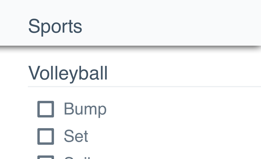
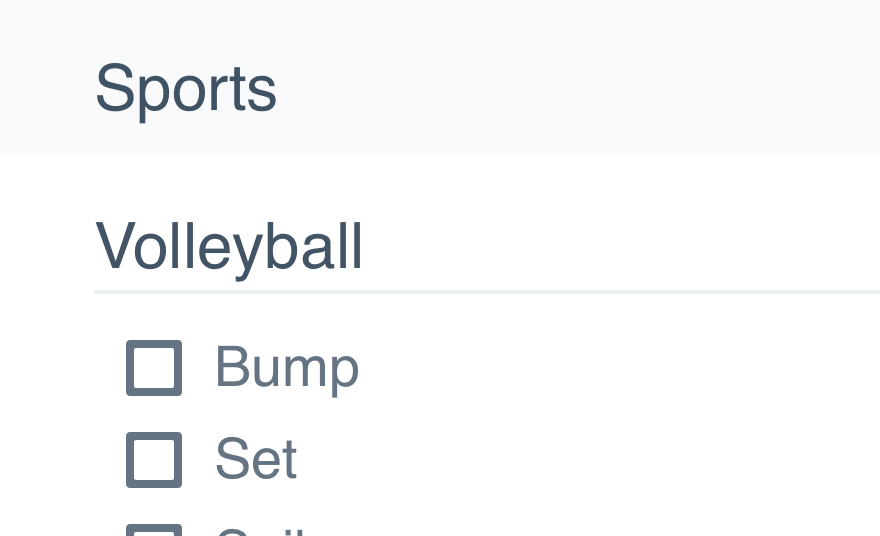
Shadows are not meant to break up content on a page. Our levels are built to handle that.

Don'tput shadows on levels or dividers.

Douse levels and accents to break up page content.
Platform
| platform | notes |
|---|---|
| Web |
|
| Apple |
|
| Android |
|
| No guidelines exist for Windows (yet). |