Hey there! This is the Uniform version 3 documentation site. If you’re looking for version 4, go here instead.
/
Modal
Present a short-term task in a user-initiated layer.
A modal disables the rest of the interface, is always dismissible, and comes with optional actions. Modals are often abused, so use them with care. (Maybe consider alerts and overlays while you're at it.)
Sizes
Sizes differ only in width, not height. Height is determined by how much content appears in the modal.
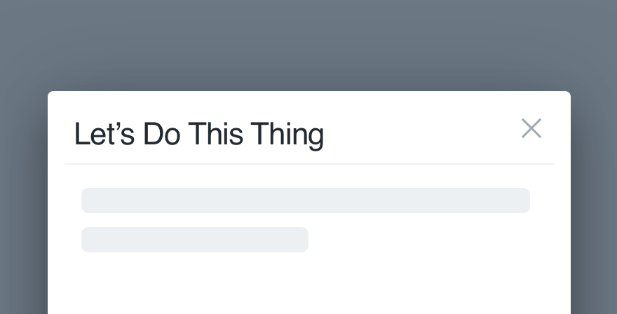
Default: The majority of our modals are default. Use this size for one column of content, scrollable or not.
Regardless of the size you choose, the modal should never extend beyond the boundaries of the screen.
Content
A modal’s content is typically one of two types: plain text or a checklist/form field.
Use plain text to confirm an action initiated by the user. Their only interaction with the modal will occur in the footer (Primary Action, Secondary Action or Cancel).
The plain text should be clear, complete sentences guiding the user toward their preferred course of action. Avoid rhetorical questions.
Use a checklist or form field to help the user add, remove or customize items. The checklist would provide a list of existing options while a form field allows them to enter new details.
- Check our Microcopy Guidelines to ensure all checklist items have the same format and form field placeholders make sense.
- Anytime a checklist or form field is involved, the primary action should be disabled until the user interacts with the content.
- Regardless of layout, keep the content concise to avoid scrolling.
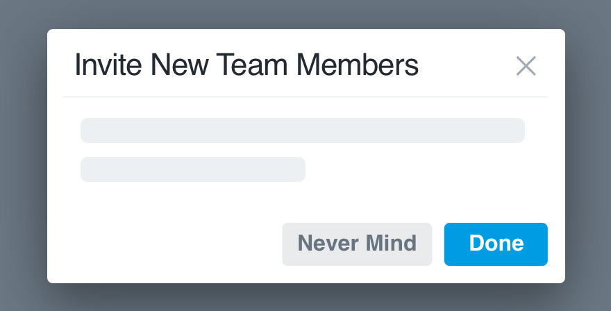
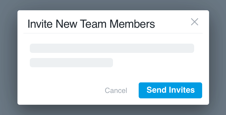
Buttons
The default size for all modal buttons is medium, though some occasions call for small, never large. Each modal can have up to three buttons: primary action, secondary action and cancel.
Calls-to-action and other button microcopy should reflect what appears in the modal title. Be sure the verb explains the purpose of the modal. For more info on title-to-CTA congruence, check our Microcopy Guidelines.
Mobile
Instead of using modals on mobile, design separate interfaces using modal view if required. The only interjection of this type on mobile should be an alert, following their guidelines. The disruption to the experience should be confined to alerts only. Information traditionally accessed through a modal can be integrated more elegantly.
Usage
When and Where
- Always user-initiated. A modal shouldn’t appear without a user taking action, and should always provide context explaining what the modal does.
- Always dismissible. Every modal can be dismissed by one of 3-4 ways: Dismiss (required), the ESC key, clicking the scrim or Cancel (optional).
- Always a sub-task. The modal is a blocking task. The user must take action, either in completing the sub-task or dismissing the window, to return to the main interface.
- Never one of many steps. The user will open a modal with one action in mind. Allow them to complete the single sub-task and choose a next step for themselves.
- Never displayed in groups. One modal should never open another, and the user should never see more than one at a time.
Titles
Sticking to our Microcopy Guidelines, all modal titles should use title case and prioritize keywords. Avoid questions as much as possible.
Don'tmake it so playful the purpose isn’t clear.
Docall out the action they’re taking.
Don'tdisconnect the title from the CTA.
Domake sure it’s congruent to the button copy.
Platform
| platform | notes |
|---|---|
| Web |
|
| Apple |
|
| Android |
|
| No guidelines exist for Windows (yet). |