Hey there! This is the Uniform version 3 documentation site. If you’re looking for version 4, go here instead.
/
Level
Apply a system of color treatments to group elements.
Levels allow you to segment your interface in a given environment and control the contrast relationships between those regions. By using levels, many decisions about foreground, background and accessibility are handled for you.
Type
Base
Use level base colors to segment a layout.
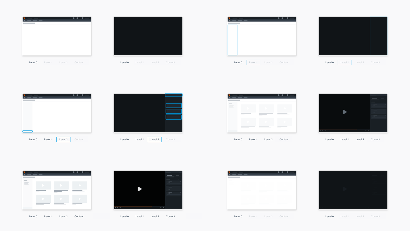
Level 0: For primary content. It’s the most dominant region because it provides the most potential contrast in either environment.
Accent
Use the accent color only on its respective base color.
Usage
How to Use
Start with Level 0 and build up one level at a time.
Primary Region
The primary region of the screen should be Level 0, even if that region is in the middle of the screen.
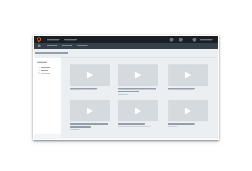
Don'tuse higher levels for primary content regions.
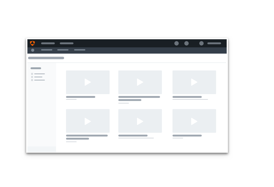
Douse Level 0 for primary content regions.
Levels and Layering
Levels are background colors for two-dimensional regions on the same plane as their peers — they do not cast shadows by default. See our layering guidelines for more on shadows.
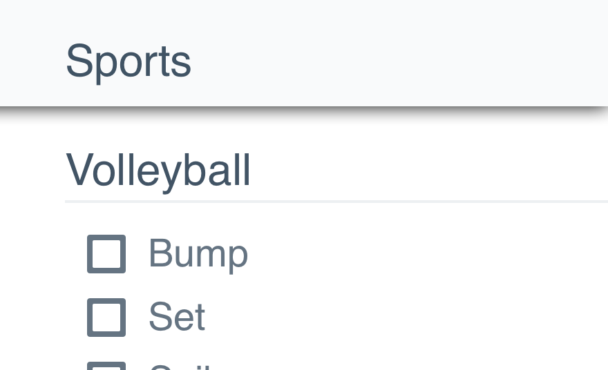
Don'tadd shadows to regions unless the element is layered.
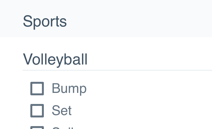
Dokeep levels on the same elevation.
Base and Accents
Each level has one accent color. An accent color should only be used with its respective base color.
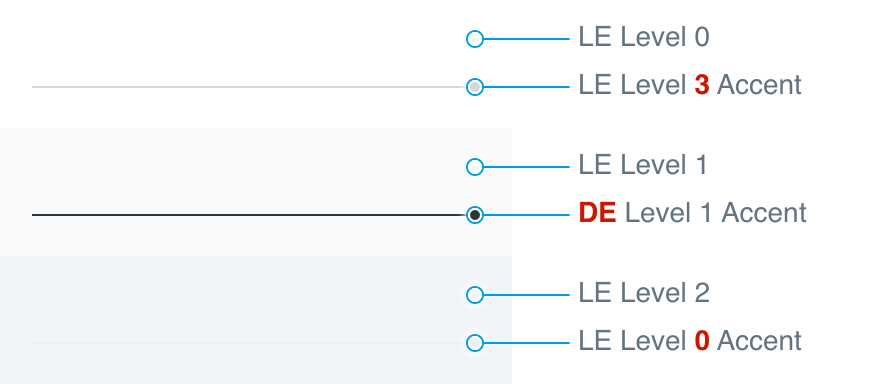
Don'tpick accents from any level.
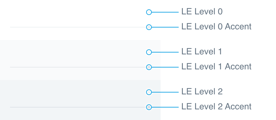
Douse the accent matching the region’s base color.
Visual Enhancements
Accents should only be used for subtle graphics like fine lines or small regions.
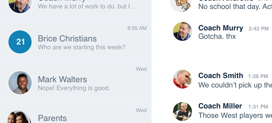
Don'tuse accents as the background for a large region.
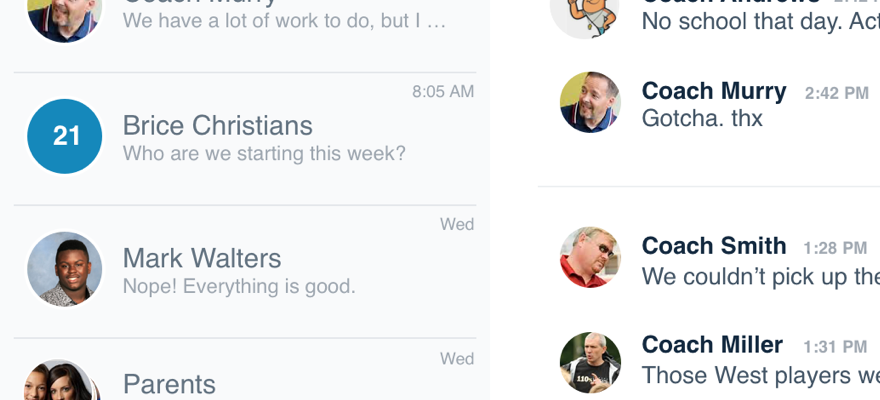
Douse accent colors for visual enhancements.
Platform
| platform | notes |
|---|---|
| Web |
|
| Apple |
|
| Android |
|
| Stick to the guidelines above for all platforms. |