Hey there! This is the Uniform version 3 documentation site. If you’re looking for version 4, go here instead.
/
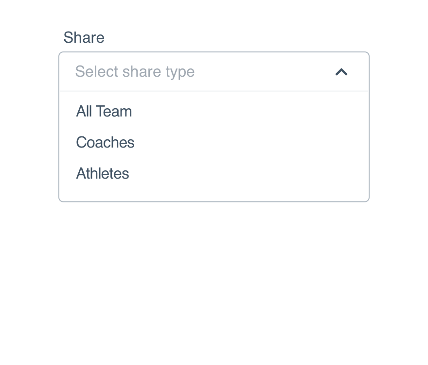
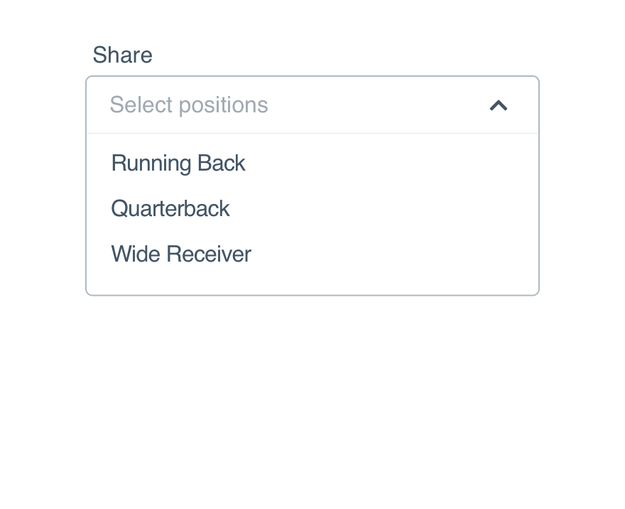
Lookup Multi-Select
Let users choose multiple items from the same lookup.
Multi-select should only be used when all items can be affected by the same action. To only allow for a single selection from the larger list, try lookup instead.
Size
Consider interface density and the select’s position when choosing between the three available sizes. (Sizing itself is controlled by the form modifier component.)
Kareem Abdul-Jabbar
Marv Albert
Al Attles
Red Auerbach
Elgin Baylor
Dave Bing
Larry Bird
X-Small: Save this for an extra tight squeeze, like an aside.
Dismiss
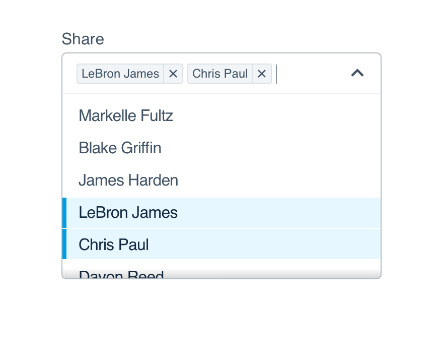
Selected items can be dismissed in one of three ways.
Al Attles
Red Auerbach
Elgin Baylor
Kareem Abdul-Jabbar
Marv Albert
Al Attles
Red Auerbach
Elgin Baylor
Dave Bing
Larry Bird
Backspace: You can hit backspace to remove the last item listed.
Mobile
Use a table view to display the results when selecting an option. If using our React Native component, this is done for you.
Usage
List Length
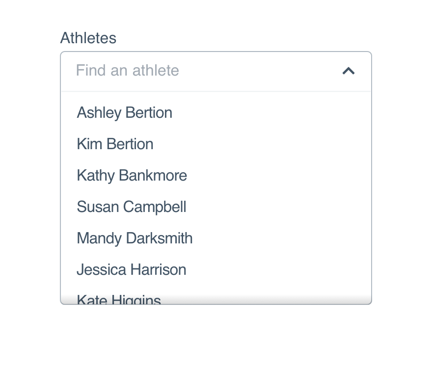
Like the lookup select, a lookup multi-select works well when your list is 15+ items long.
Don'tlist three items they could easily select with a checkbox.
Dojustify the typeahead with a larger list to filter.
For shorter lists, read the checkbox guidelines.
Options
Option content should be familiar to the user–they should have an idea of what’s in the list before opening the select. That familiarity helps them decide what to type.
Don'tframe every item differently in an unhelpful order.
Doprovide a logical list of related items.
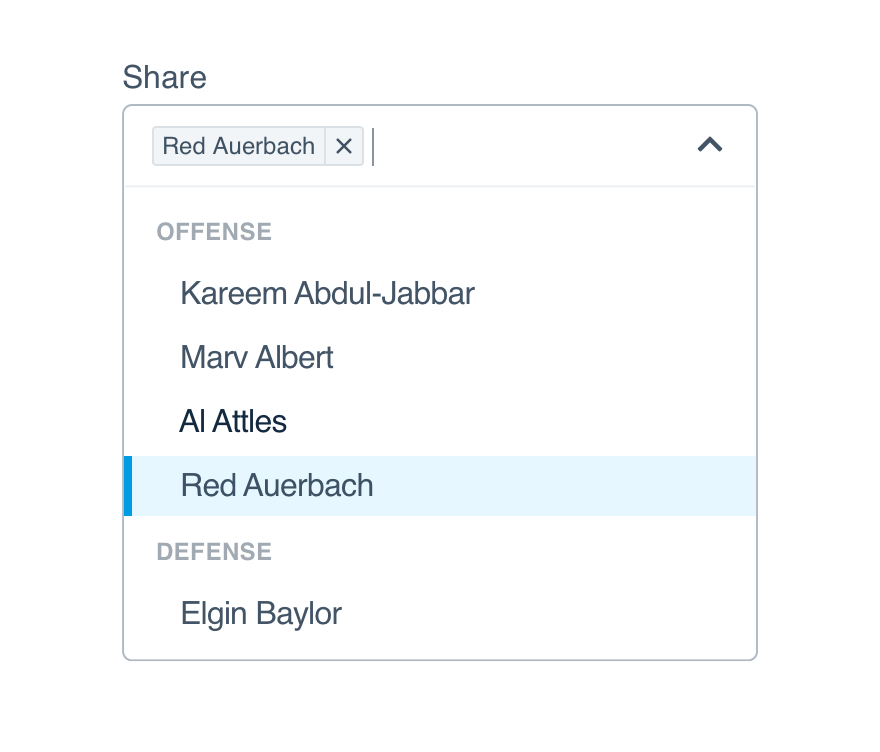
Option Groups
Use option groups to divide larger lists into logical sections, like putting the most popular items at the top. You can also add labels for increased clarity.
Kareem Abdul-Jabbar
Marv Albert
Al Attles
Red Auerbach
Elgin Baylor
Dave Bing
Larry Bird
Offense
Defense
List Height
Allow enough space in your interface or adjust the max-height to prevent the option list from expanding beyond the screen.
By default, 6.5 items will show when the option list is expanded. If you use option groups, adjust the max-height to ensure it falls on a ½ item to signal the user can scroll.
Don'tallow overflow to land between options making it look like all options are visible.
Dosize the maximum height to split an option to make scrolling obvious.
Max-Height
Should the selected items exceed one line, the default max is set to 2.5rem. If you need something larger, we suggest the half-line to indicate more items are listed and the user can scroll.
Microcopy
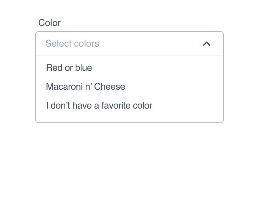
Placeholder
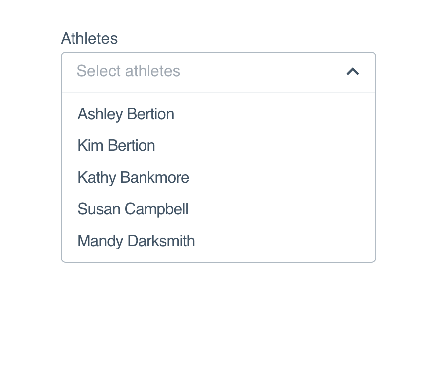
The multi-select placeholder should read “Select items,” making it clear that the user can and should choose more than one.
Don'tput a single object in the placeholder.
Doprovide direction with “select” as the action.
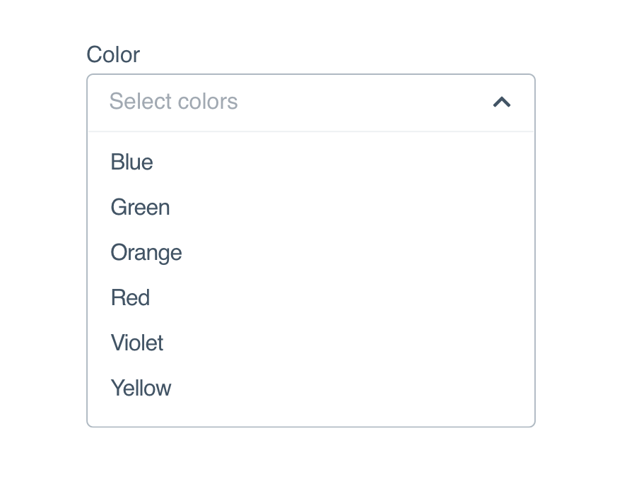
Options
Treat all options as non-label text and only capitalize the first word, both in the list and as pills.
Don'tcapitalize every word in an option (unless it’s a proper name).
Dokeep consistent capitalization from option list to pill.
Platform
| platform | notes |
|---|---|
| Web |
|
| Apple |
|
| Android |
|
| No guidelines exist for Windows (yet). |