Hey there! This is the Uniform version 3 documentation site. If you’re looking for version 4, go here instead.
/
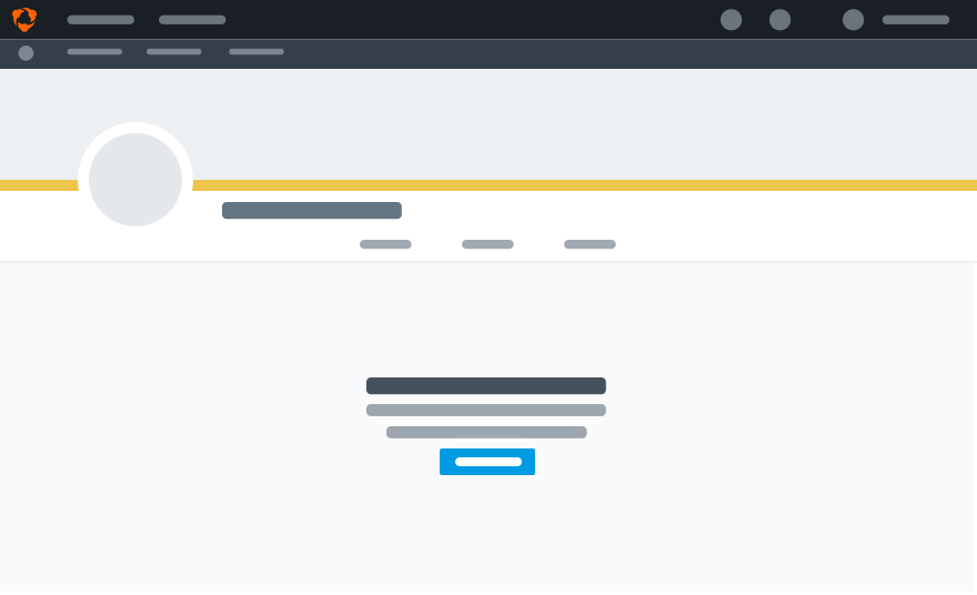
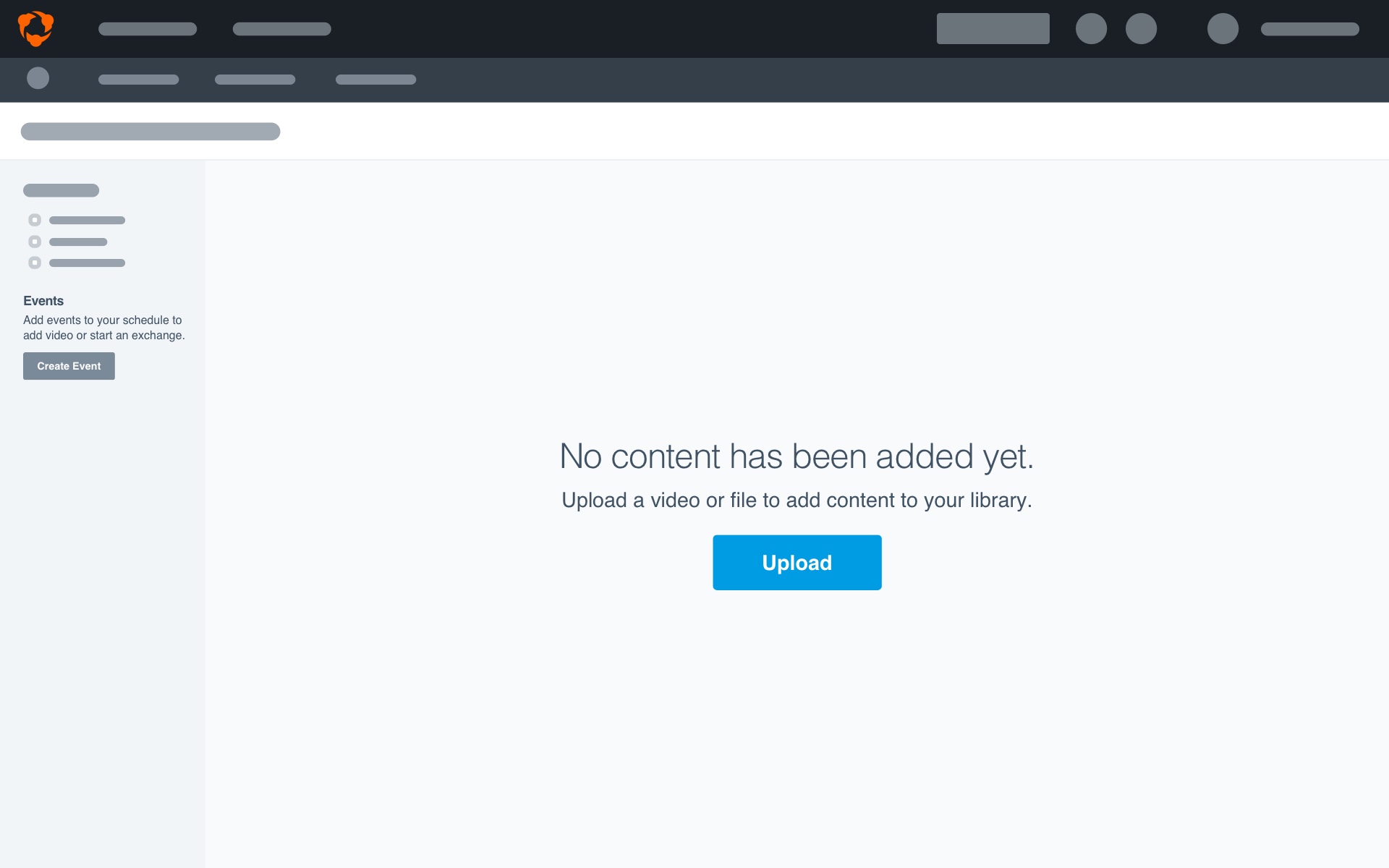
Empty States
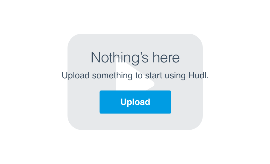
Every empty state, no matter the feature or its spot in a given workflow, should serve to onboard the user. It should always tell them what’s missing and how to get it there.
Container
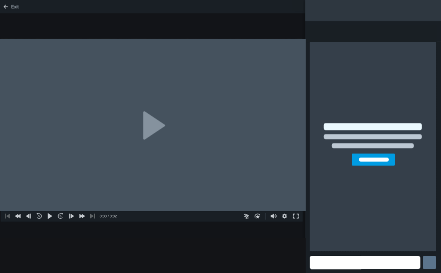
An empty state can exist in a main interface or a smaller aside.
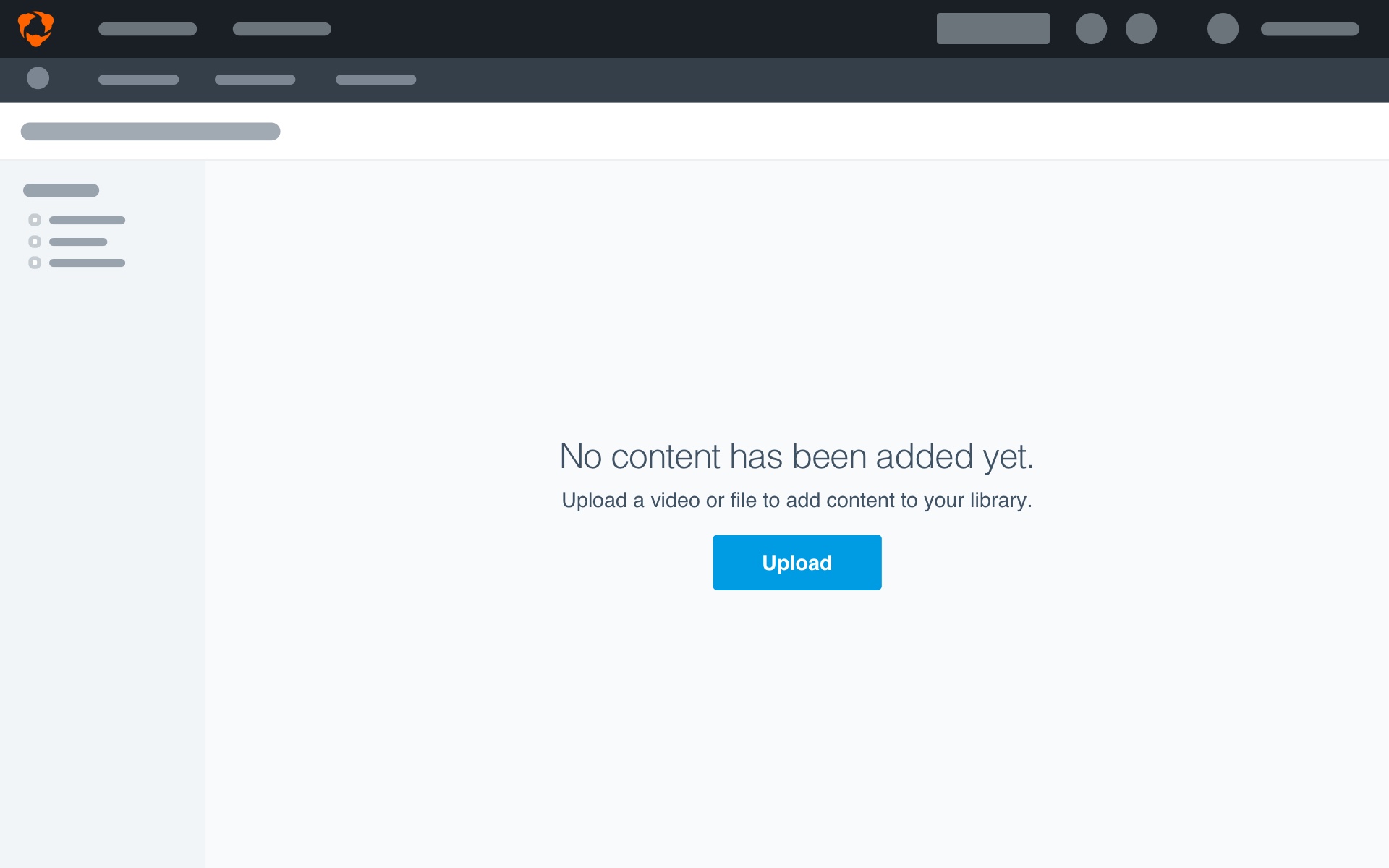
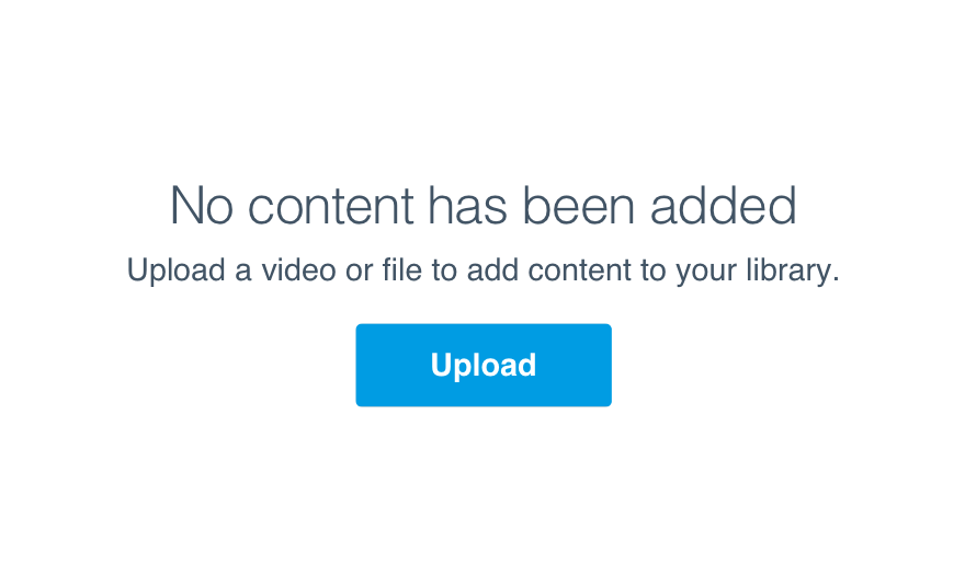
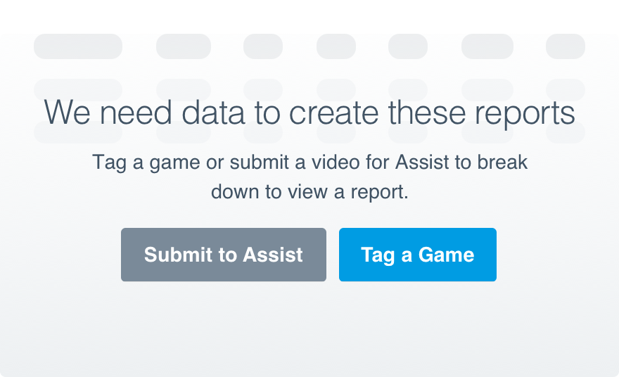
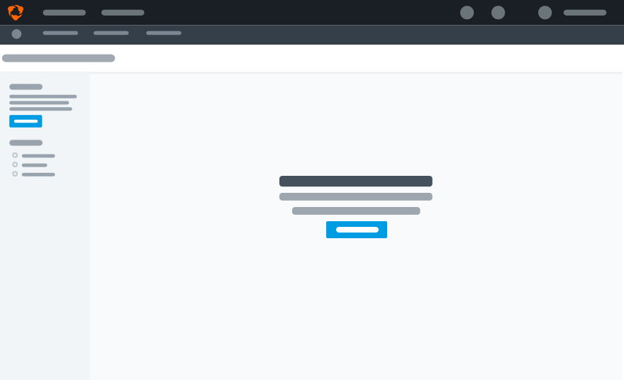
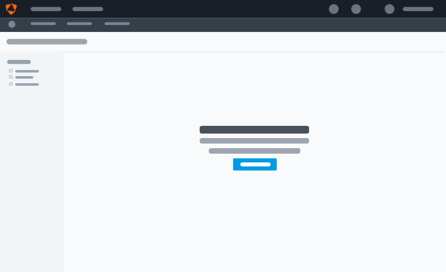
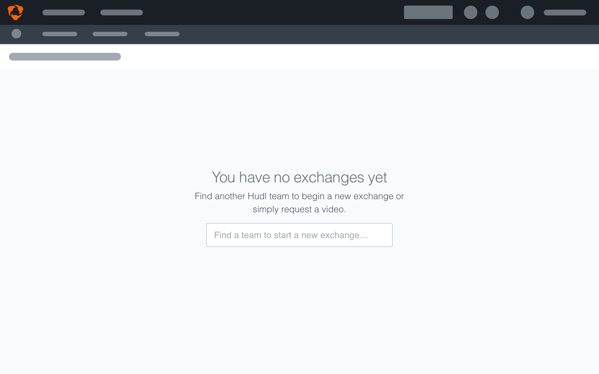
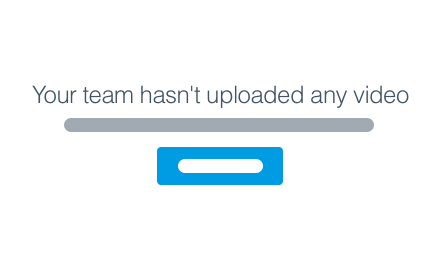
Main Interface: When the main functionality of a page is limited by the absence of content. Think of the library with no video, the Reports page with no data, or an exchange with zero history of swapping film.
Position
Main Interface: Center the text vertically and horizontally within the viewing area to clearly indicate the missing content affects the entire area.
Aside: Vertically align within that specific section. Text stays left-aligned.
Usage
Value Props
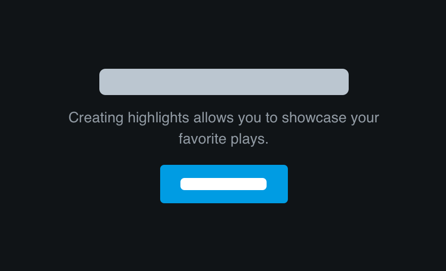
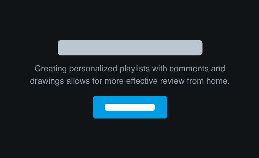
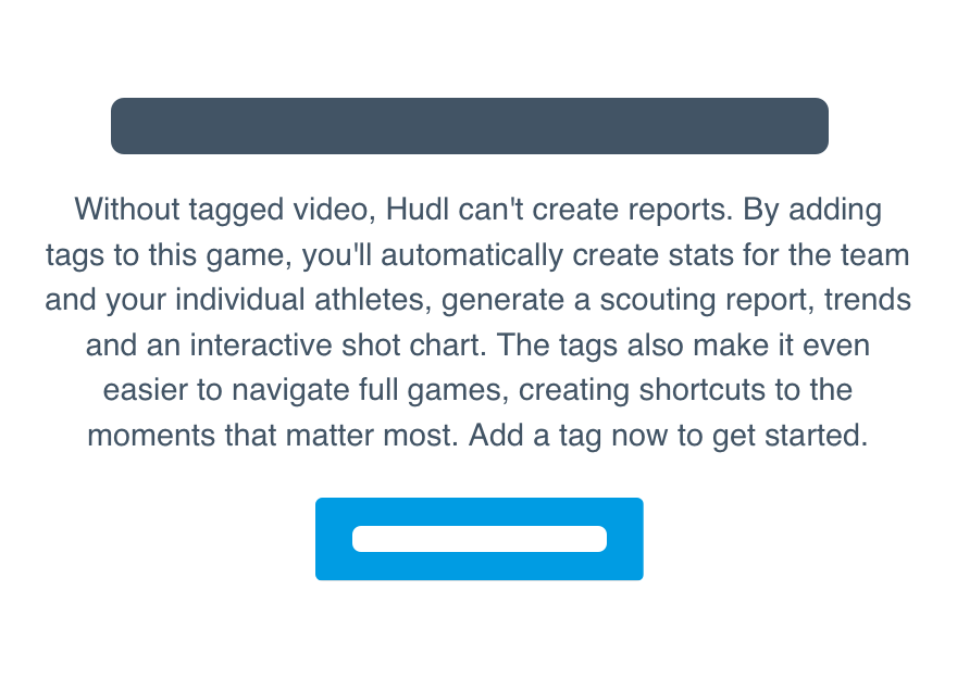
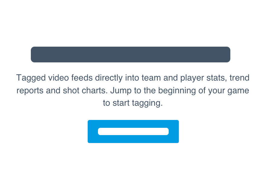
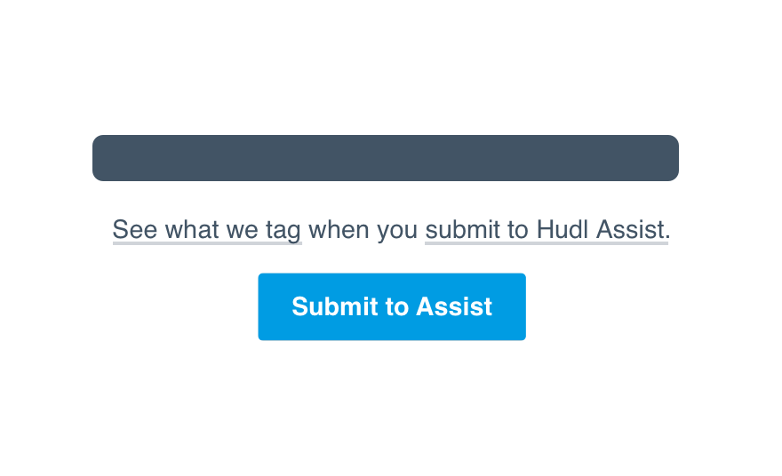
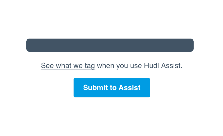
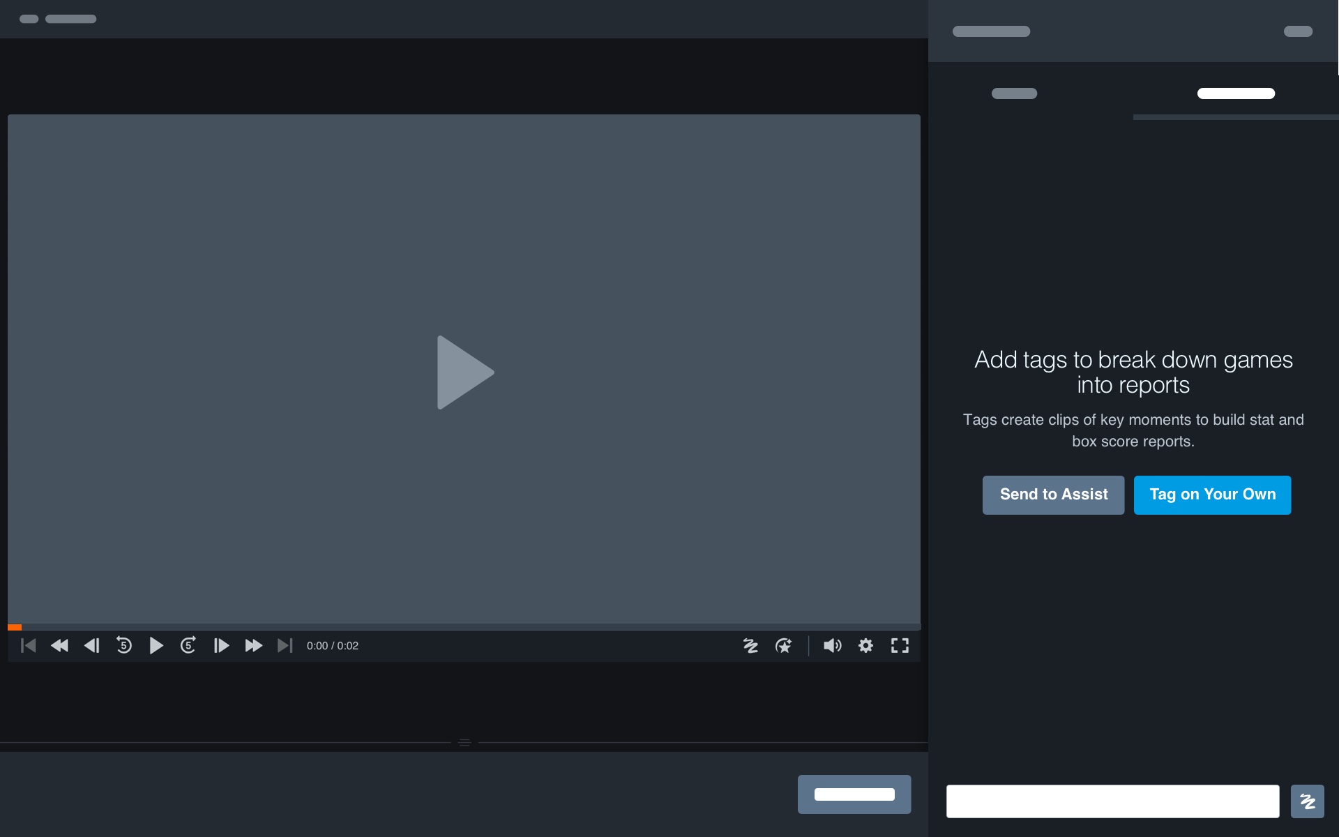
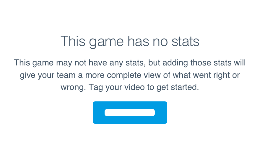
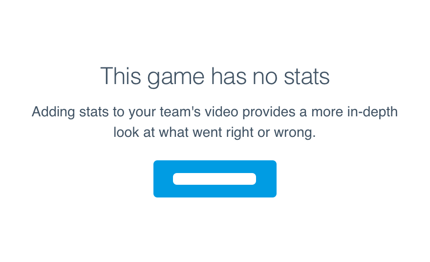
Certain empty states would benefit big time from the addition of a value prop. This means we go beyond telling them how to fill the space to why they’d want to and what other tools might help.
But again, that’s only certain empty states. We don’t need to add a value prop every time, just stick to the features that intertwine with other aspects of Hudl like video (duh!), tags and reports.
Don'tuse a value prop to point out the obvious.
Douse value props to tie different features together.
Adding a value prop can be as simple as updating the text to explain the feature’s impact on their entire Hudl experience.
Don'twrite up an entire paragraph on how everything ties together.
Doprecede the how with a single line about why.
Anytime a value prop is included in the body, you must link to more information. Ideally, we’d send them to a tutorial or other article about the feature.
Don'tleave them to learn everything on their own.
Dotake extra steps to help them get the most out of a new tool.
Use linked text for these resources. Save buttons for actual actions.
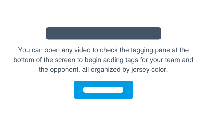
Another way to communicate the true value is through sample content. Don’t go crazy filling the entire interface, but give them a glimpse of what a fully utilized feature could look like.
Don'tbombard them with samples and distract from the message.
Doinclude a snippet of sample content to show them what’s possible.
Illustrations
We realize there’s likely a lot of negative space, but avoid an illustration purely for the sake of filling the empty state.
Don'tdistract from the key message.
Douse your words to explain what belongs.
The only acceptable use of added context is skeleton content to help communicate how content would be displayed.
Don'tuse it just to liven up the page.
Douse skeleton content for dense interfaces.
Levels
The empty state does not get its own level. Keep it in line with all other regions on that page.
Don'tplace it higher or lower for added contrast.
Dofollow our stack order to find the right level.
For more about the stack order, check our level guidelines.
Single Empty States
You should only ever have one empty state per page. We want to make sure the user is properly onboarded and understands the clear next step before providing more context.
Don'tshow them everything at once with no clear path forward.
Dofocus on the most important missing content.
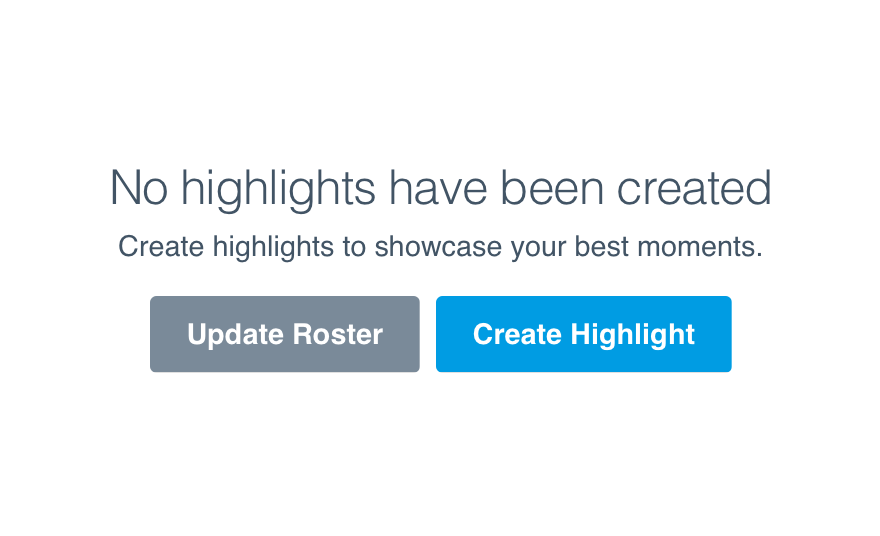
Single CTAs
Just as important as prioritized empty states are prioritized CTAs. Only give them one clear next step in generating the missing content. Too many options and we’d fail at the main goal to educate.
Don'tgive them a list of things to do with no clear prioritization.
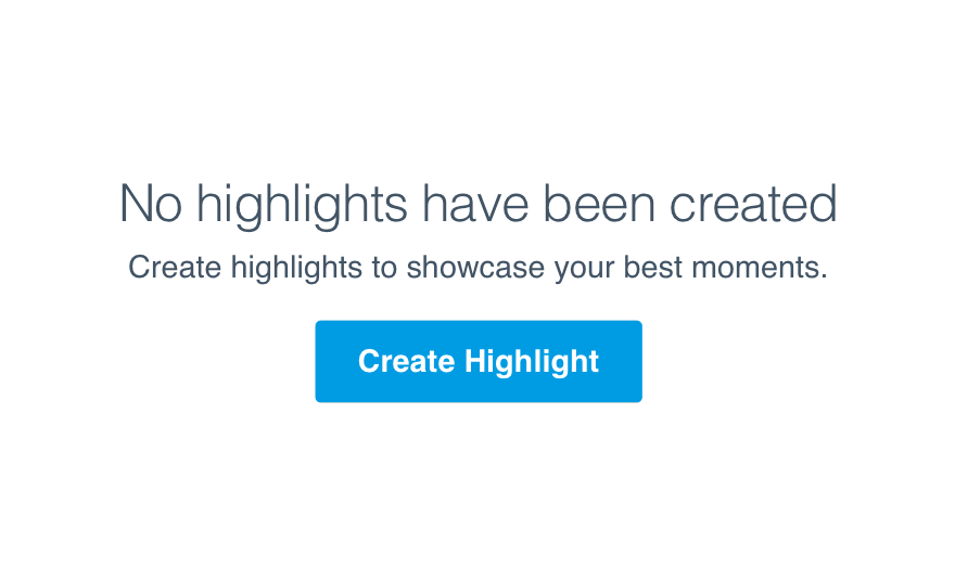
Dofocus on the most logical next step.
Buttons
Ideally the CTA will always begin a workflow. If the workflow begins on that page, use our button component. If the workflow begins somewhere else, use our button link.
Don'thide the CTA as linked text or a button elsewhere on the page.
Douse a button to clearly call out the action they can and should take.
Links
Links should only appear in the body and take the user somewhere to learn more. It shouldn’t serve as the CTA or begin a workflow of any sort.
Don'tframe it as a CTA in the middle of the body.
Dogive them the option to check a tutorial for more information.
Make sure you open a new tab when taking the user to a new destination. We don’t want to disrupt the workflow in their quest for more info.
Exceptions
Multiple Empty States
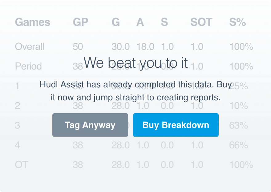
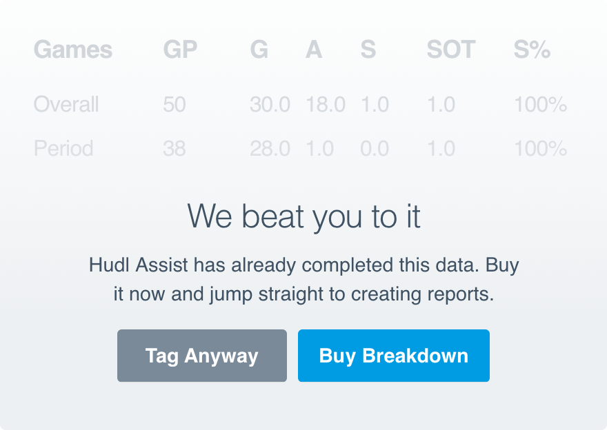
There are some instances where two workflows have no clear prioritization. In this case, when one piece of content doesn’t have to precede the other, two empty states can co-exist.
Still, only one action should be treated as primary. Consider which empty state has the greatest impact on the experience and apply the primary action there. The other button should be secondary.
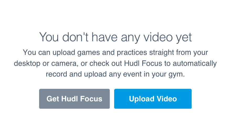
Multiple CTAs
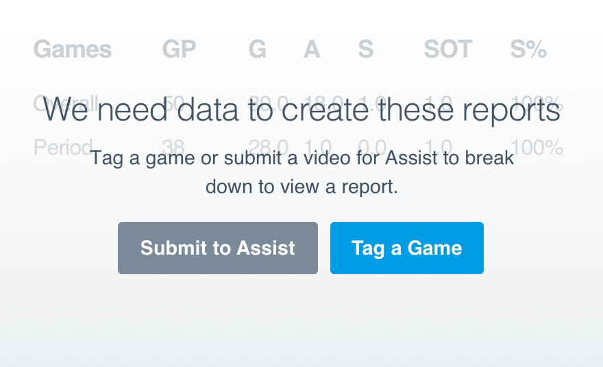
More often than not, there will only be one logical next step. If there are a number of ways to generate the same content, however, a second CTA is acceptable.
This is usually the case when the body includes a value prop for a feature immediately available to the user.
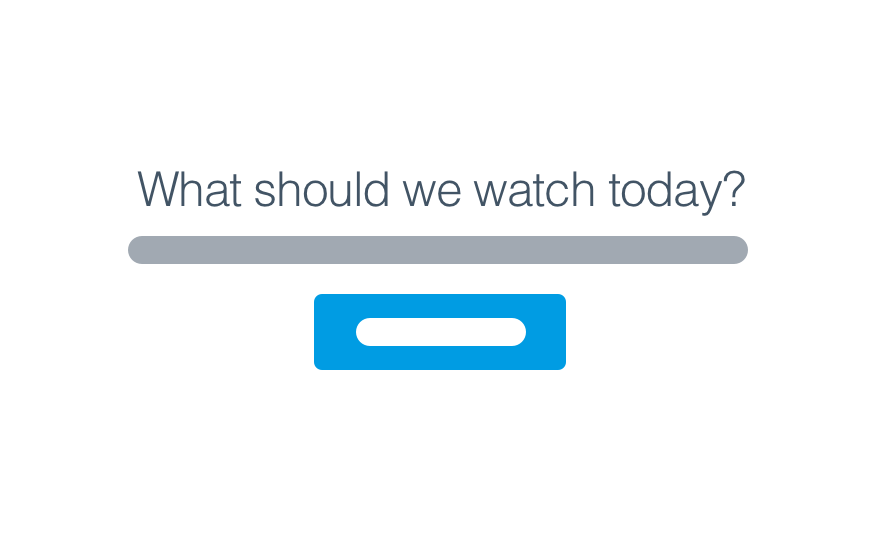
Search as CTA
If the actual workflow requires a search before anything else, the search can appear in place of the normal button. This is only if search is the actual first step.
Microcopy
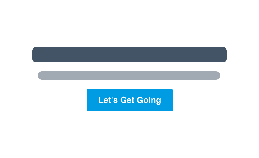
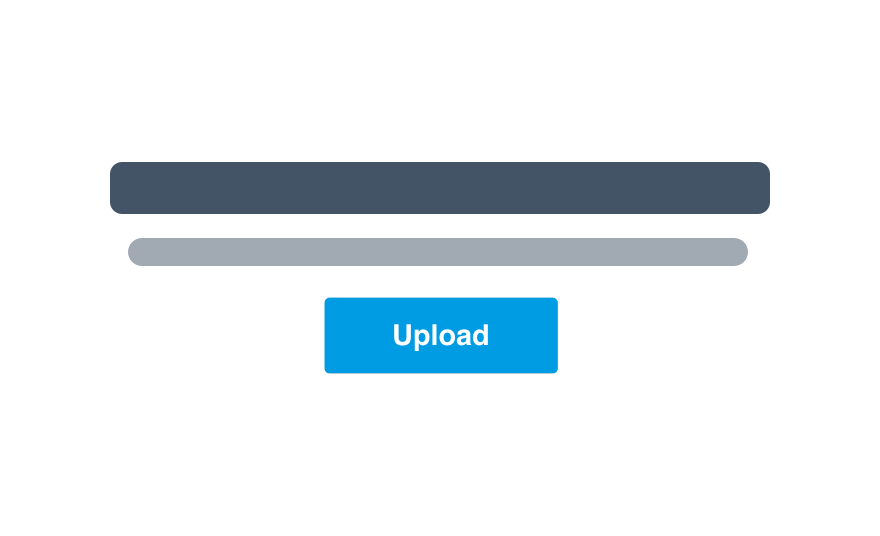
Headline
Use the headline component. (For the aside, try a subhead variation.)
Try limiting yourself to 6-7 words. Clearly state the purpose of that section and what belongs in the empty state.
Don'tbe clever and risk confusion.
Dotell the user exactly what’s missing.
Body
Use Uniform text. Small should work for the aside.
The body should always explain how to go about adding what’s missing. Don’t go into too much detail—a max. of 100 characters should suffice.
Don'texplain the complete process of adding said content.
Dobriefly touch on the benefit of adding content to that interface.
Value Props
Value props should be added to the body, same text size as everything else. Limit it to a single sentence, likely before telling them how to get started.
Don'trepeat the headline as you explain why the missing content matters.
Doeed off of the headline and expand on why they should fill the empty state.
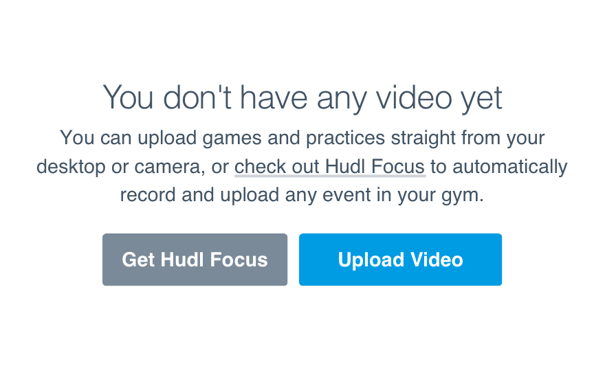
Linked Text
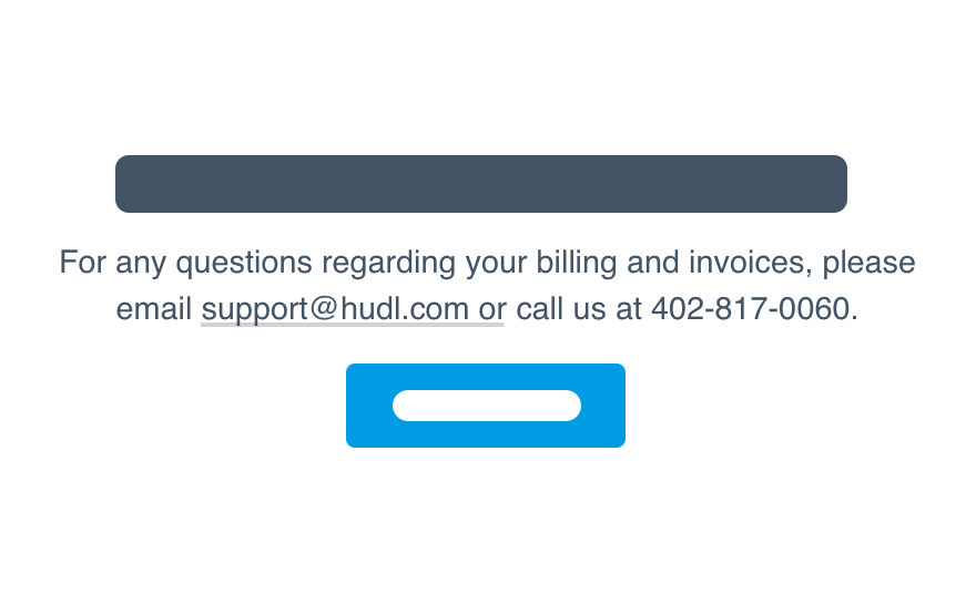
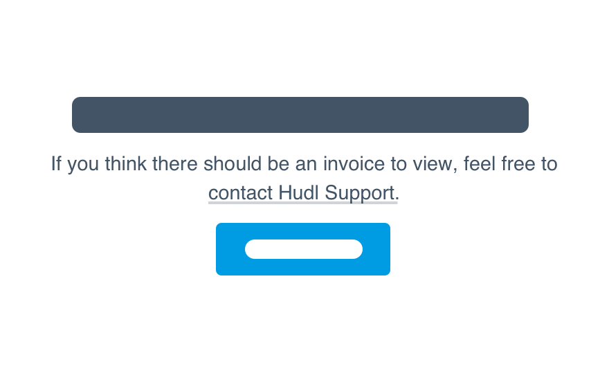
Our link guidelines cover most of the dos and don’ts, but empty states frequently call for the suggestion to contact Hudl Support.
If you want to include that link, spell out “contact Hudl Support” and link to the actual contact form. Do not give them the email address with a mailto: link. (And avoid typing out the phone number—think of the added steps!)
Don'tgive them the email address to type in themselves.
Dotreat Hudl Support as a proper noun.
For links related to value props, make sure the text clearly states what clicking will do. “Check out Hudl Focus” and “Learn more about Assist” are great, but avoid the blatant “Click here for a tutorial.”
CTA
Our button guidelines have all the details.
One big thing for empty states: If a CTA already exists on that page or might appear once content is generated, make sure the empty state CTA mirrors that copy. The sooner they become familiar with a workflow, the better.
Don'tmix up the language just to keep things “fresh”.
Doprovide consistent CTAs.