Hey there! This is the Uniform version 3 documentation site. If you’re looking for version 4, go here instead.
/
Link
Navigate to a destination outside the current context.
Links are a common interactive element seen throughout our websites and web apps. Use them to take the user somewhere else.
Type
There are three types of links: default, article and implied.
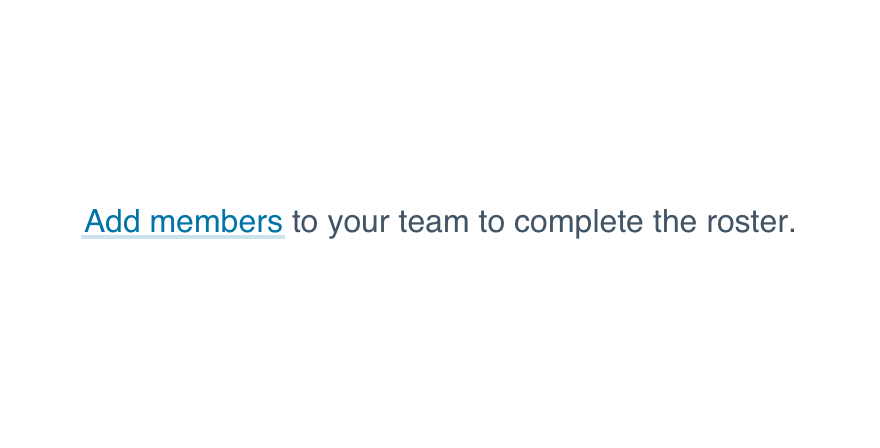
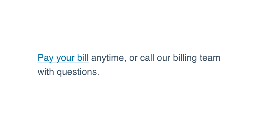
Pay your bill anytime, or call our billing team with questions.
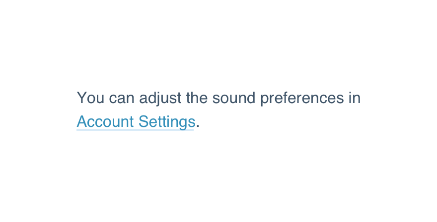
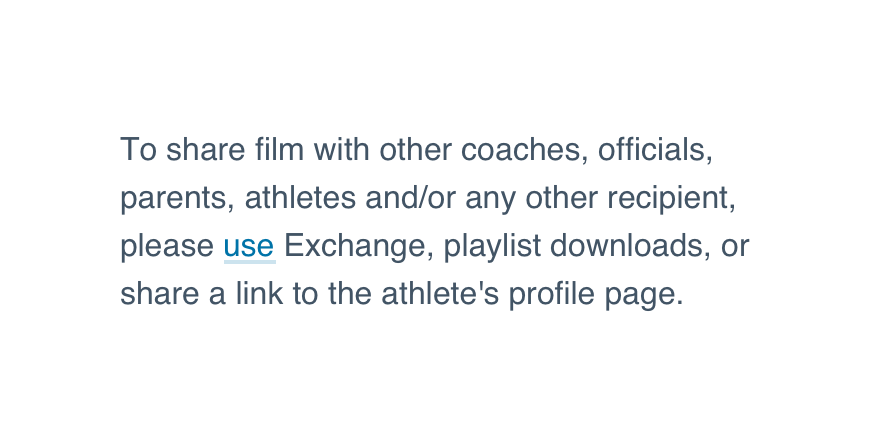
Default: Neutral underline. Inherits surrounding text color. It blends in while still having a distinct underline affordance.
State
Links exist in a normal, hovered or active state.
Share this video with a message.
Usage
Inheriting Text Color
Default and implied links inherit their text color from the context in which they’re placed (e.g., paragraph, list item). To ensure your link complies with Uniform guidelines, use one of our type elements.
Links vs. Buttons
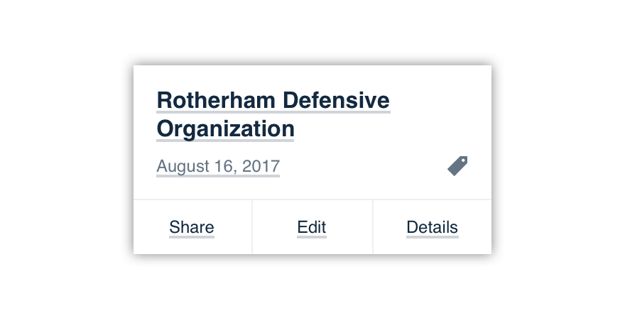
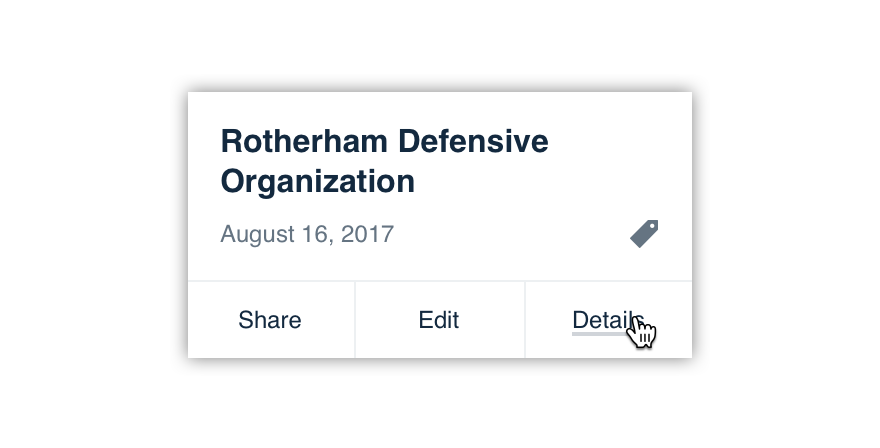
Links should send the user outside of the current context. To keep the user in the same context, use a button instead.
If you’re worried about the visual weight of a button, try the minimal style.
Don'tuse a link to initiate an in-page action.

Douse a link to take the user to another page.
One exception: Buttons may replace links in landing pages and in-app promotions where the primary call-to-action will take the user elsewhere (e.g., promoting a trial sign-up in the mobile app).
Just remember to limit the number of links and actions on a single page, especially primary buttons.

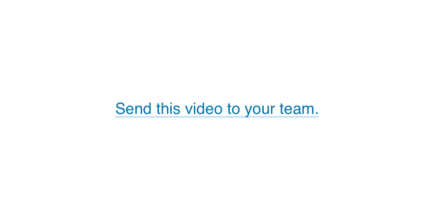
Don'tforce yourself to use one massive link for a primary CTA.

Douse a button in exceptional cases to take the user to a new flow.
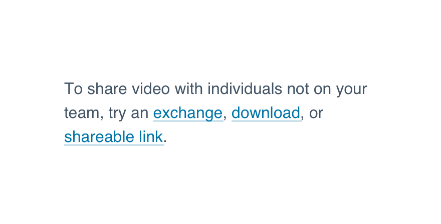
Implied Type
If one screen features dozens of links, try the implied style.
Don'toverwhelm the user with default or article links.
Douse the implied type when natural exploration reveals interactivity.
Microcopy
Pay special attention to the words you wrap. The following guidelines can help.
Avoid “Click Here”
There are better words to link. Think of the children!

Don'tcut corners by adding “click here” to your phrase.
Dowrap your link around a verb and its object—ideally both.
Link Phrases, Not Sentences
Links need not overpower the text.
Don'tlink entire sentences.
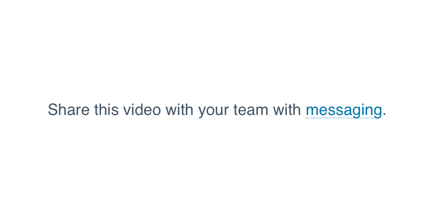
Dodraw attention to the area where a user can take action.
Send Users Somewhere Else
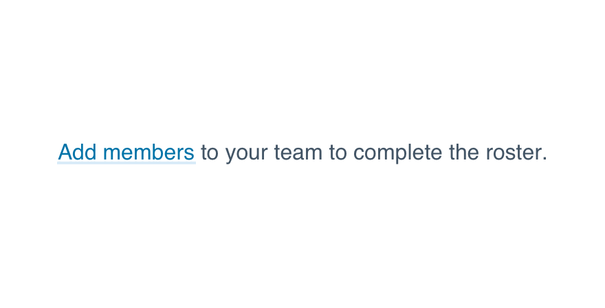
Ideally, your link text should describe or allude to a new destination.
Don'tuse links to keep users in the current context.
Dofocus your link text on that destination.
Balance the Findability
If your link text is short, but the surrounding context is noisy, reconsider the style or rewrite the link to make it more noticeable.
Don'tbury a link in a sea of microcopy (e.g., linking one small word).
Doensure the link stands out.
Platform
| platform | notes |
|---|---|
| Web |
|
| Apple |
|
| Android |
|
| No guidelines exist for Windows (yet). |