Hey there! This is the Uniform version 3 documentation site. If you’re looking for version 4, go here instead.
/
Spinner
Communicate to the user their content is loading.
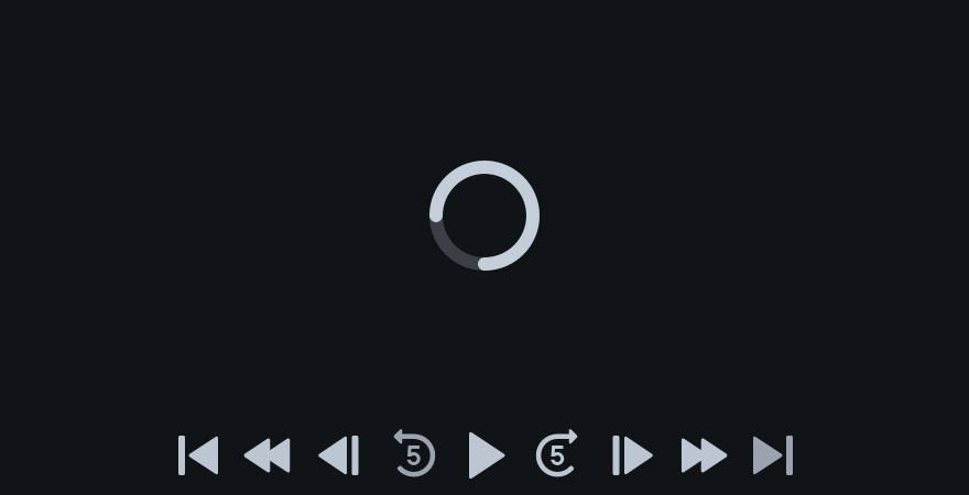
Our spinner indicates that the content meant for a given container is taking extra time to appear. Regardless of how long or short the time to load may be, the spinner will always operate at one speed. It should never be used to indicate progress.
Sizes
Choosing the right size depends on where the loading content lives.
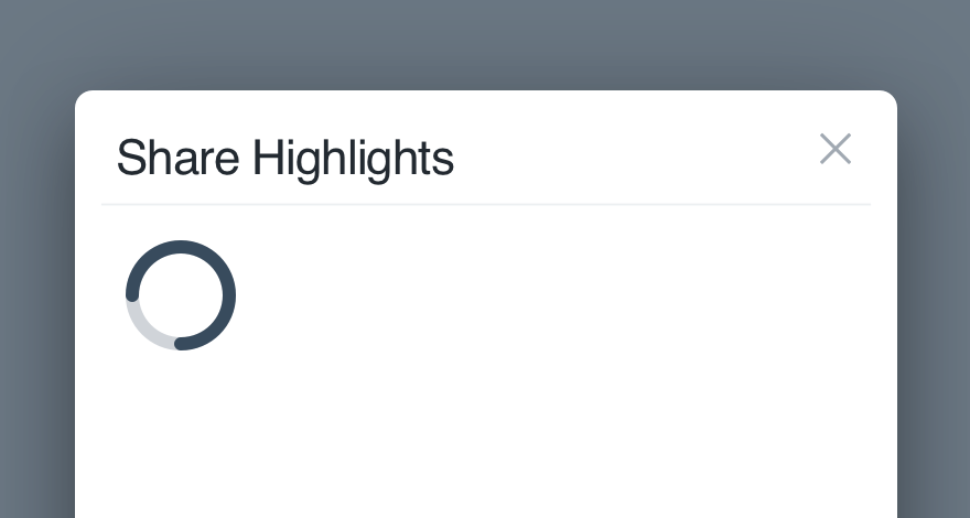
Small: For the smallest parts of a UI, like a thumbnail or select.
States
We animate the spinner to tell the user things are happening and the content is on its way.
Start: A spinner starts spinning as soon as it appears. (Say that 10 times fast.)
Mobile
Spinners are closely aligned with progress on mobile. They’re generally used to represent activity, like pulling to refresh or synchronizing data. They might also be used to load a new experience or portion of the interface.
Use the spinner when checking for updates, or loading new content into a list. Don’t use it when reporting determinate progress, and never replace the network activity indicator in the status bar. Instead follow Apple’s recommendations.
Like Apple, when representing determinate progress, use progress indicators as outlined by Material's guidelines.
Usage
Not for Progress
The spinner should never be used to indicate progress. There’s nothing to track, we’re simply completing a quick call to our servers.
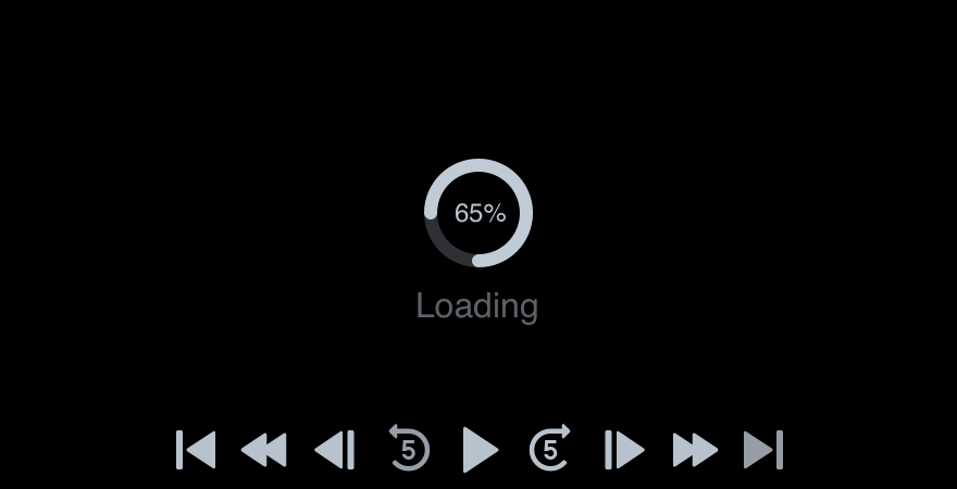
Don'tinclude any text regarding progress.
Doallow the spinner to speak for itself.
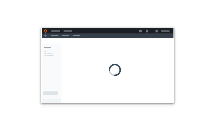
Position
Always place spinners in the center of the content’s container. Don’t hide it in the corner like the loading isn’t important.
If the loading content lives outside of the viewport, center horizontally instead.
Don'tmisplace a spinner where it may not be seen.
Doput it front and center to clearly indicate something’s happening.
Limit per Page
You get one spinner per page. Show too many at once and the user might get sick! If more than one piece of content is loading, stick to a large for the whole page.
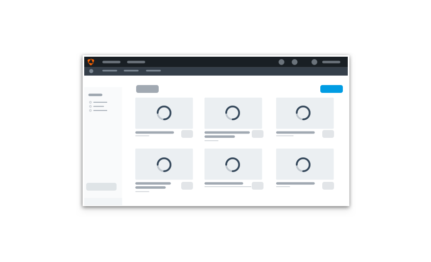
Don'tgive each container its own spinner.
Doput one spinner in the center of the UI to indicate multiple pieces are loading.
Platform
| platform | notes |
|---|---|
| Web |
|
| Apple |
|
| Android |
|
| No guidelines exist for other platforms (yet). |