Components

Design
Code
keyboardshortcuts
d
Design
c
Code
,
Previous Section
.
Next Section
/
Toggle Preview Environment
[
Previous Platform
]
Next Platform
command +
Scroll to Top
command +
Scroll to Bottom

Graphically represent an object or action in limited space.

Use this component to add Uniform standard icons to your interface. Looking to create your own icons in our style? Follow the iconography guidelines.

Categories

Effects

effectarrow
Effect Arrow
effectcircle
Effect Circle
effectcursor
Effect Cursor
effectfreehand
Effect Freehand
effecttext
Effect Text

Features & Navigation

drawing
Drawing
exchanges
Exchanges
help
Help
highlights
Highlights
home
Home
leagueexchanges
LeagueExchanges
logout
Logout
menu
Menu
messages
Messages
notifications
Notifications
notificationsoff
Notifications Off
playtools
Play Tools
record
Record
reports
Reports
search
Search
settings
Settings
upload
Upload
video
Video

Feedback

confirmation
Confirmation
critical
Critical
information
Information
warning
Warning

Filetype

filetypedocument
Filetype Document
filetypeimage
Filetype Image
filetypeother
Filetype Other
filetypepdf
Filetype PDF
filetypepresentation
Filetype Presentation
filetypespreadsheet
Filetype Spreadsheet
filetypevideo
Filetype Video
filetypezip
Filetype Zip

Interaction

add
Add
comment
Comment
delete
Delete
download
Download
edit
Edit
remove
Remove
share
Share

Logos

logofull
Logo Full
logomark
Logo Mark

Media Playback

angle1
Angle 1
angle2
Angle 2
angle3
Angle 3
angle4
Angle 4
angle5
Angle 5
angle6
Angle 6
audio
Audio
audiooff
Audio Off
autoskip
Auto Skip
backward5sec
Backward 5 Sec
enterfullscreen
Enter Fullscreen
exitfullscreen
Exit Fullscreen
fastforward
Fast Forward
forward5sec
Forward 5 Sec
loop
Loop
loopoff
Loop Off
next
Next
normalplay
Normal Play
pause
Pause
play
Play
previous
Previous
replay
Replay
rewind
Rewind
slowbackward
Slow Backward
slowforward
Slow Forward

Permissions

restricted
Restricted

Sports

australianfootball
Australian Football
baseball
Baseball
basketball
Basketball
cheer
Cheer
cricket
Cricket
dance
Dance
fieldhockey
Field Hockey
football
Football
golf
Golf
gymnastics
Gymnastics
hockey
Hockey
lacrosse
Lacrosse
netball
Netball
othersport
Other Sport
rugby
Rugby
soccer
Soccer
softball
Softball
swimming
Swimming
tennis
Tennis
trackandfield
Track & Field
volleyball
Volleyball
waterpolo
Water Polo
wrestling
Wrestling

Technology

battery
Battery
batterylow
Battery Low
devicelandscape
Device Landscape
deviceportrait
Device Portrait
location
Location
resolution4k
Resolution 4K
resolutionhd
Resolution HD
resolutionsd
Resolution SD
streaming
Streaming
sync
Sync
wifi
WiFi
wifiwarning
WiFi Warning

UI Controls

uidismiss
UI Dismiss
uiexpandcollapseup
UI Expand Collapse Up
uiexpandcollapsedown
UI Expand Collapse Down
uiexpandcollapseleft
UI Expand Collapse Left
uiexpandcollapseright
UI Expand Collapse Right
uiexpandcontent
UI Expand Content
uimore
UI More
uinewwindow
UI New Window
uireorder
UI Reorder
uinavigationback
UI Navigation Back
uinavigationforward
UI Navigation Forward

User

user
User
useradd
User Add
usergroup
User Group

Video Features

clip
Clip
keyboardshortcuts
Keyboard Shortcuts
playlist
Playlist
playlistadd
Playlist Add
tag
Tag

Labels

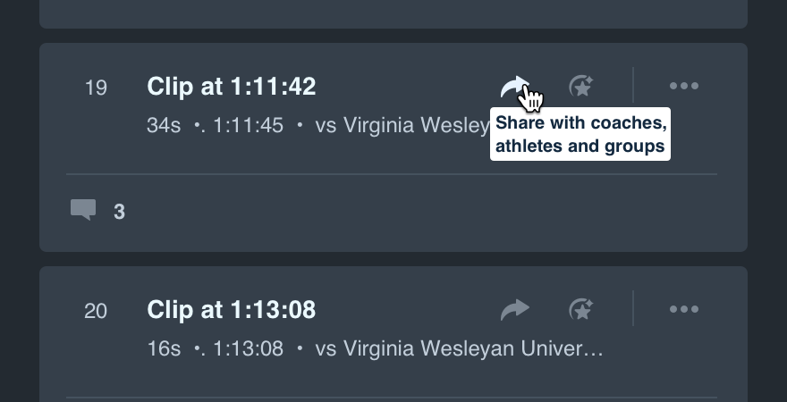
The icon label clearly states the action performed by the icon or icon button on hover.

That said, don’t get it confused with the more detailed and instructional tooltip. The latter allows for more text and includes a tail.

iconlabel-tooltip-dont

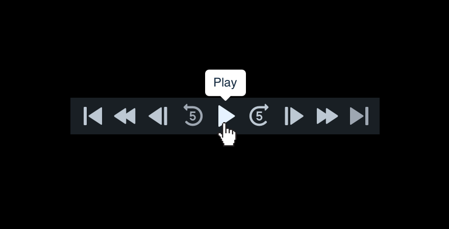
Don'tuse a tooltip to simply name an icon.

iconlabel-tooltip-do

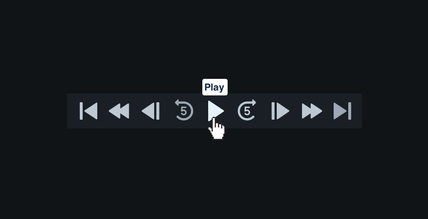
Douse an icon label when no additional instructions are needed.

iconlabel-sentence-dont

Don'tmake the label a complete sentence.

iconlabel-sentence-do

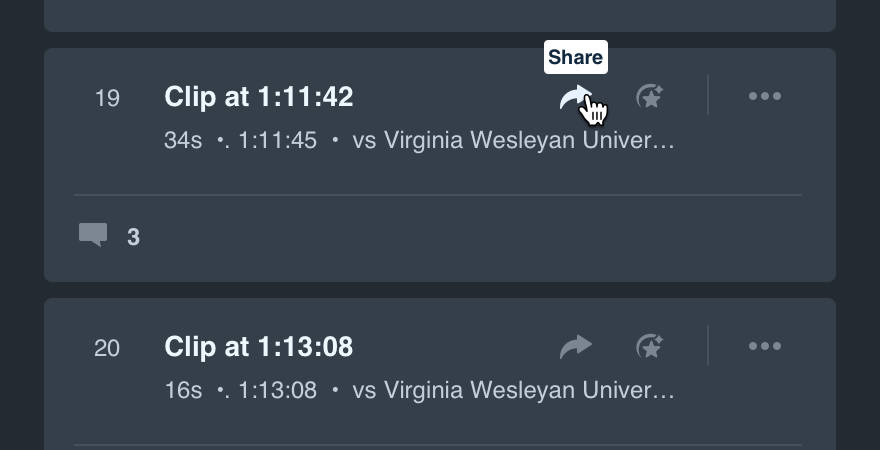
Domake it a single action and stick to UI label guidelines.

Abiding by UI label guidelines also means no icon label should have closing punctuation.

Platform

platformnotes
Web
  • Stick to the icons above.
Apple
  • Stick to the icons above.
Android
  • Stick to the icons above.