Hey there! This is the Uniform version 3 documentation site. If you’re looking for version 4, go here instead.
/
Keyboard Shortcut
Communicate how a key or keys can replace the mouse.
The keyboard shortcut exists only to show which key or combination of keys performs a given action. The action itself should be further explained in accompanying content.
Style
The keyboard shortcut and accompanying content should always appear as a table in-line, as a dialog or via icon label.
Functions
If several shortcuts are available but real estate is limited, the shortcuts can be presented as a dialog triggered by the keyboard icon.
Content
Text options within the keyboard shortcut are limited. Case and punctuation depend entirely on what purpose the text serves.
Keys
All shortcuts should do their best to match what appears on the user’s keyboard.
- All single letters A-Z are uppercase.
- For non-letter keys such as enter, esc and shift, stick to lowercase.
- Use the arrow symbol as opposed to spelling things out.
- Same goes for numbers—numerals (1, 2, 3) are perfect.
Modifiers
The only punctuation you should need is the + to indicate a combination of keys will activate the shortcut.
For a sequence of keys where one must follow the other, spell out then. Stick to lowercase to match the non-letter keys.
If two different keys can execute the same action, or the shortcut itself may look different on the user’s keyboard, insert or.
Results
The action performed by a keyboard shortcut should not come off as a complete sentence. Use sentence case, but don’t give it closing punctuation.
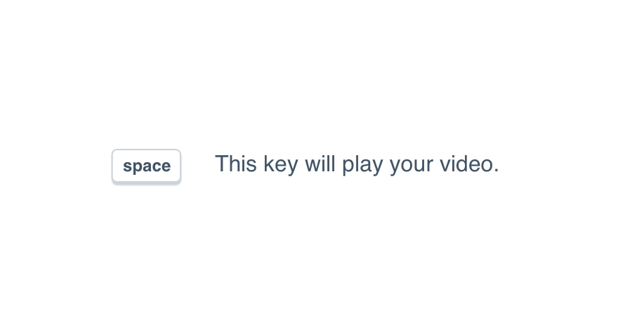
Don'tget too detailed with the result.

Dostick to the verb phrase.
Mobile
Never hide important actions or information under a keyboard shortcut on mobile devices. Instead, display this in the interface in an easy to see place. Consider using a note.
Usage
Unique Functions
Never use one key for multiple functions. Avoid the direction to “hold” a key for the sake of performing an action different than that of a tap.
Instead, give each action its own key or combination of keys. We never know how quickly or slowly a user may interact with their keyboard.
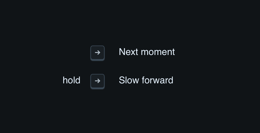
Don'tinclude any modifier not related to sequence.
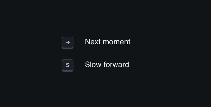
Doassign a unique function its own key.
Container
Always build the shortcut in a table or grid with everything (shortcut and result) left-aligned. For recommended margins within that grid, be sure to check our space guidelines.
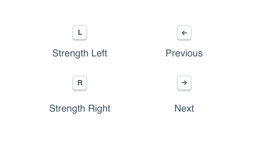
Don'tcenter the shortcut, no matter how few there may be.
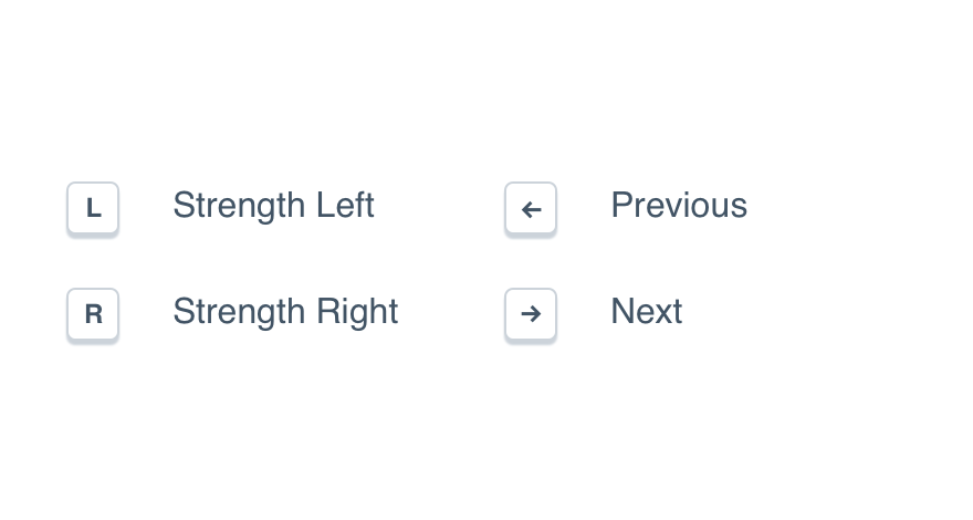
Douse a grid to make spacing easier.
Icon Label
A keyboard shortcut displayed via icon label should always appear in parentheses.
Place it at the end of the label itself, following the action they’d perform. (The action is required. A shortcut should never appear on its own!)
Don'tprovide a shortcut with zero context.
Dolist the icon’s purpose first.
Organization
Use logic to group related shortcuts. Anything related to playback should appear together, as should tags, highlights, page controls, etc.
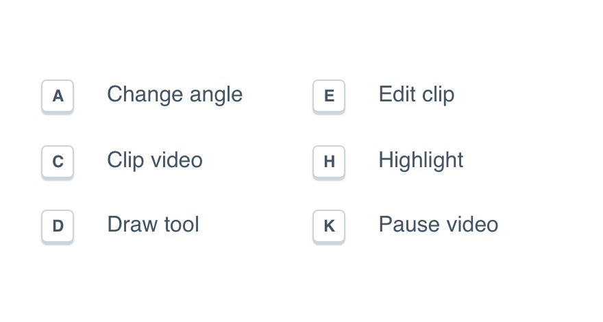
Don'tuse a random system to organize shortcuts.
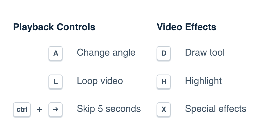
Douse headings to make large tables easier to navigate.
Platform
| platform | notes |
|---|---|
| Web |
|
| Apple |
|
| Android |
|
| No guidelines exist for Windows (yet). |