Hey there! This is the Uniform version 3 documentation site. If you’re looking for version 4, go here instead.
/
Card
Collect related content or tasks within a container.
Cards exist to group repeatable content and display it in a modular, easy-to-read way.
Cases
While all cards are displayed in a familiar format, the content within them changes the purpose of each.
Basic: The majority of our cards are basic. It can collect and display a variety of content and most likely won’t include any visuals.
Elements
Every card consists of a body, but can also include a header, footer and sometimes media content.
Chase Winovich — Draft 2019
The only thing that matters is that you outwork every single person.
Body: Use for just about any and all content imaginable.
Usage
Content
Content shows up in different ways when grouped into cards. Some require headers, some will only need footers and some might need both. When collectively displayed, they each should remain consistent and use the right card type.
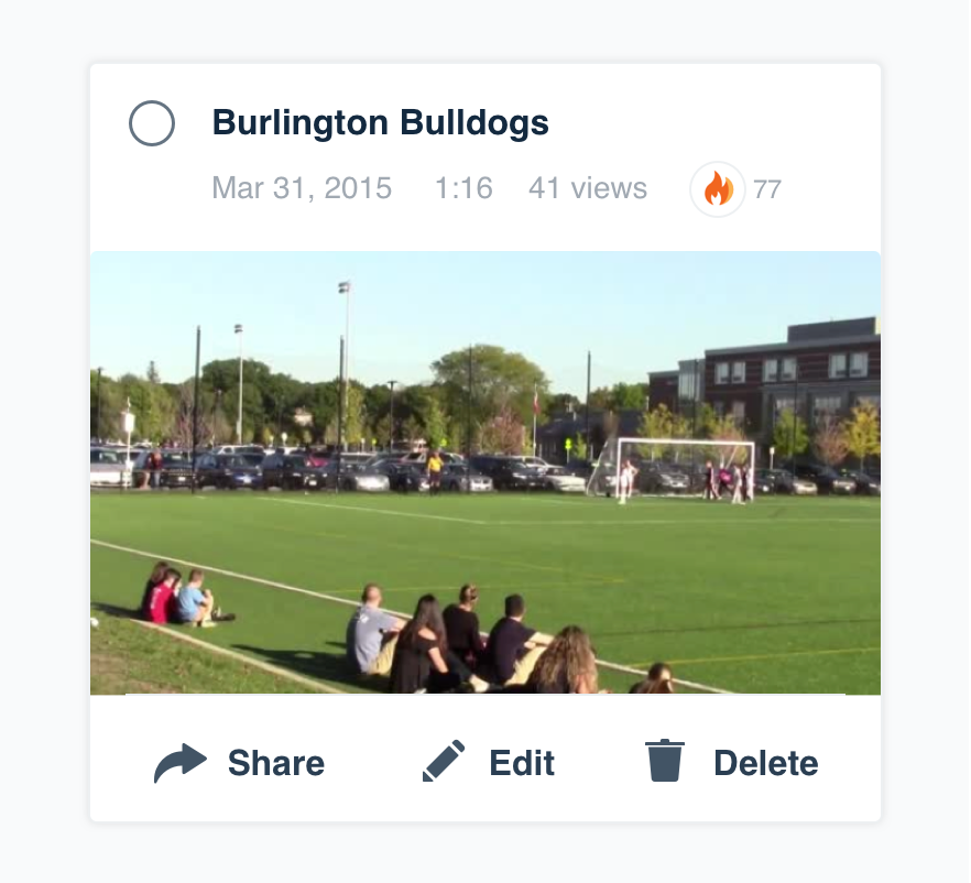
Don'trecreate a card type out of individual elements.
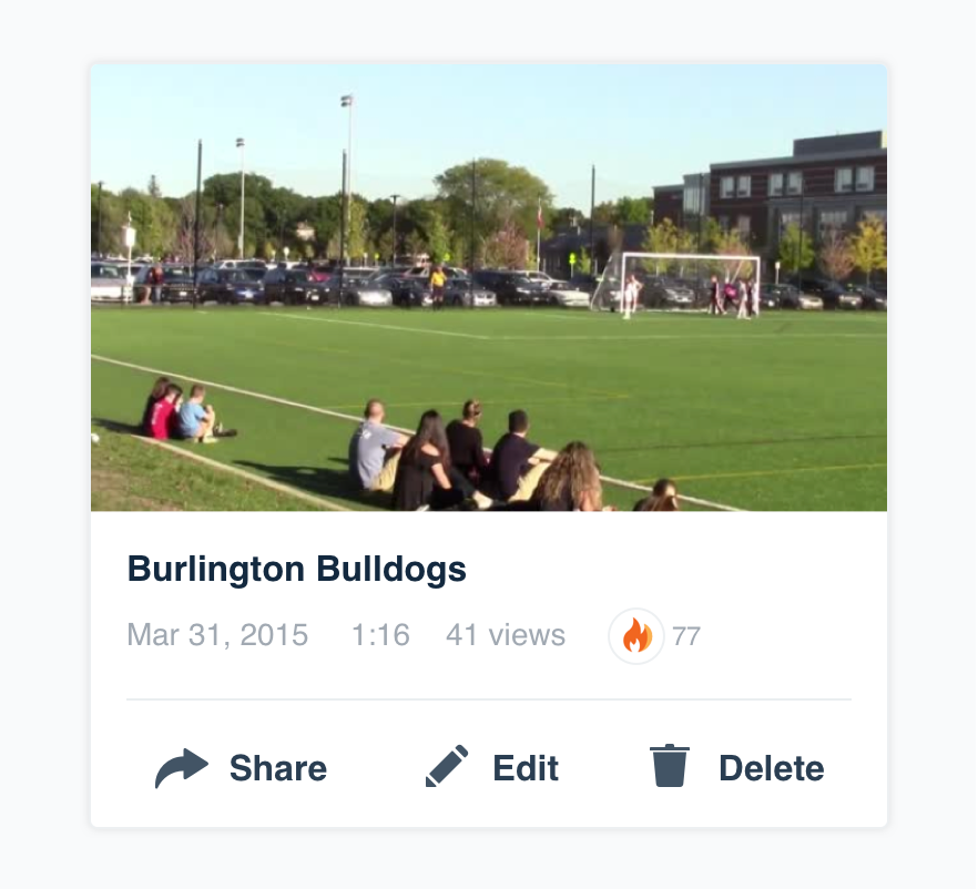
Dochoose the right card for the content.
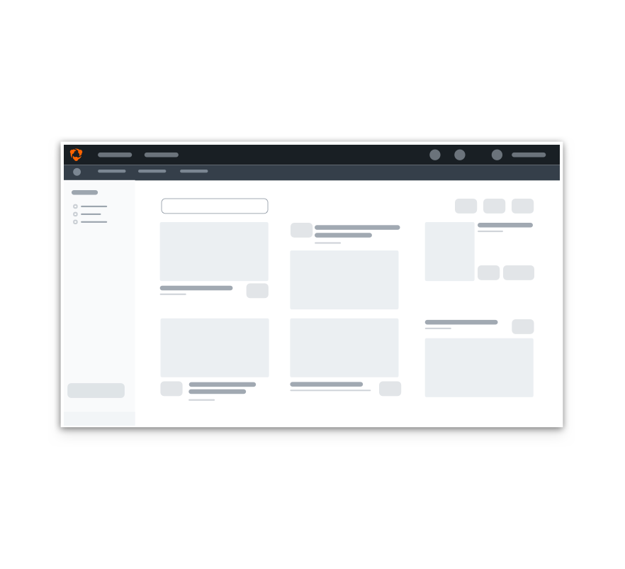
Don'torganize content in different ways when grouped together.
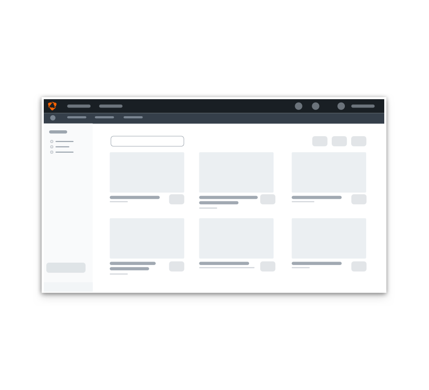
Dokeep cards consistent for easy scanning.
Actions
Cards may vary in size depending on the purpose and content. Actions should only ever be present in the footer. Reserve these for the three most important.
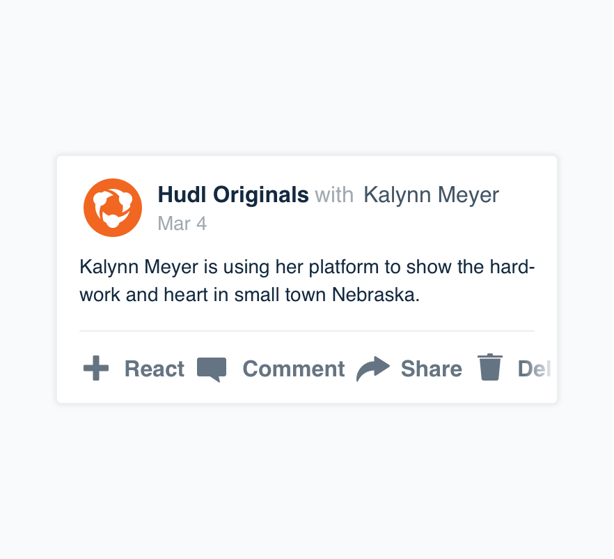
Don'toverload the footer with actions.
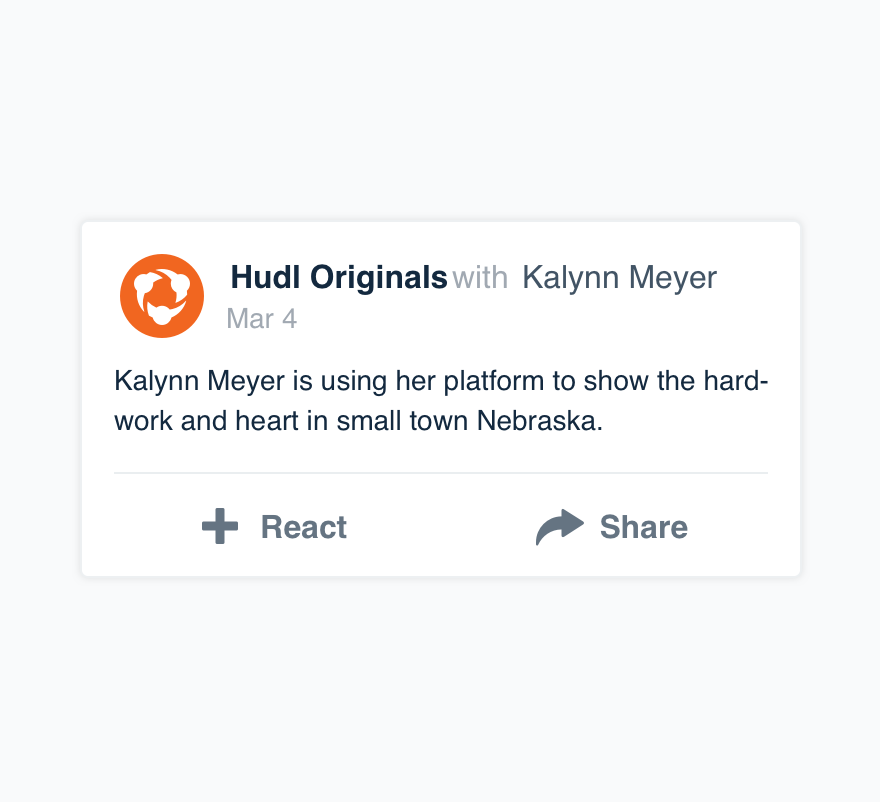
Dolist the most important the user can take.
Selection
In some cases cards may be selectable. If it makes sense to include selection, use our select mark in the upper left corner.
Microcopy
Titles
Titles should be concise and briefly explain the content. Write them in title case, but don’t worry about punctuation for these.
Date and Time
Cards are nearly synonymous with time as they’re most often displayed in feeds. Follow our date and time guidelines.
Case & Punctuation
Like most things, cards follow our non-label text guidelines and use appropriate punctuation and sentence case.
Platform
| platform | notes |
|---|---|
| Web |
|
| Apple |
|
| Android |
|
| No guidelines exist for Windows (yet). |