Hey there! This is the Uniform version 3 documentation site. If you’re looking for version 4, go here instead.
/
Alert
Interrupt with a mandatory acknowledgement or decision.
Like its friends modal and overlay, an alert disables the rest of the interface—but its actions are not optional. Reserve this component for choices that should be carefully considered.
Cases
The two practical applications of an alert are an acknowledgement and a decision.
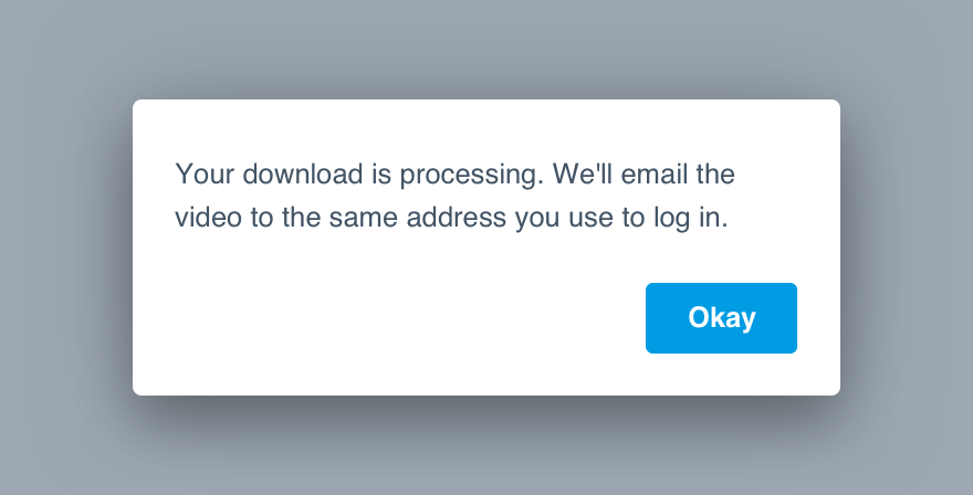
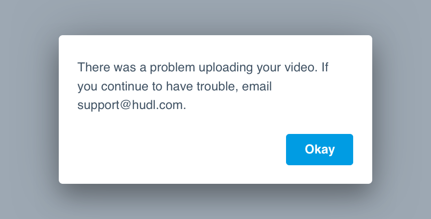
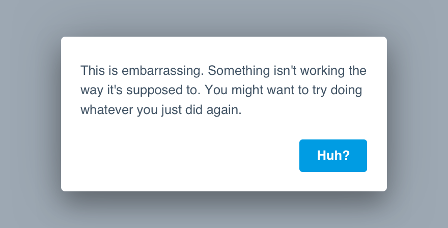
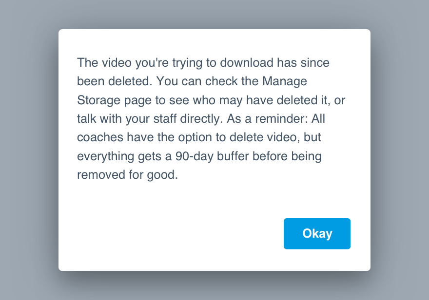
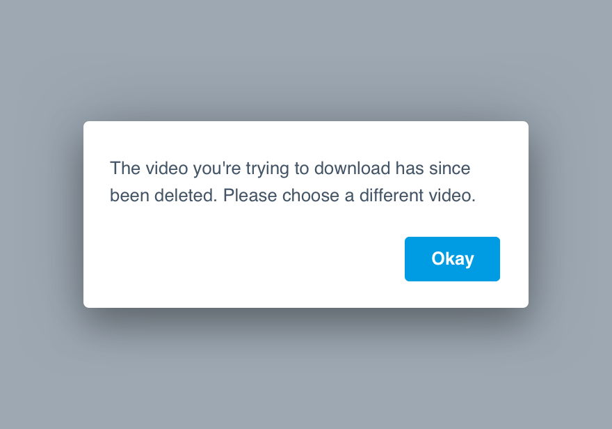
Acknowledgement: This is typically information related to an action they’ve already completed. No decision required, just the understanding that they read the alert.
Buttons
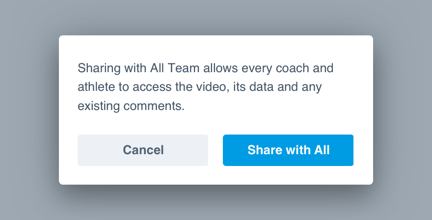
The number of buttons is determined by the alert’s purpose. An acknowledgement only requires one, while the decision should offer two.
Single: Should never affect or complete an action, simply allows them to close the alert.
Button Types
- For a single acknowledgement, use Primary.
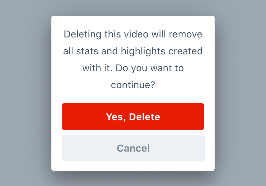
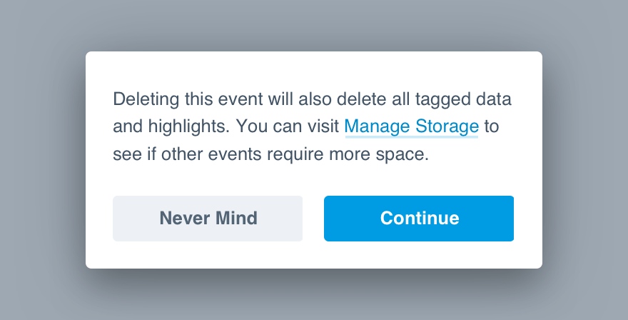
- For a double instance where they’ve chosen to delete something, put Destroy on the right with Subtle on the left—the latter should allow them to opt out.
- For a double instance with no preferred action, use Secondary for both.
- For double with a clear preference, use Primary on the right and Subtle on the left.
Our button guidelines can give you a closer look at each type and how to use them.
Mobile
Alert vs System Alert
Reserve using the Uniform alert for actions that take place in the Hudl ecosystem–like adding a teammate to the roster or editing the final score of an event. Decisions that affect the physical device should make use of the operating system’s alert. For example, use a system alert when communicating the device is out of storage. We need to be clear to our users they are deleting video from their physical device and not their Hudl account.
Don'tuse a system alert when the message applies to Hudl content.
Douse alerts for Hudl-related decisions.
Action Order
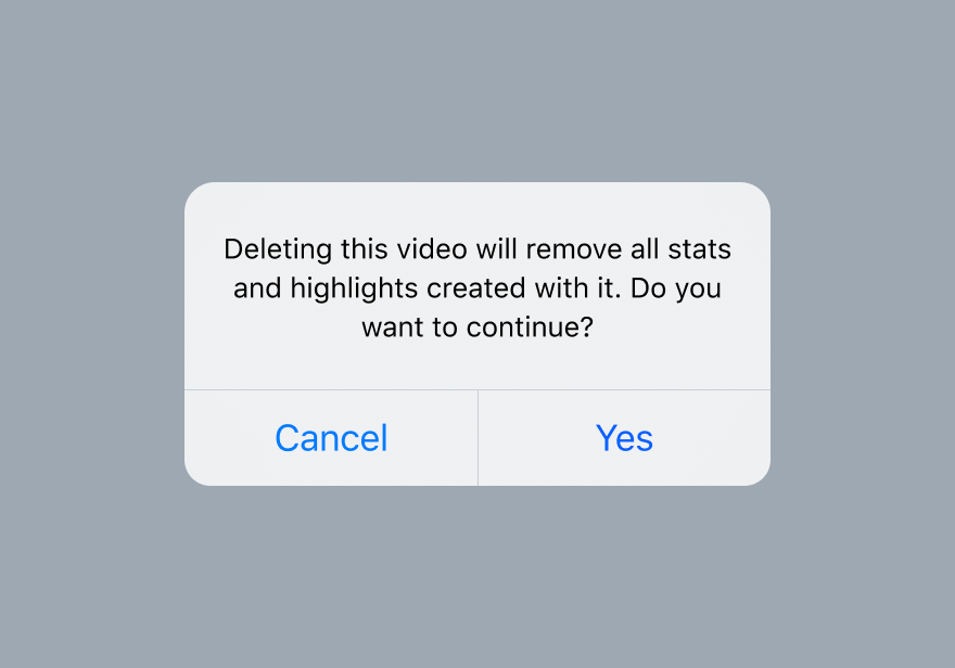
When users have decisions to make in an alert, always list the action that will take them forward first.
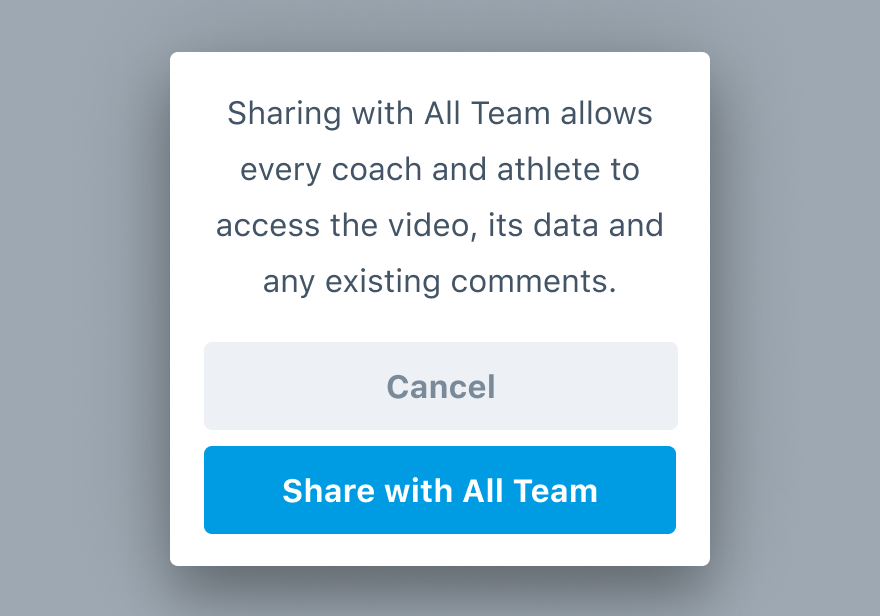
Don'tswitch up the order of actions.
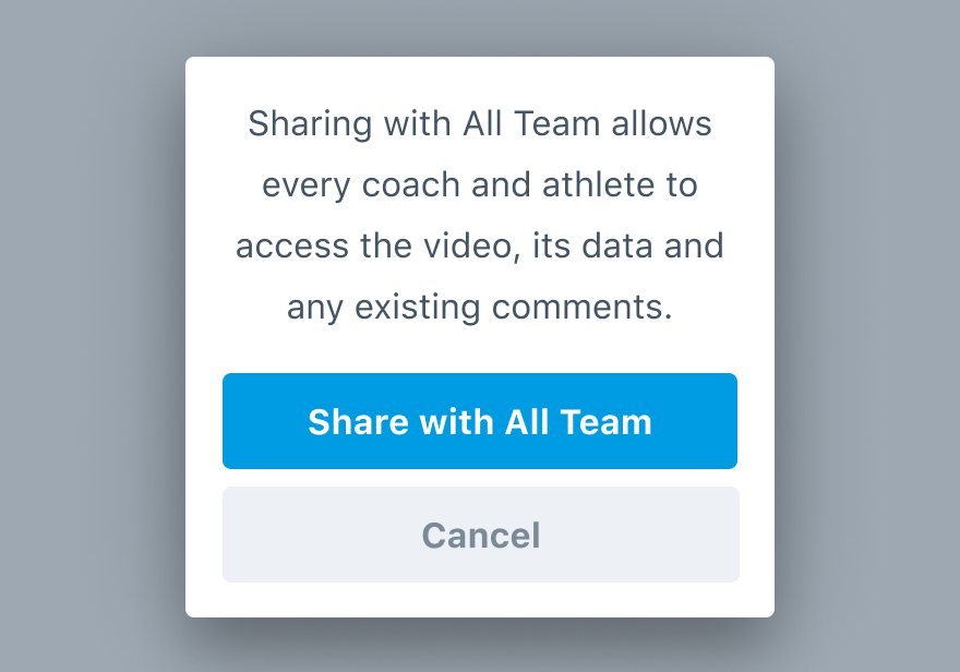
Dolist the action the user has chosen to take first.
Usage
Not Expected
An alert should never be a “next step” or part of a workflow’s logical progression. It should only appear when the action is seemingly complete.
Don'tuse it to provide a whole new task.
Doconsider the alert a follow-up rather than any sort of step.
Good for Errors
Alerts are ideal for an error they should know about before going anywhere else. Make it clear something didn’t go as planned and they can/should remedy.
Don't interrupt with an unrelated issue.

Douse the alert for errors they may not notice otherwise.
No Dismiss
Action or acknowledgement is required with all alerts—it’s why we removed the dismiss.
One of the options can be to cancel or “never mind”. We just want to make sure that decision to opt out is deliberate.
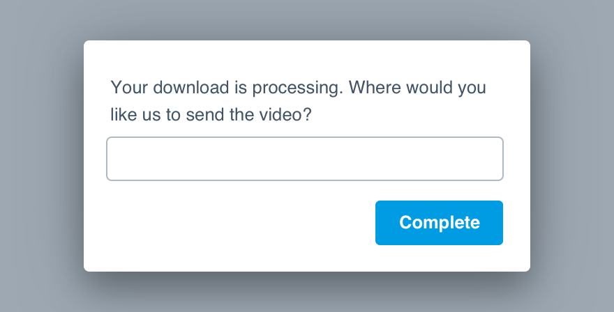
No Links
We shouldn’t distract from the actual thing they’re trying to do. If there are resources worth providing, direct them via text, but don’t give them an additional “out” via hyperlink.
Don'tlink off and prevent them from making the very important decision.
Domention resources only if they’d make a difference.
You could also risk the user interpreting a button as a way to that destination. (Not great when deleting.)
Microcopy
Body Only
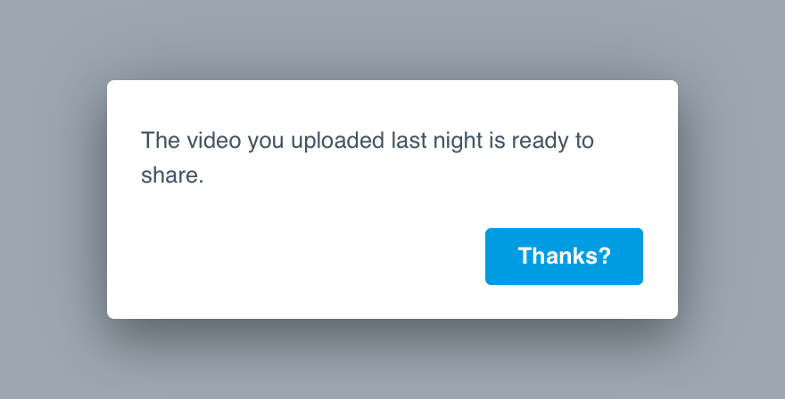
Unlike the modal, the alert has no title or subtitle. We jump straight to the body to ensure they read everything all at once.
Don'tbe cryptic and dance around the alert’s purpose.
Douse complete sentences and make sure the content flows into the button copy.
(And by “flow” we mean congruence.)
Content Length
The body of the alert should be no longer than 150 characters long. If you can make it shorter, even better. Just shoot for two lines max.
Get straight to the point and provide their options—don’t forget we just interrupted their workflow.
Don'twrite a novel explaining the cause and what they should do.
Dotell them what’s up and provide a course of action.
Buttons
The button should very clearly state its action. Avoid complete sentences, opt for a strong verb phrase instead. Title case always.
You can read more about button microcopy in our button guidelines.
Platform
| platform | notes |
|---|---|
| Web |
|
| Apple |
|
| Android |
|
| No guidelines exist for other platforms (yet). |