Hey there! This is the Uniform version 3 documentation site. If you’re looking for version 4, go here instead.
/
Overlay
Bring a second, related workflow into focus with a layered interface.
Like its cousins the modal and alert, the overlay is designed to float above content within the main interface. Treat it like a container for a secondary UI made up of other components.
Cases
It’s all a matter of how the overlay workflow relates to the main interface.
Primary: This overlay is a necessary step in navigating the main interface. It’s typically a full-blown workflow with a number of tasks and possible actions.
Behavior
The overlay has a couple of fun quirks. One is automatic, the other is up to you.
Sizing
The overlay is designed to fill 80% of the viewport, in both height and width. However, at 1024px it responds to fill the entire view. (That’s the same point at which our navbar changes, so it shouldn’t seem too weird.)
Dismiss
A dismissal method isn’t required, but you have options as to what would do the trick.
- Hitting the ESC key
- Clicking the scrim
- Clicking the dismiss—but you can’t have this without the rest of the header.
Mobile
Like the modal, design separate interfaces using the modal view. Reserve any interjection on mobile to the alert.
Usage
Header
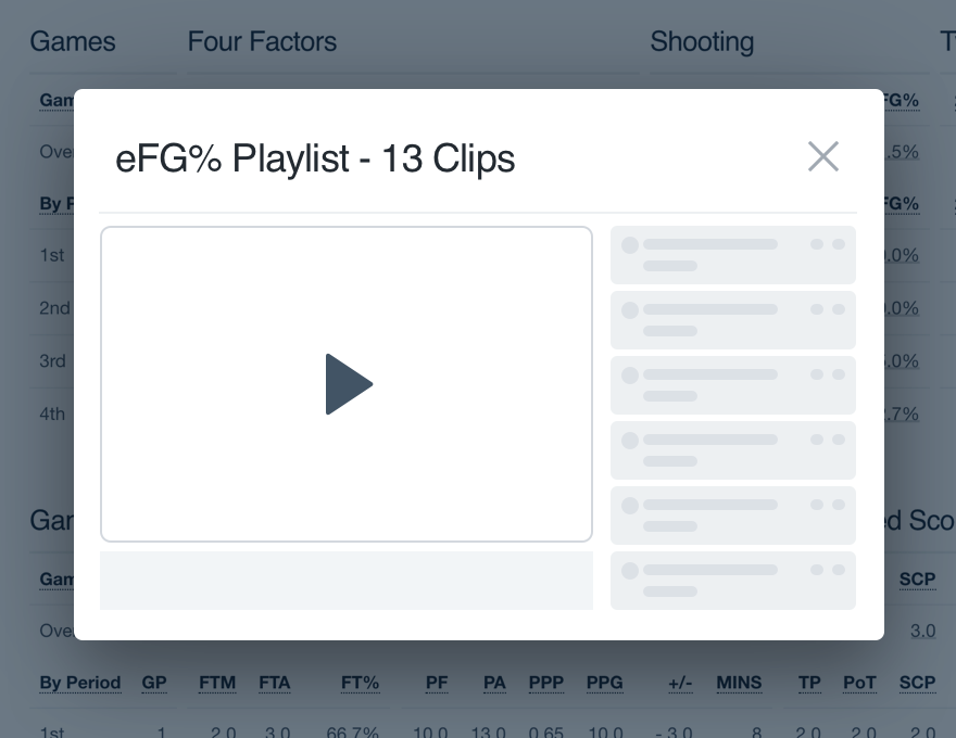
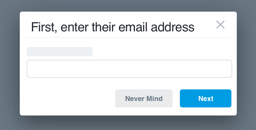
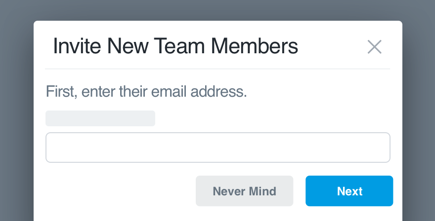
The overlay’s header is optional. If you choose to include the header, it comes with a title and dismiss. You can’t have one without the others!
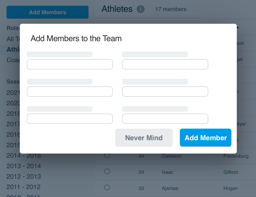
Don'tavoid a header by incorporating a title into the content.
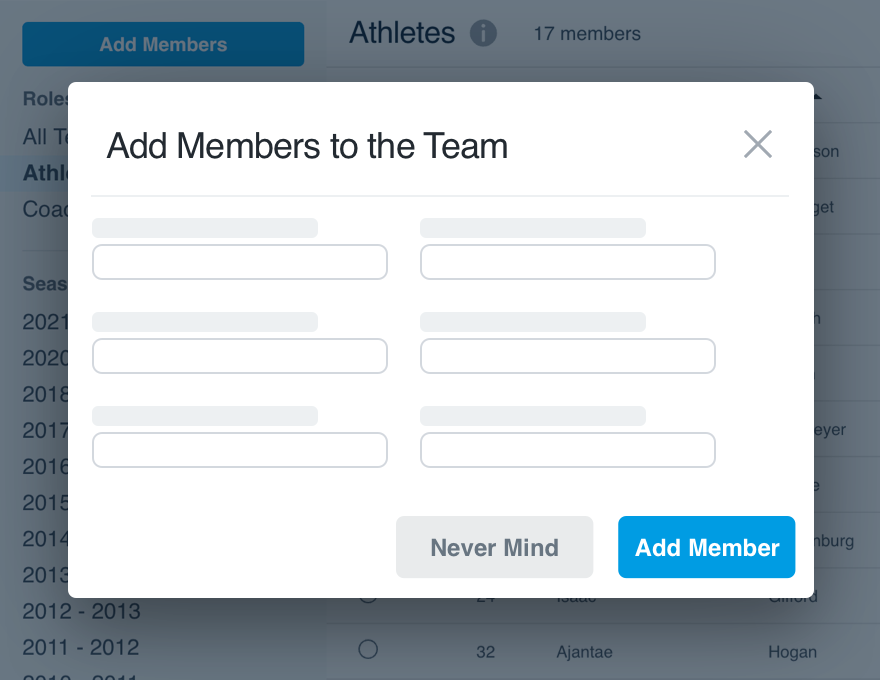
Doinclude a header if the title and/or dismiss would benefit the workflow.
Imported Content
All imported content should come with its natural environment, regardless of the main interface environment. If there is no “natural” environment, mirror that of the main interface.
Don'trely on the environment of the main interface for all imported content.
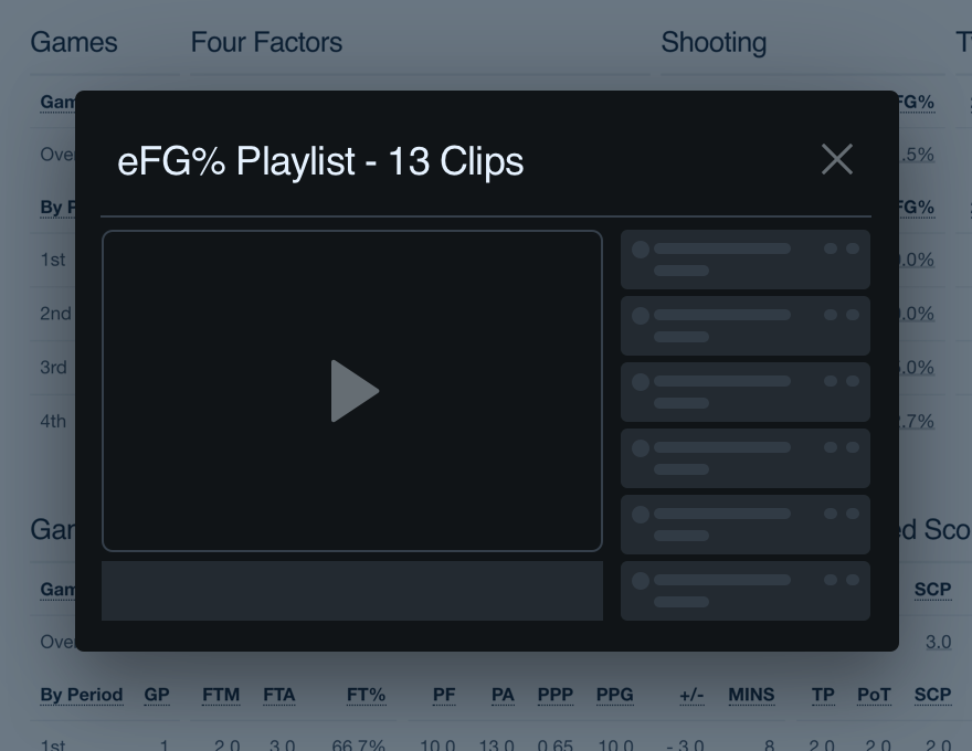
Doinherit the environment relative to the overlay’s content.
Microcopy
Titles
If you include a title, make sure it explains what they’re seeing or doing in the overlay. Keep it brief with keywords at the front, title case. Our label guidelines can help.
Don'tuse the title as a means of onboarding the user to that workflow.
Doclarify what the triggered overlay allows the user to do.
Buttons
If your overlay features any buttons, each should very clearly state its action. Avoid complete sentences, opt for a strong verb phrase instead. Title case always.
You can read more about button microcopy in our button guidelines.
Platform
| platform | notes |
|---|---|
| Web |
|
| Apple |
|
| Android |
|
| No guidelines exist for other platforms (yet). |