Hey there! This is the Uniform version 3 documentation site. If you’re looking for version 4, go here instead.
/
Floating Action
Let users perform a primary action on mobile devices.
The floating action button is designed solely for primary actions on mobile devices.
Size
The floating action has two sizes, medium and large.
Medium: Only use for mobile devices.
Position
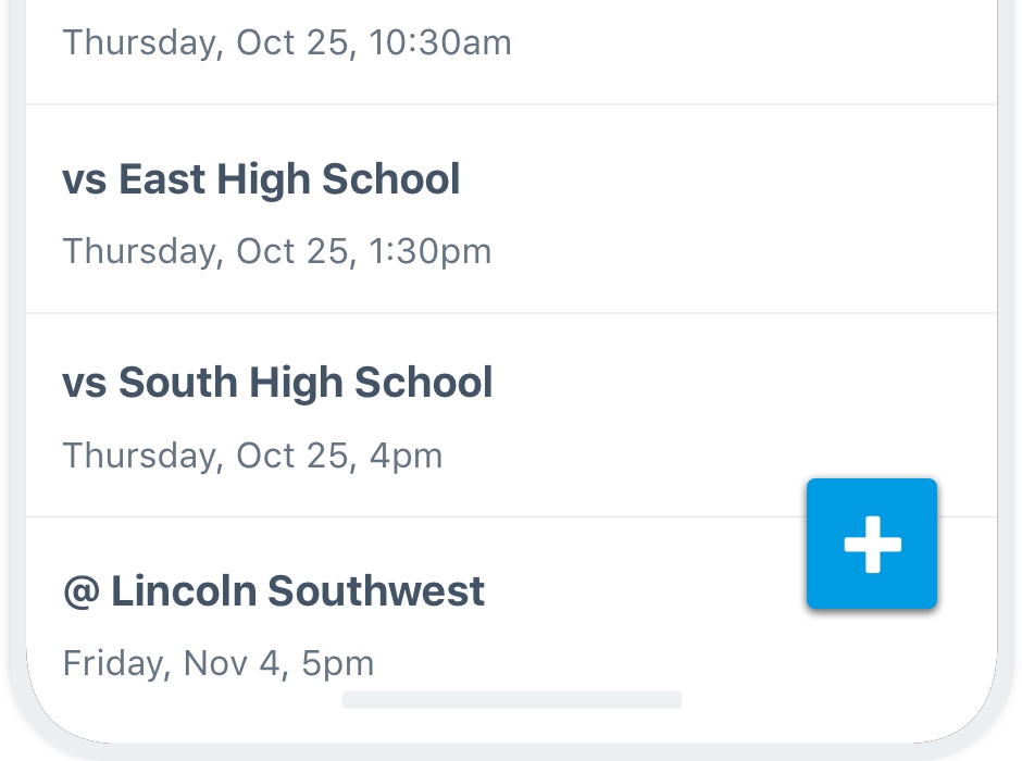
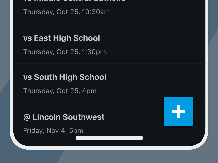
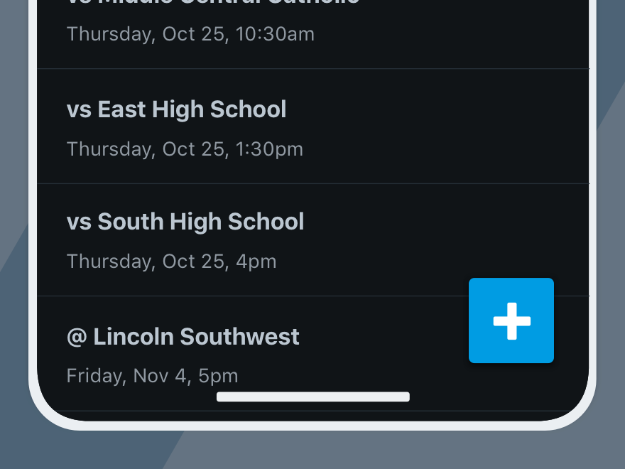
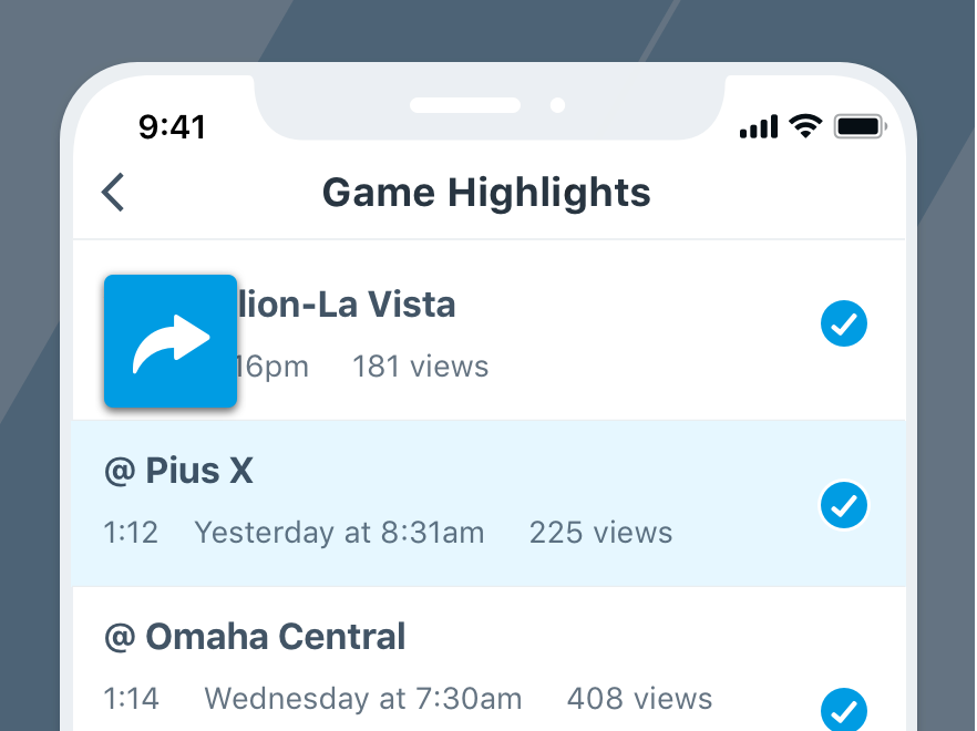
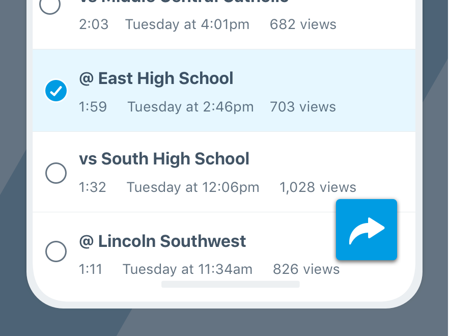
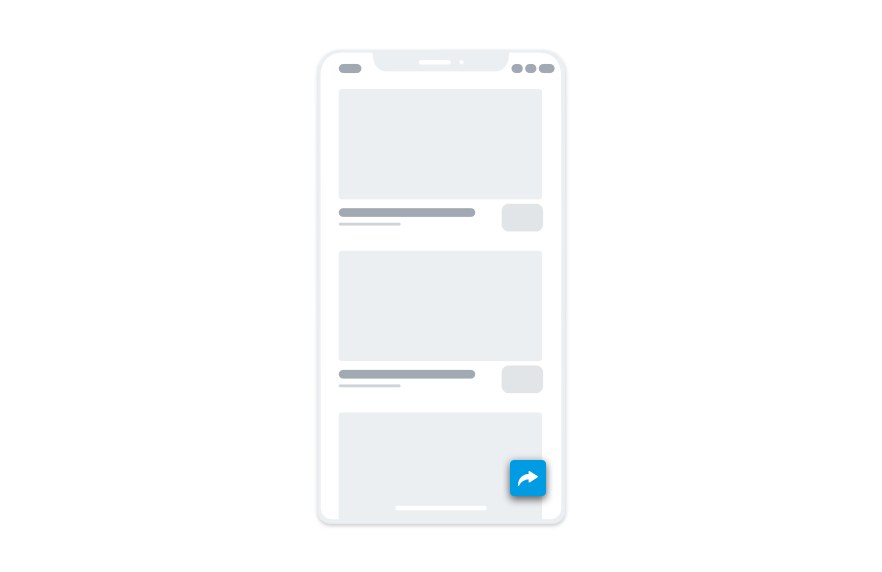
- Location: The floating action button (FAB) appears at the bottom right of the interface in which the action takes place.
- Elevation: Consistent with our stack order, the FAB has a level 2 elevation.
Icon-Only
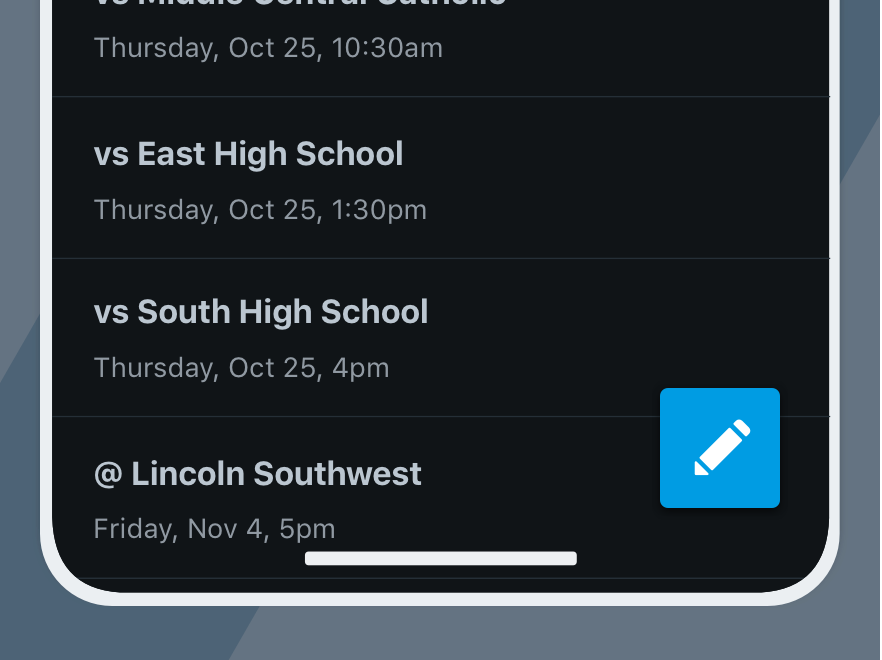
This button is always icon-only, and should never have a label used in its place.
Don'tuse a label to explain an action.
Do use icons for adding or sharing.
Actions
The floating action button (FAB) should only initiate an action. Never use it to complete a workflow.
Don'tuse the button to modify or save content.
Douse it to initiate something constructive.
Avoid using the FAB for bulk or destructive actions and instead place them elsewhere to avoid confusion.
Don'tdelete or remove content.
Doplace secondary actions in other areas of the interface.
Important, primary actions make use of our action color, which demands a lot of attention. It’s best to limit its use to just one.
Don'tuse for multiple actions in an interface.
Doreserve for the single, most important action.
Position
The floating action button should remain fixed and not be placed haphazardly.
Don'tplace the button overtop meaningful content.
Dokeep its placement consistent to the bottom right.
Mobile-Only
As exciting as this button may be, avoid using it for anything other than mobile applications.

Don'tuse the floating action button for web-only workflows.
Douse it for Apple and Android devices.
Platform
| platform | notes |
|---|---|
| Web |
|
| Apple |
|
| Android |
|
| No guidelines exist for Windows (yet). |