Hey there! This is the Uniform version 3 documentation site. If you’re looking for version 4, go here instead.
/
Data Table
Organize static data for easy consumption and understanding.
The data table allows both Hudl and the user to clearly display large sets of information for the sake of visualizing data.
This goes beyond box scores and stats reports to any instance where the numbers could be accessed, analyzed and acted upon—including rosters, schedules and payment history.
Elements
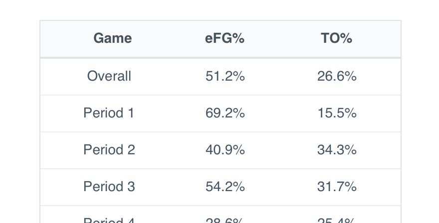
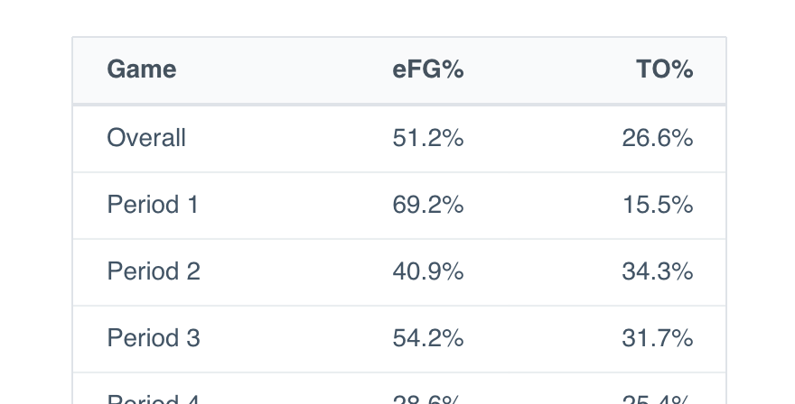
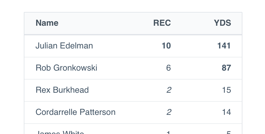
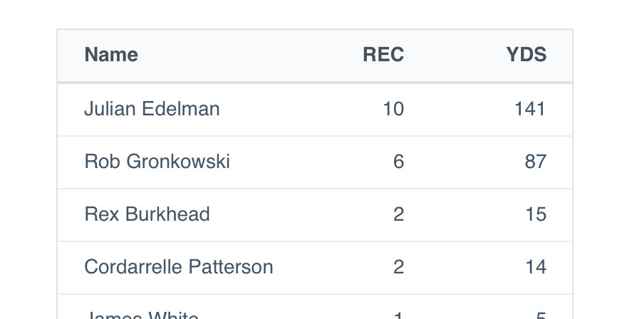
Every data table is comprised of one or more headers, rows, columns, cells and the occasional footer.
| G | MP | FG | FGA | FG% | |
|---|---|---|---|---|---|
| Team | 75 | 17985 | 2944 | 6480 | .454 |
| Team/G | 243.0 | 39.8 | 87.6 | .454 | |
| Lg Rank | 4 | 20 | 20 | 18 | |
| Year/Year | 0.4% | 2.9% | -1.4% | +.019 |
Header: Clearly classifies the contents of that individual row or column.
Size
Cell size is informed by content size. Consider view density and the amount of content when choosing between the four available options.
| Name | Jersey | Position | Height | Weight |
|---|---|---|---|---|
| Rawle Alkins | 20 | SG | 6'5" | 225 lbs |
| Chandler Hutchinson | 15 | SF | 6'7" | 197 lbs |
| Zach LaVine | 8 | PG | 6'7" | 200 lbs |
X-Small: For super dense interfaces, not super dense tables.
Style
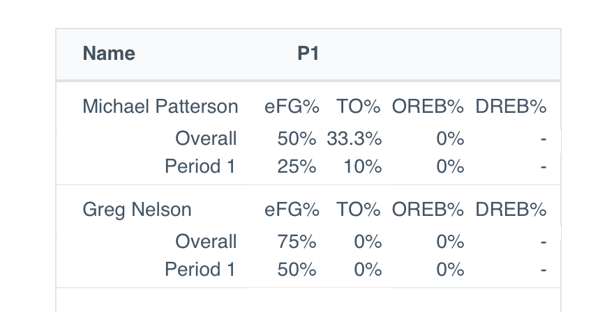
In some cases, like a very dense and/or long table, use styling to break up the content and make things more digestible.
| G | MP | FG | FGA | FG% | |
|---|---|---|---|---|---|
| Team | 75 | 17985 | 2944 | 6480 | .454 |
| Team/G | 243.0 | 39.8 | 87.6 | .454 | |
| Lg Rank | 4 | 20 | 20 | 18 | |
| Year/Year | 0.4% | 2.9% | -1.4% | +.019 |
Default: With tons of content packed closely together, dividers help the user separate individual pieces of info.
Functions
While the data itself is static, the table can be manipulated to make consumption a little easier.
| Name | Jersey | Position | Height | Weight |
|---|---|---|---|---|
| Rawle Alkins | 20 | SG | 6'5" | 225 lbs |
| Chandler Hutchinson | 15 | SF | 6'7" | 197 lbs |
| Zach LaVine | 8 | PG | 6'7" | 200 lbs |
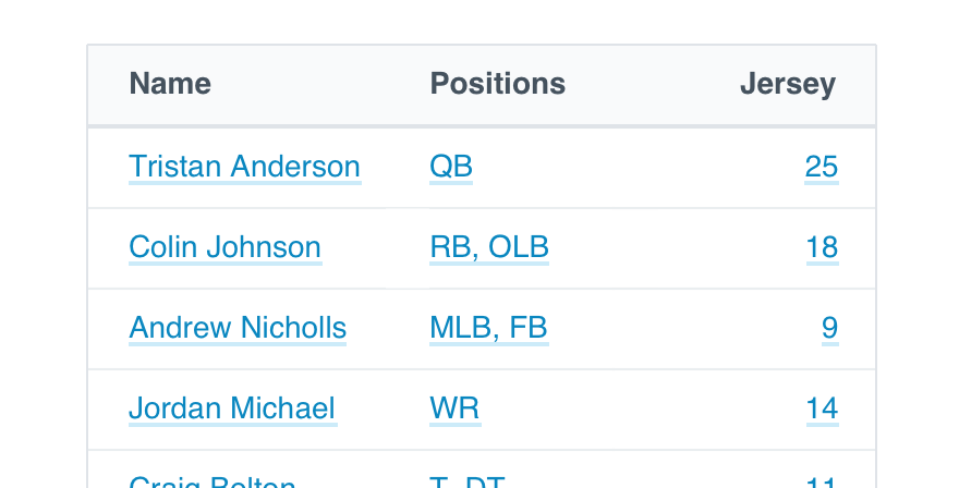
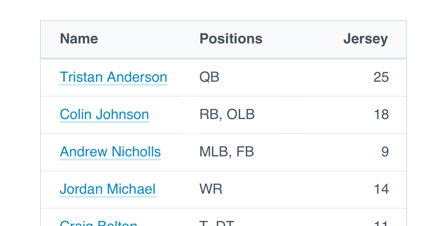
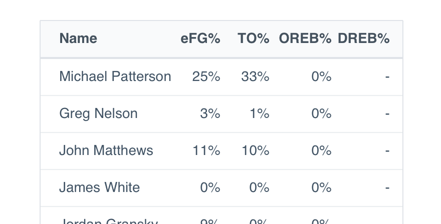
Fixed Header: If the table is comprised of many rows, use a fixed header to help the user keep tabs on what’s what.
Mobile
Uniform data tables should only be used on desktops. Instead, when designing for mobile use the table view to accurately display information if it makes sense. Data tables will be displayed in single-column views, so in cases when it is important to display more than one column of information at a time, consider designing a separate view with the information in a different presentation, like a list.
Usage
Alignment
Data table content should never be centered. For all names, titles and other text, align left. Numbers stay on the right.
Centered content becomes more difficult to scan as the table becomes more dense. Give the user a line, however (in)visible, to track alongside.
Don'tcenter the content in every cell, regardless of table size.
Doalign left or right depending on content type.
Links
Numbers and text may be linked to connect content within Hudl, like a video, playlist or highlight. Use any type except button.
Just don’t go too crazy with linked content. Wherever you take the user should tie directly to the table they’re studying. Don’t totally change context with the option to check a tutorial or contact support.
Don'tlink to several external sources and interrupt the experience.
Dolink to any Hudl content feeding that specific table.
Text Formatting
Bold text is reserved for headers, nothing in the cells. Aside from that, you shouldn’t have to format the text at all. Too many different styles and the whole table becomes illegible.
Don'tmix formats in an effort to call out key information.
Dofeature data that exists well on its own.
Multiple Lines
Wrapping may happen, but never force a line break. Stick to the microcopy guidelines below and you should be safe with a single line.
Don'tuse line breaks to put tons of content in a single cell.
Dokeep things brief to avoid natural breaks.
Selection
Should your table include selectable content, the select mark will indicate the user may take action on multiple items.
Selectable content is the only time a hover state should be applied to the data table.
Microcopy
Headers
Like other UI labels, table headers should adhere to title case, no complete sentences and definitely no punctuation.
Abbreviations are encouraged in the case of a tight squeeze—again, no periods. Just stick to the first three letters of the word itself. If the full meaning is lost, use the three letters that makes things most clear.
Don'tget too detailed with what’s in the table.
Dokeep things tight and tidy.
Cell Content
Each cell should only contain one piece of data. Default to spelling things out, but if space becomes an issue, feel free to abbreviate.
Numbers should always be cardinal, no 1st, 2nd, etc. Use whole numbers whenever possible, and be sure to include % anytime it is a true percentage.
Display all phone numbers with hyphens to make the full string more legible.
Complete sentences should never appear as cell data.
Null States
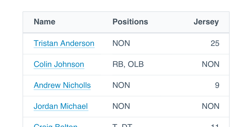
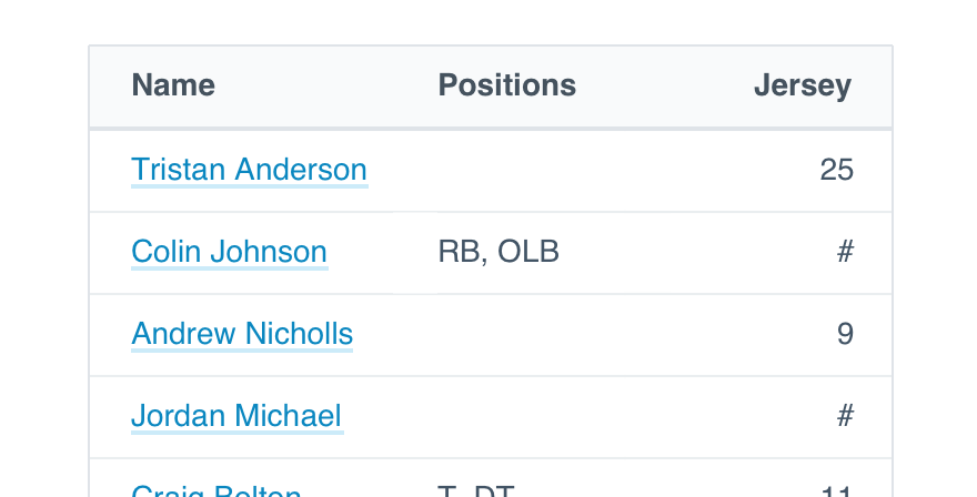
If a null state appears because the user didn’t complete that information, leave the entire cell blank. It’s the clearest way to indicate nothing has been added.
Should a null state be the result of an incomplete calculation—numbers only—use a double hyphen. If the calculation would be a percentage, include that symbol, as well.
Don'tcreate a null state that could be confused for content.
Doprovide appropriate clues for what content belongs.
If the cell is simply not applicable to that user or their current workflow, opt for “n/a”.
Only use the number 0 for that actual sum.
Platform
| platform | notes |
|---|---|
| Web |
|
| Apple |
|
| Android |
|
| No guidelines exist for Windows (yet). |