Hey there! This is the Uniform version 3 documentation site. If you’re looking for version 4, go here instead.
/
Checkbox
Let users pick one or more options from a short list.
Checkboxes provide a natural and familiar way to indicate preference, allowing users to choose more than one option at a time. Use checkboxes with five or fewer options displayed simultaneously.
Size
Checkbox size (x-small, small, medium, large) and the form’s density (standard, compact) are dictated by the form modifier component. Check those guidelines for more detailed recommendations.
State
A checkbox’s state depends on the interaction itself or a submission error.
The actual focus state is sorted for you, so anyone navigating via keyboard or screen reader is set. A disabled checkbox prevents the user from interacting with a field until certain conditions are met. It’s a good way to prevent invalid submissions, but should be used sparingly.
Mobile
Use Uniform checkboxes for both Apple and Android devices. Checkboxes should be used within forms. If there are more than six options, display the options in a separate table view.
When selecting multiple items to perform an action, use a select mark in place of the checkbox.
Usage
Layout
Limit yourself to one field per row.
Disabled States
An alternative to disabled states is hiding the field until it becomes relevant. It reduces cognitive load and creates a much clearer path to completing the form—especially as fields change with preceding selections.
Microcopy
Labels
A label should clearly and concisely describe the field’s purpose with no more than a few words.
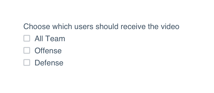
Don'tmake the label a complete sentence telling the user what to do.
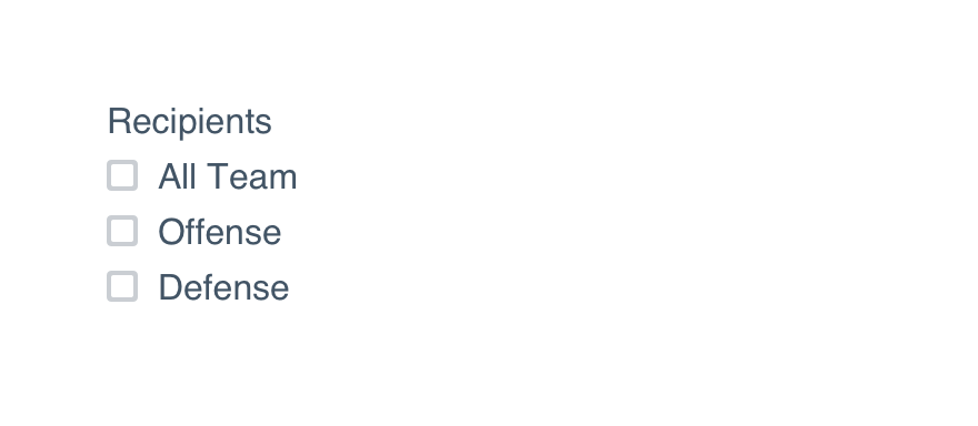
Doname exactly what belongs in that field.
Check UI label guidelines for more detail on case and punctuation.
For required fields, place an asterisk at the beginning of the label. There’s no need to spell out ‘required’ and extend the length of that label.
Platform
| platform | notes |
|---|---|
| Web |
|
| Apple |
|
| Android |
|
| No guidelines exist for Windows (yet). |