Hey there! This is the Uniform version 3 documentation site. If you’re looking for version 4, go here instead.
/
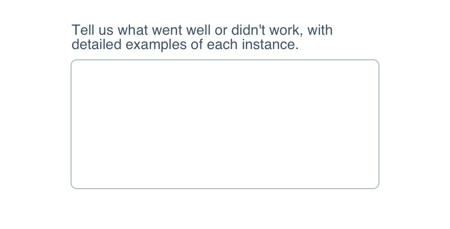
Text Area
Let users enter multiple lines of text.
When you expect a large amount of text, perhaps in response to an open-ended question, qualitative feedback or notes on a game, opt for the text area over an input.
Size
Text area size (x-small, small, medium, large) and the form’s density (standard, compact) are dictated by the form modifier component. Check those guidelines for more detailed recommendations.
State
A text area’s state depends on the interaction itself or a submission error.
Default: The actual focus state is sorted for you, so anyone navigating via keyboard or screen reader is set.
Usage
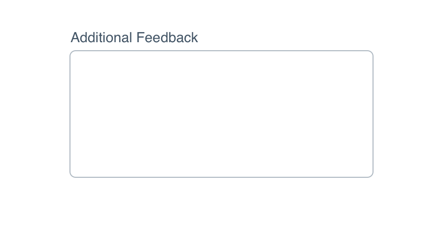
Labels
Labels are mandatory on all fields, but they don’t always have to be visible. Even hidden labels make a difference in accessibility.
Labels should always appear left-aligned above the field. They should provide enough direction that no placeholder copy is needed.
Layout
Limit yourself to one field per row.
Disabled States
An alternative to disabled states is hiding the field until it becomes relevant. It reduces cognitive load and creates a much clearer path to completing the form—especially as fields change with preceding selections.
Microcopy
Labels
A label should clearly and concisely describe the field’s purpose with no more than a few words.
Don'tmake the label a complete sentence telling the user what to do.
Doname exactly what belongs in that field.
Check UI label guidelines for more detail on case and punctuation.
For required fields, place an asterisk at the end of the label. There’s no need to spell out required and extend the length of that label.
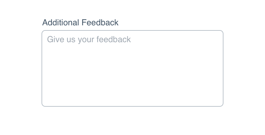
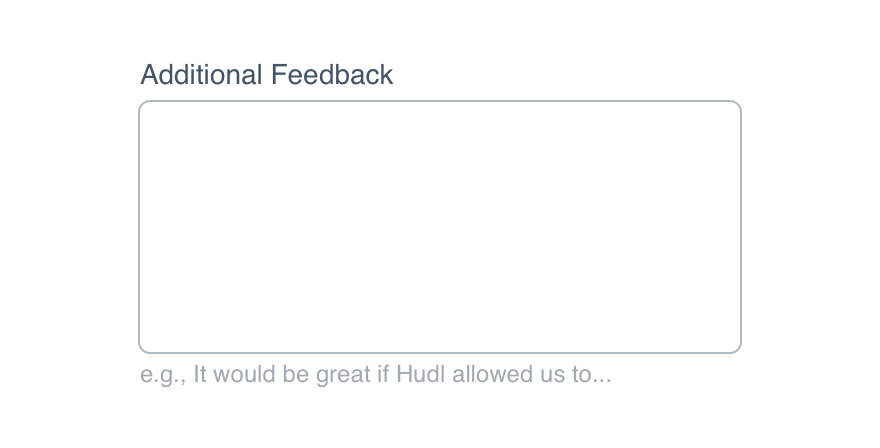
Placeholders
Placeholders are suggested but not always necessary. They shouldn’t repeat the label outright or insert the label into a CTA (e.g., “Enter your email address”).
Don'trepeat the label for the sake of having a placeholder.
Doprovide more instruction with a sample entry.
They can provide an example or preferred format of the content we’re looking for, like a date or phone number.
Placeholders should follow non-label text guidelines, but don’t put punctuation on the end.
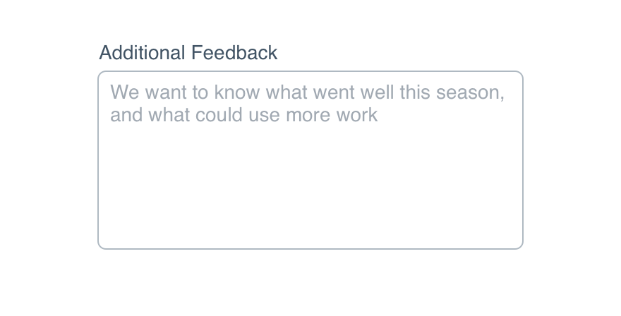
Help Text
Help text can provide details not included in the label or placeholder, like certain criteria to meet for a valid submission.
Don'tuse the help text to provide a sample entry.
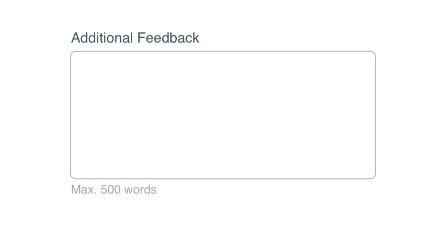
Doexplain what restrictions might exist in that field.
In the case of an error, the help text should be updated explaining why an error occurred and how it’s fixed.
Platform
| platform | notes |
|---|---|
| Web |
|
| Apple |
|
| Android |
|
| No guidelines exist for Windows (yet). |