Hey there! This is the Uniform version 3 documentation site. If you’re looking for version 4, go here instead.
/
Note
Provide context relevant to one piece of an interface.
The contextual note is meant to further explain a given task or piece of content. It’s not important enough to warrant an interruption, but should serve as a heads-up worth knowing then and there.
For information related to an entire interface, check the notice. And if something comes up as the result of a workflow, use the toast.
Size
Relevant to the note’s size are the sizes of both the icon and text. Consider location and interface density as you choose.
This information will only appear for verified recruiters, not the general public.
Small: Micro text and the small icon, ideal for dense interfaces where the note should not compete for attention.
Type
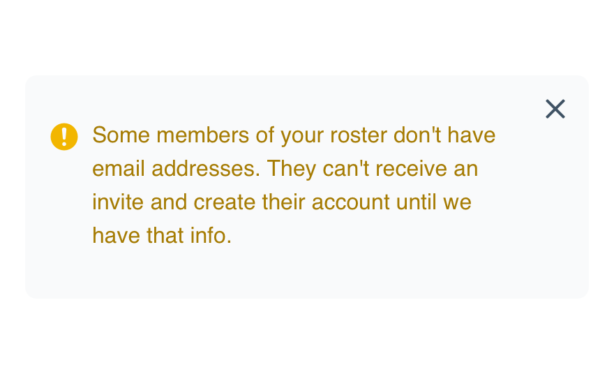
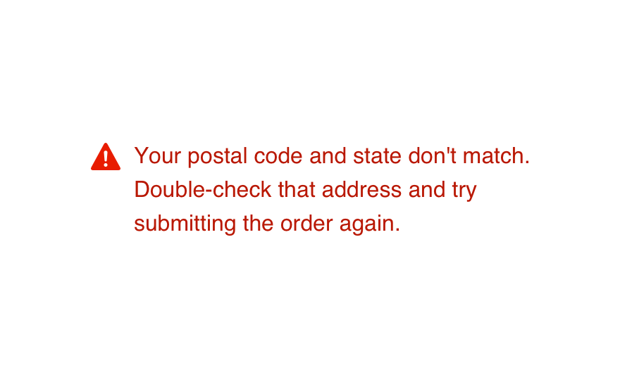
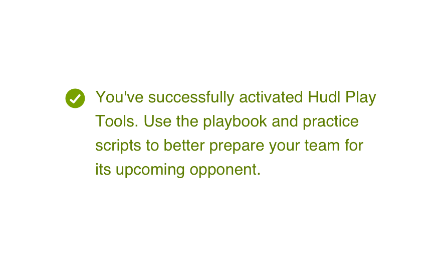
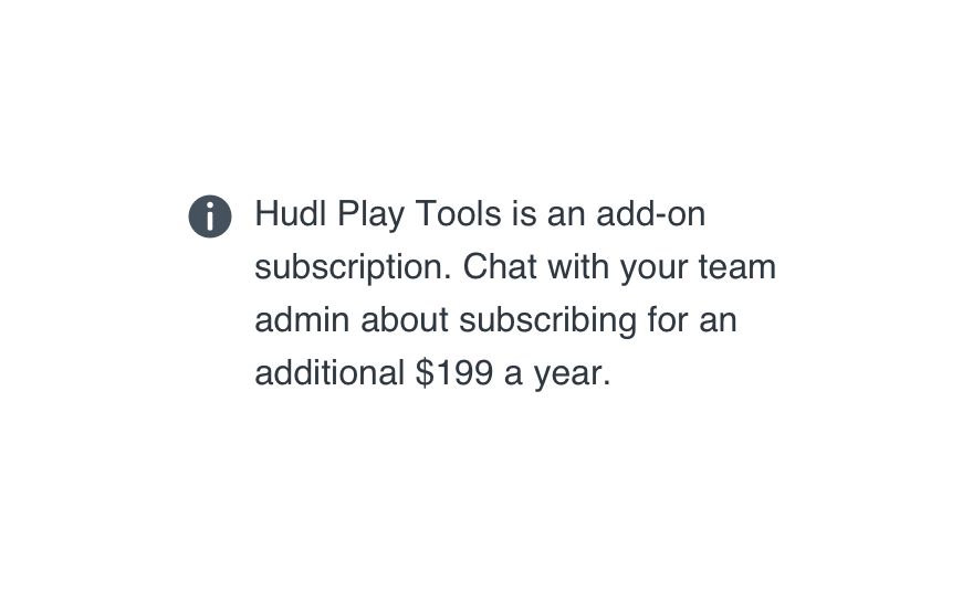
The four note types correspond directly to our feedback icons.
We'll use this email address and cell phone number to send you updates related to your account.
Information: Use this for a message that won’t really affect a given task, more of a neutral FYI.
Mobile
Small and medium notes work well on mobile phones, but reserve the large size for tablet views only.
Usage
Non-Dismissible
Every note is either ever-present or removed by righting a wrong.
Don'tallow them to remove context.
Dodisplay the note for as long as the content is relevant.
Relative Importance
Most notes should serve as subtle hints and updates in the interface, tied directly to just one section.
Don'tuse it to introduce an entire page or discuss a feature’s purpose.
Docarefully consider how helpful the note would be.
Location
Where a note lives can make all the difference in whether or not its seen and how effective the message is.
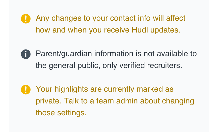
Don'tpresent multiple notes together.
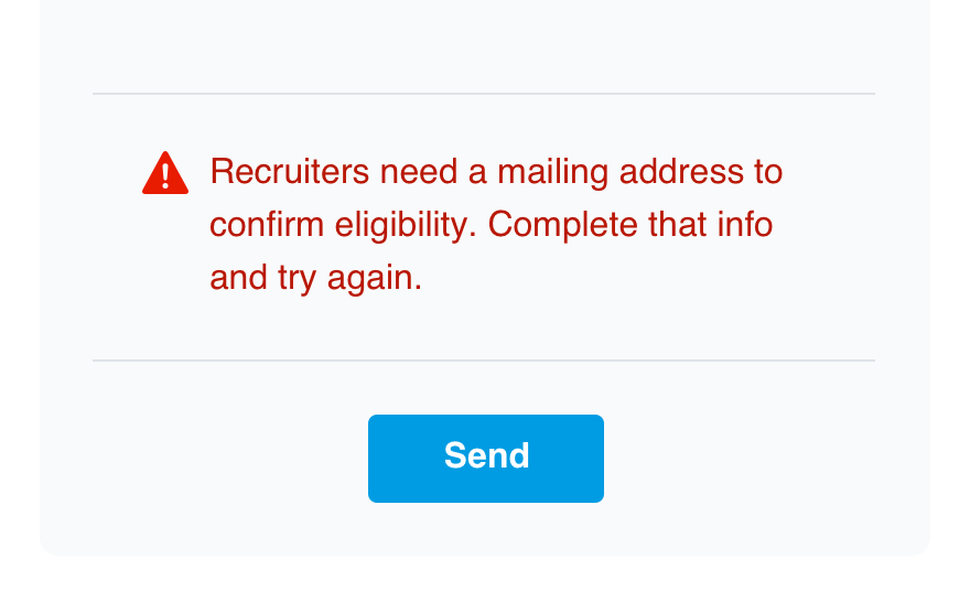
Doplace the note right next to whatever it’s discussing.
Links
Feel free to hyperlink text in information and warning notes for the sake of providing more details. Just make sure the linked resource is relevant and valuable enough to distract from the current task.
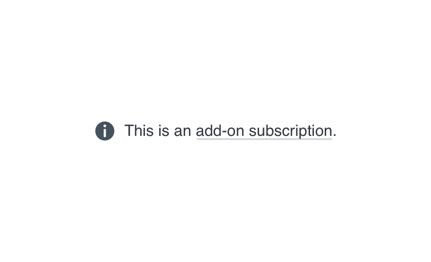
Don'tmake the link mandatory or use it in place of the note itself.
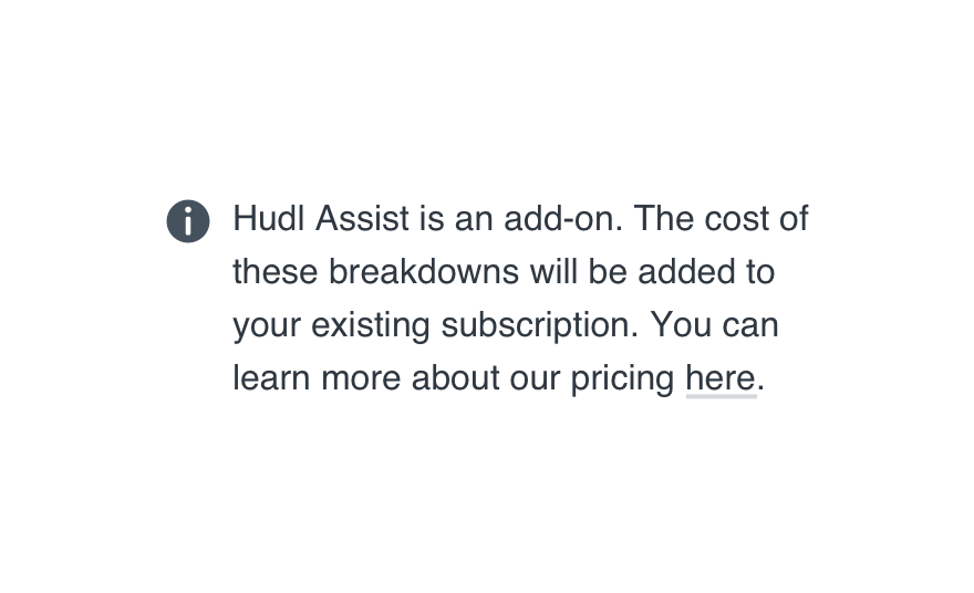
Doframe it as supplementary to what’s mentioned in the note.
Styling
Like tooltips, you should only bold or italicize one phrase per note—never an entire sentence, and only if the styling is absolutely necessary.
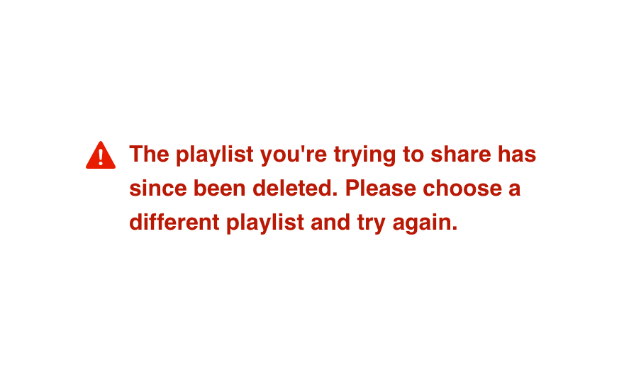
Don'tstyle an entire note just to grab a user’s attention.
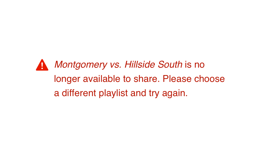
Douse styling for emphasis or clarification.
Microcopy
Content Length
Each note should be no longer than 170 characters. If you can make it shorter, great. Any longer and you risk interrupting their flow.
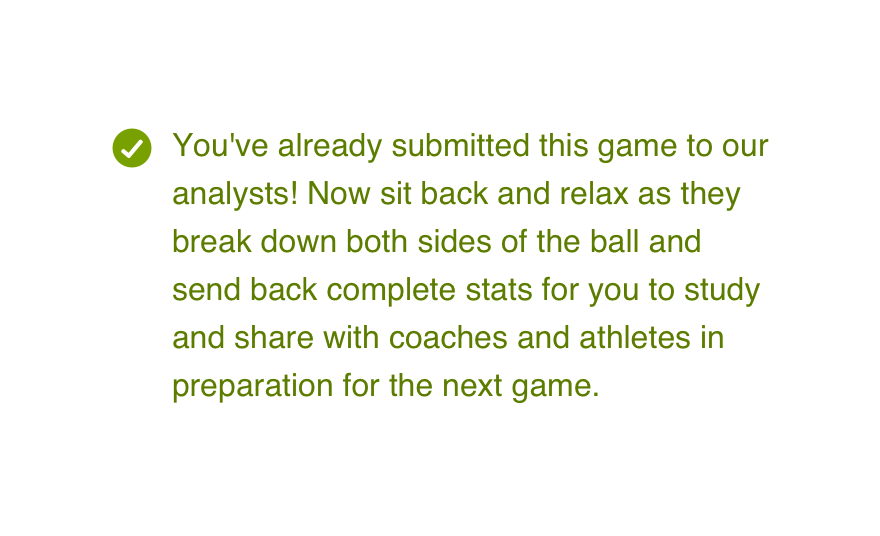
Don'tramble when hyperlinked text is always an option.
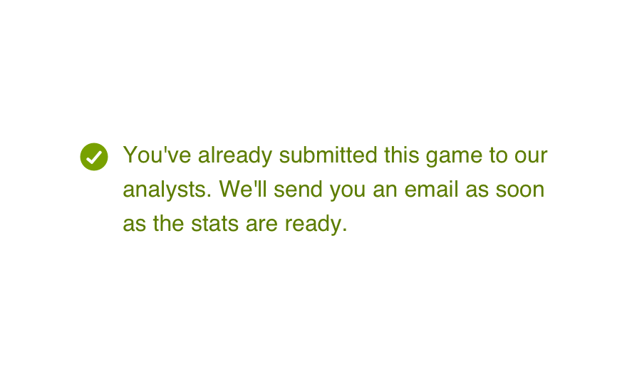
Doget to the point with only the most relevant info.
Whose Interface?
Check these guidelines and remember “we’re” always talking to a “you”.
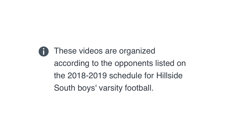
Don'twrite in third-person and make things weirdly impersonal.
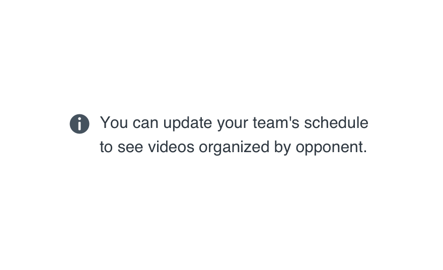
Dosound like one human talking to another.
Body Only
Regardless of what purpose the note serves (message or status), you’ll never need a title or subtitle.
Messages should be written as complete sentences with proper punctuation.
Statuses should be no longer than three words, free of punctuation.
Both should be sentence case.
Platform
| platform | notes |
|---|---|
| Web |
|
| Apple |
|
| Android |
|
| No guidelines exist for other platforms (yet). |