Hey there! This is the Uniform version 3 documentation site. If you’re looking for version 4, go here instead.
/
Toast
Briefly display instant feedback in a layered banner.
Use toasts to deliver a timely, straightforward response to an action.
If the message would be more effective before the task, consider a notice or note instead.
Type
Information: The information toast presents a neutral update. Use this if effects aren’t immediate, like if time or another user is required to complete the action.
States
Web
All toasts appear at 100% and immediately fade to 90% for a four-second hold before automatically dismissing with a three-second fadeout.
The auto-dismiss timeline gives users a full seven seconds to hover and hold the toast at 100%.
Critical toasts do not auto-dismiss. We need the user to acknowledge the problem being communicated.
Apple
Toasts will auto-dismiss after three seconds if you choose to make it timed. If you don’t, the toast must be deliberately dismissed with a single tap or swipe.
Usage
Action Buttons
A dismiss is included on all toasts, but you can also include one additional action styled as a small subtle button.
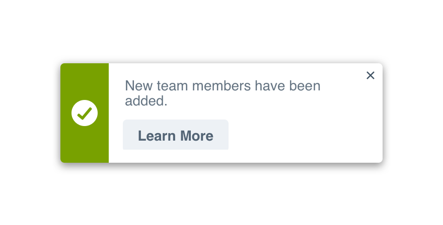
Don'tadd an irrelevant action just to have one.
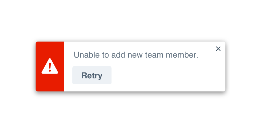
Domake the action a clear next step relevant to the content.
All critical toasts require an action, usually Learn More.
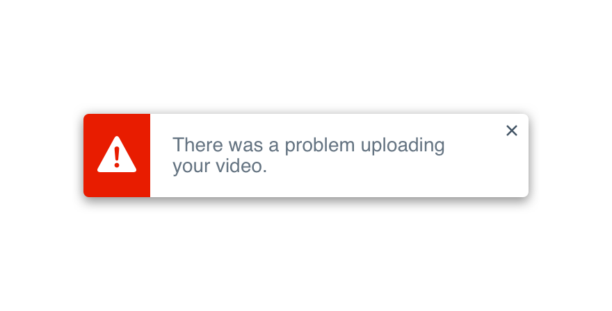
Don'tabandon the user to solve the problem themselves.
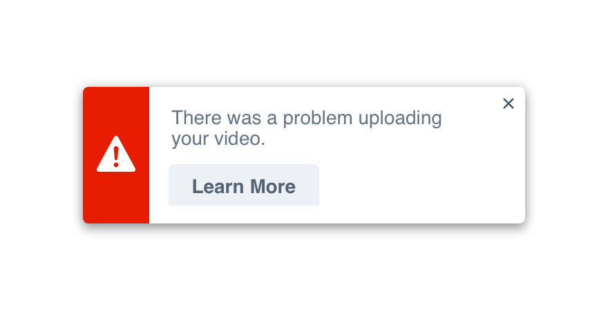
Dohelp them understand what went wrong and offer a solution.
Position
Position is handled for you, regardless of platform. On web, the toast will appear in the bottom right corner. On Apple, it’s positioned along the top of the screen.
For the time being, stick to displaying one toast at a time.
Microcopy
Case & Punctuation
Toasts follow the non-label text guidelines. They use sentence case with appropriate punctuation.
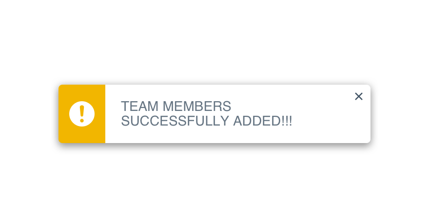
Don'tyell at the user with caps lock or crazy punctuation.
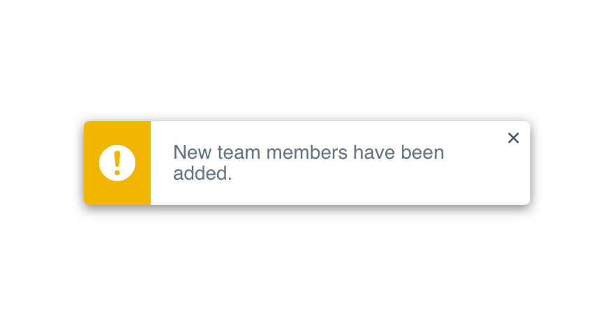
Douse complete sentences followed by a period.
Content Length
Keep the content readable at a glance—no more than 60 characters long. Put keywords at the front.
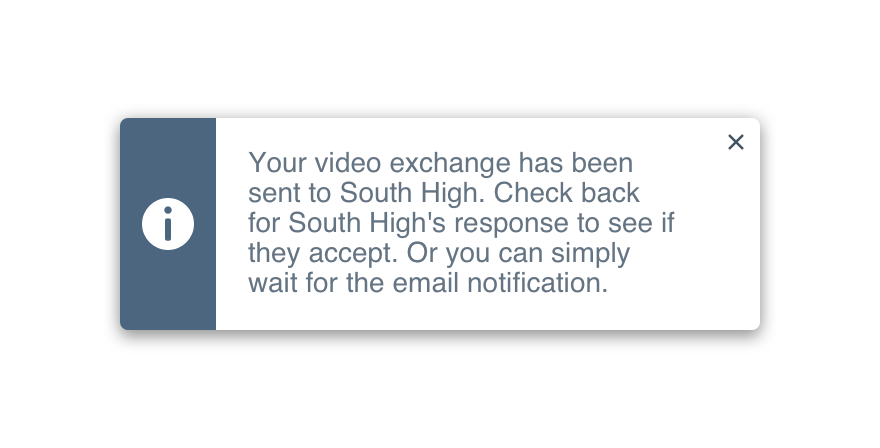
Don'toverwhelm the user with too many details.
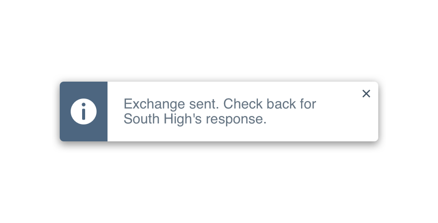
Dokeep things brief with only the most important info.
Titles
Given a toast’s size and the scope of information provided, it should never have a title.
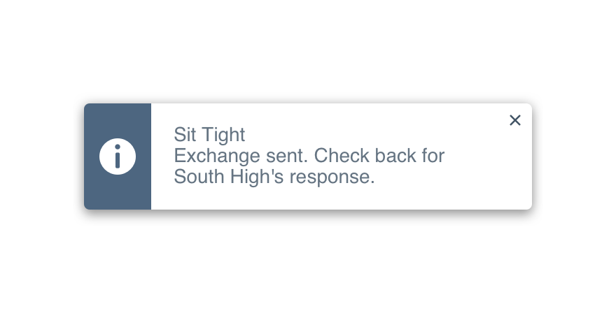
Don'ttake up valuable real estate with unnecessary copy.

Doload the content with keywords to make scanning easy.
Action Buttons
Try limiting the action to a single verb, ideally one of the following five: Undo, Retry, View, Share or Learn More.
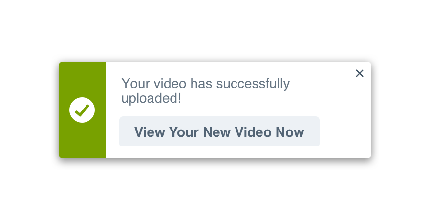
Don'tmake button labels complete sentences.
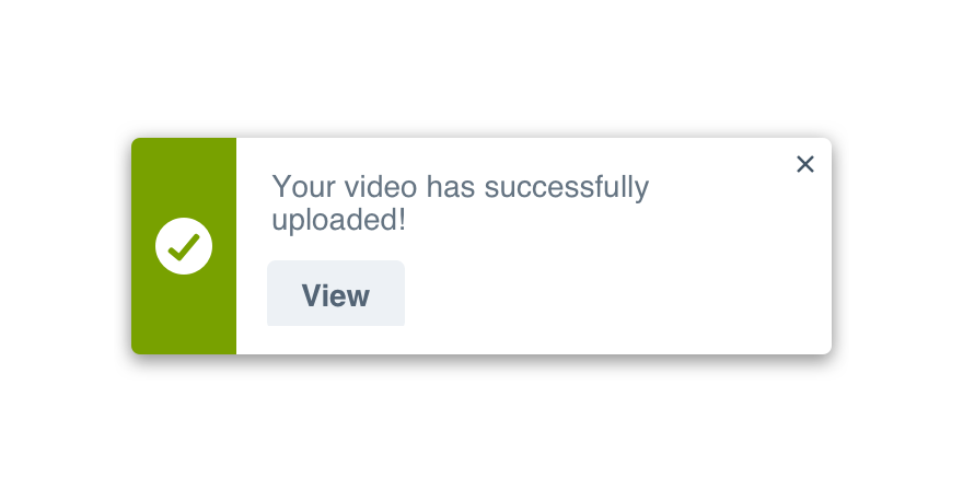
Dokeep things simple with a single verb.
Platform
| platform | notes |
|---|---|
| Web |
|
| Apple |
|
| Android |
|
| No guidelines exist for other platforms (yet). |