Hey there! This is the Uniform version 3 documentation site. If you’re looking for version 4, go here instead.
/
Notice
Display important information specific to an interface.
Use the page notice to deliver a timely message regarding the entire interface, not just one section or task.
If the information does pertain to just one section, use a note. (And for immediate feedback as the result of a workflow, go with a toast.)
Type
All page notices are displayed in line, fixed to the top of the primary content area of the given page.
Hudl Assist has added 24 credits to your account
Submit any of this season's game or opponent video to have it broken down for you and sent back within 24 hours.
Information: The information notice presents a neutral update. Use this to provide additional info that doesn’t require any action.
Style
Page Notices have two different styles, standard and minimal.
Hudl Assist has added 24 credits to your account
Submit any of this season's game or opponent video to have it broken down for you and sent back within 24 hours.
Standard: The standard notice is the default choice for any page-level communication.
State
All notices appear as soon as the page loads. They should remain dismissable either with an actual dismiss or by completing the action listed. All notices (except for critical) should permanently disappear once they’ve been dismissed.
Critical notices will disappear when dismissed, but only for that session. If the action has not been completed, the notice will reappear on the next page load.

Don'tforce notices to persist without the ability to dismiss.
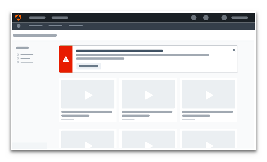
Doinclude a way for users to remove the notice.
Mobile
Space is of a premium when designing notices for mobile devices. Stick to only using the minimal style.
Usage
Actions
Every critical notice should include an action to help the user solve their issue. The action itself is optional on all other notices. Just be sure to weigh the value it may (or may not) add.
Position
A notice is always positioned beneath the navbar within the primary content area of the given page. It should span the full width of the page until the natural max-width is achieved.
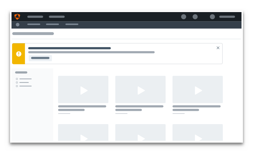
Don'tposition a page notice above a sidebar or side panel.
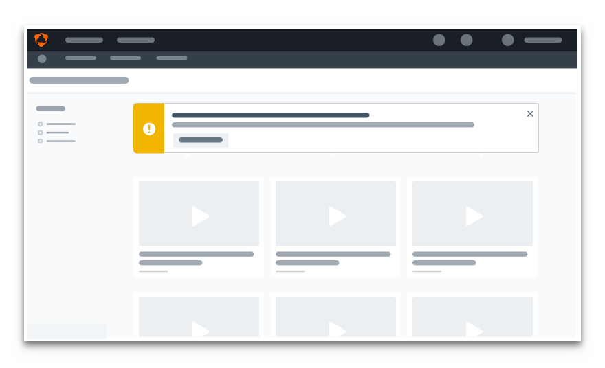
Dokeep a notice in line with the primary content area.
Microcopy
Case & Punctuation
Notices follow our non-label text guidelines—use sentence case with appropriate punctuation.
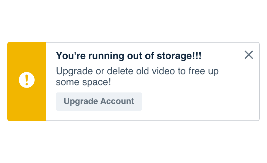
Don'tuse crazy punctuation to level up the message.
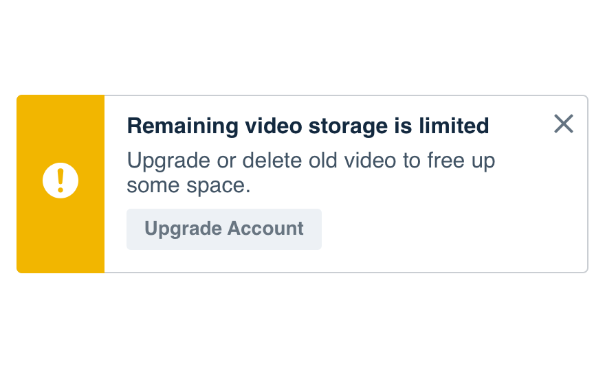
Douse complete sentences followed by periods.
Content Length
Make the content readable and don’t go overboard—just be sure it’s longer than the title. Keep it brief with the most important info at the front.
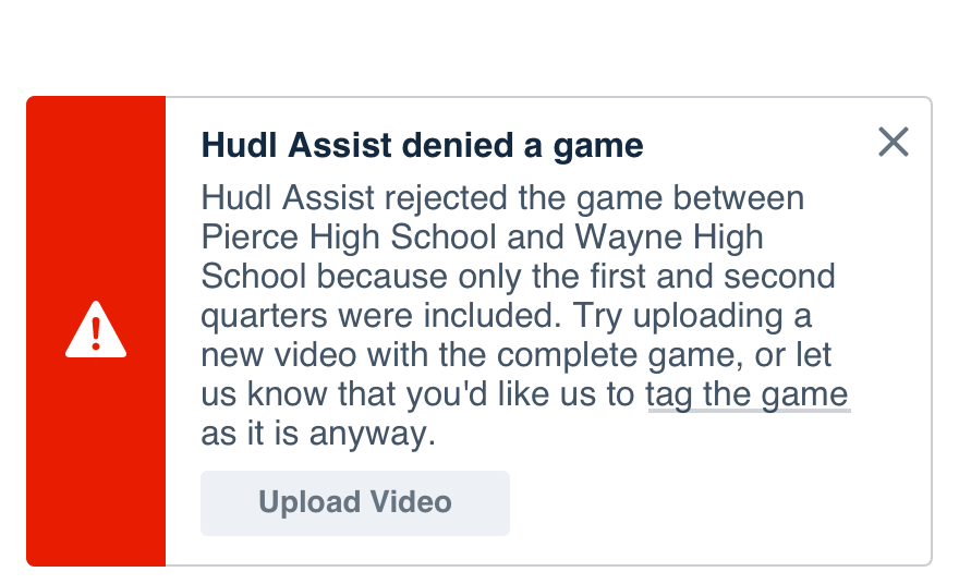
Don'toverwhelm the user with unnecessary information.
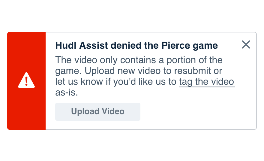
Dokeep the message short and to the point.
Titles
Titles should be concise with keywords at the front. The content should relate directly to the action they’d need to take.
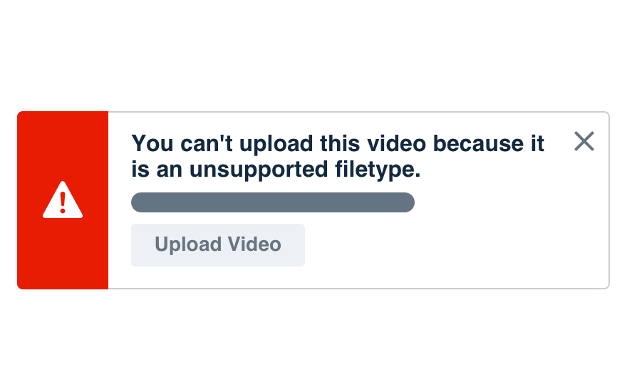
Don'texplain the entire message in the title.
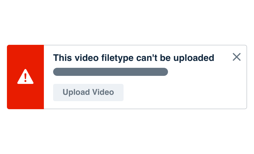
Dofocus on the most important info.
Actions
Try limiting actions to a single verb. If you can’t, stick to a three-word phrase.
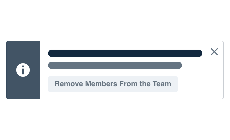
Don'tmake button labels complete sentences.
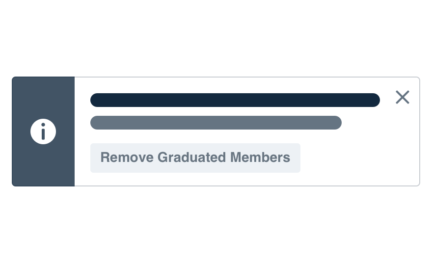
Dokeep things simple with a single verb.
Platform
| platform | notes |
|---|---|
| Web |
|
| Apple |
|
| Android |
|
| No guidelines exist for other platforms (yet). |