Hey there! This is the Uniform version 3 documentation site. If you’re looking for version 4, go here instead.
/
Single Select
Let users choose one option from a short popup list.
The single select functions similarly to a radio in that the options are mutually exclusive. Unlike the radio, it’s more space efficient—especially as the number of options (and each option’s length) increases. If the list grows too large, consider a lookup select.
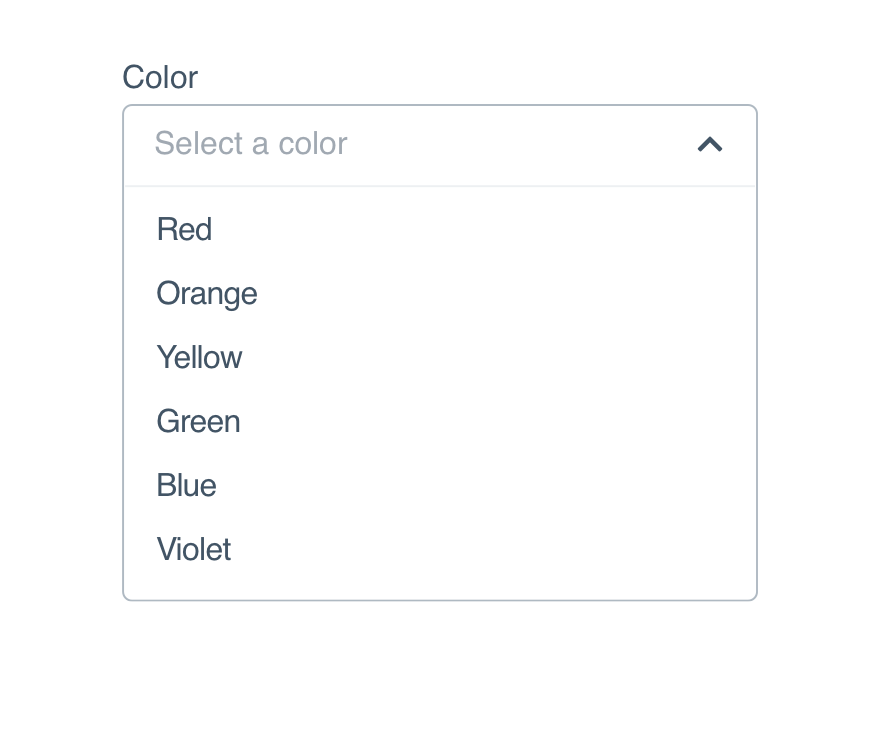
Size
Consider the interface’s density and the select’s position when choosing between the three available sizes. (Sizing itself is controlled by the form modifier component.)
Kareem Abdul-Jabbar
Marv Albert
Al Attles
Red Auerbach
Elgin Baylor
Dave Bing
Larry Bird
X-Small: Ideal for dense interfaces.
Mobile
Use a picker to display the results when selecting a single option. If using our React Native component, this is done for you.
Usage
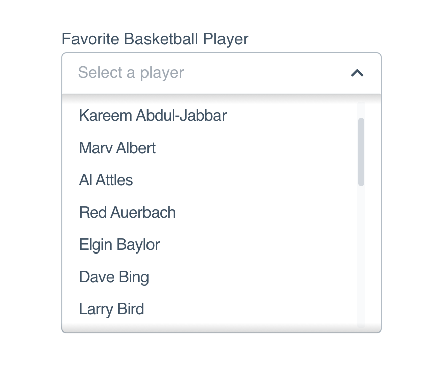
List Length
A single select works for shorter lists with familiar options, ideally 5-15 items. For fewer options, use a radio. For more than 15, use a lookup select.
Don'tmake the list too long with options the user may not predict.
Dokeep the list short so typeahead is not needed.
Options
Option content should be familiar to the user–they should have an idea of what’s in store before opening the select.
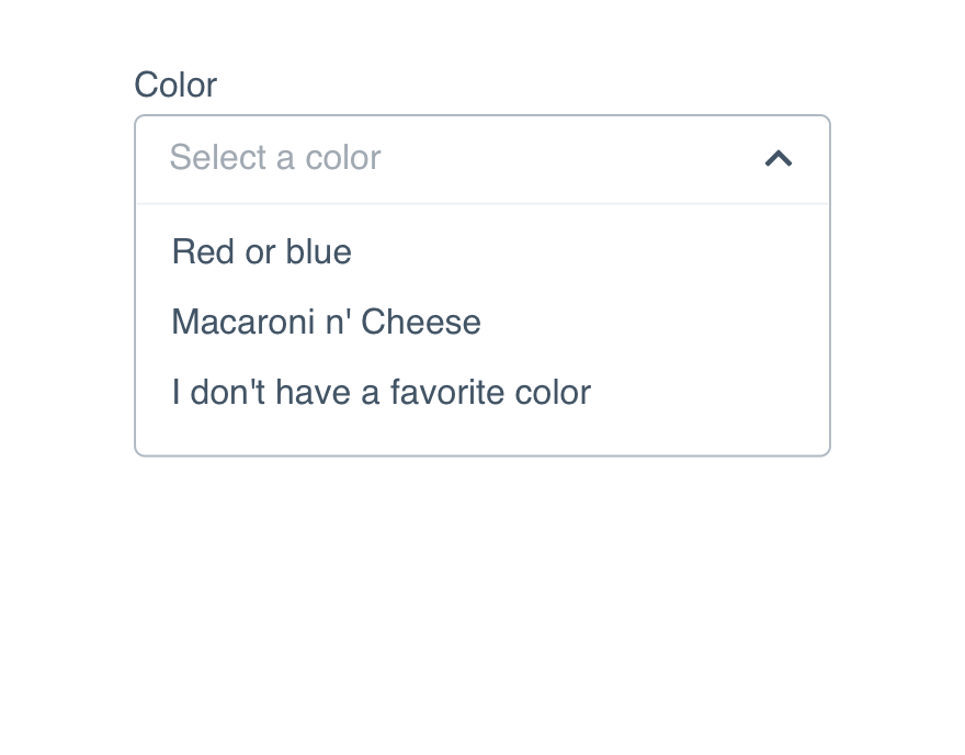
Don'tframe every item differently in an unhelpful order.
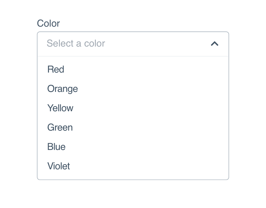
Doprovide a logical list of related items.
Option Groups
Use option groups to divide larger lists into logical sections, like putting the most popular items at the top. You can also add labels for increased clarity.
Kareem Abdul-Jabbar
Marv Albert
Al Attles
Red Auerbach
Elgin Baylor
Dave Bing
Larry Bird
Offense
Defense
Custom Options
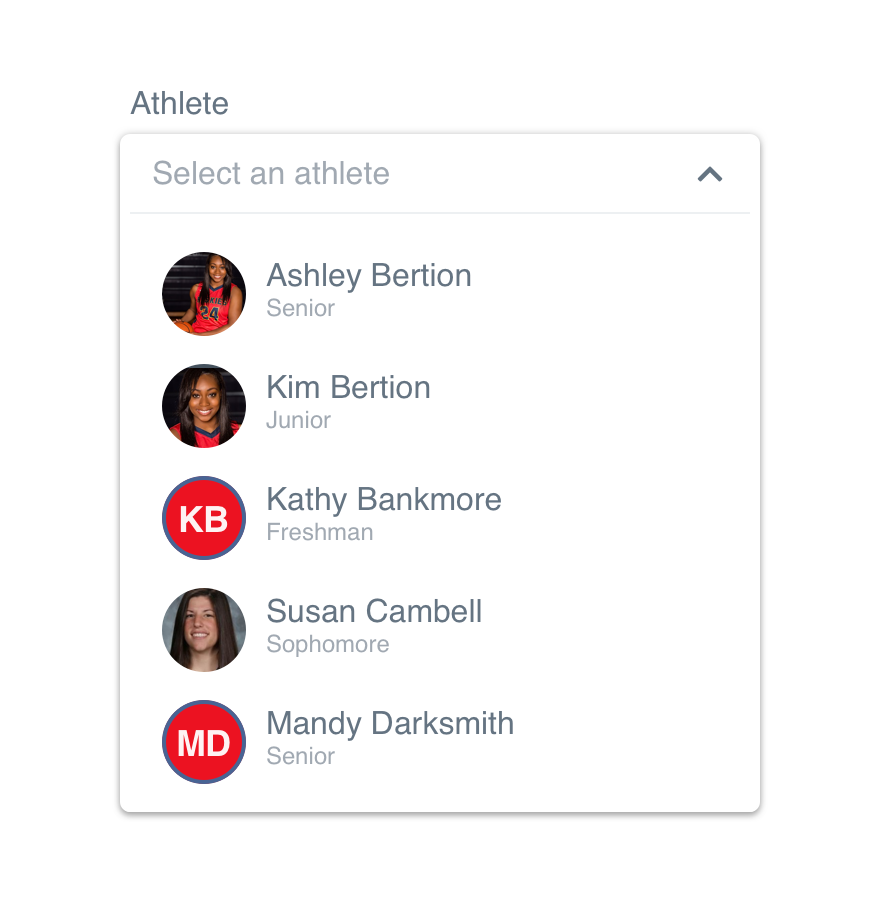
Options are not limited to a single line of text. Additional text and images are allowed, just be consistent with the content.
A common custom option example is listing athletes with avatars–it should always be for the sake of helping users find what they’re looking for.
KAJ
Kareem Abdul-Jabbar
MA
Marv Albert
AA
Al Attles
RA
Red Auerbach
EB
Elgin Baylor
DB
Dave Bing
LB
Larry Bird
If you do include additional text and/or images, the closed height cannot change once an option is selected.
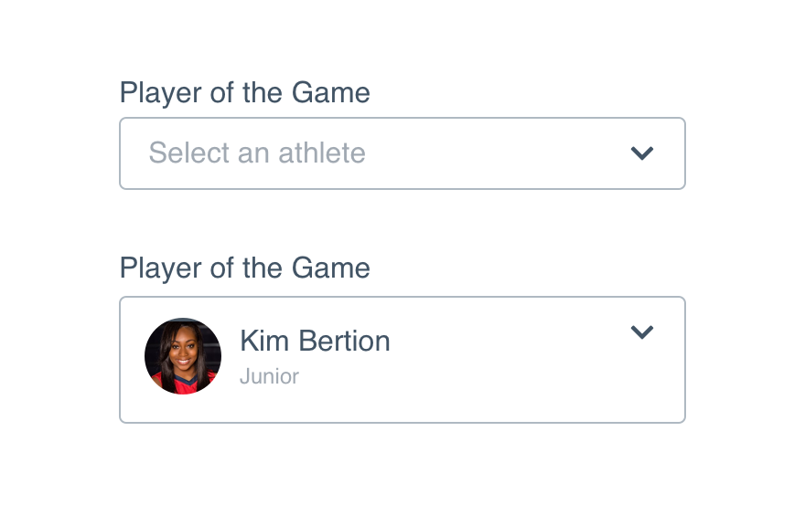
Don'texpand the closed state for large selected options.
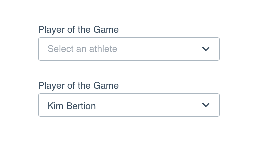
Domodify the selected item preview to match the placeholder size.
List Height
Allow enough space in your interface or adjust the max-height to prevent the option list from expanding beyond the screen.
By default, 6.5 items will show when the option list is expanded. If you use option groups or custom options, adjust the max-height to ensure it falls on a ½ item to signal the user can scroll.
Don'tallow overflow to land between options and give the impression all options are visible.
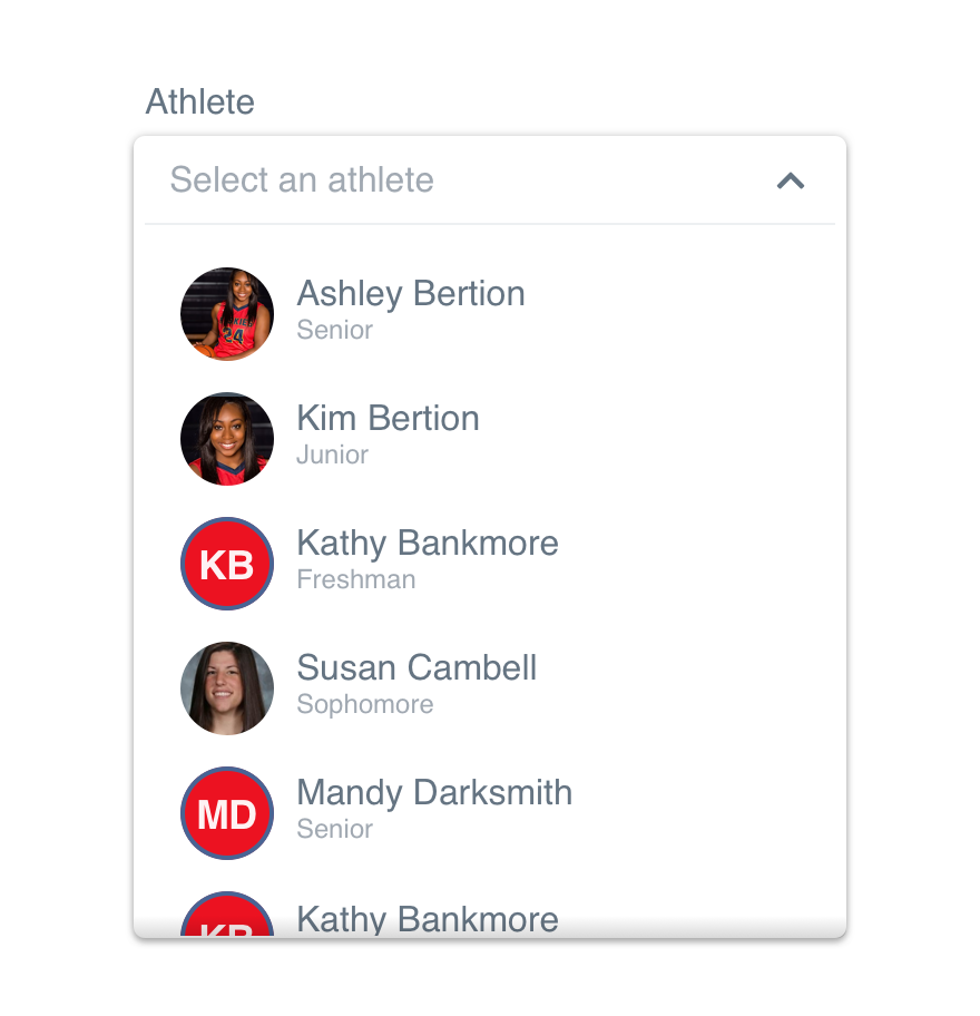
Dosize the maximum height to split an option and make scrolling obvious.
Microcopy
Placeholder
Single select placeholders should read “Select a/an __”. By limiting the CTA to select, we’re suggesting there is a list to choose from. The article a/an makes it clear they can only choose one.
Options
Single select options are typically single words or names. If your options go beyond that, be sure to follow the non-label text guidelines.
Platform
| platform | notes |
|---|---|
| Web |
|
| Apple |
|
| Android |
|
| No guidelines exist for other platforms (yet). |